National Design Academy spotlights ten student interior design projects
A restaurant repurposed from old shipping containers and a Japandi-style coffee shop are included in Dezeen's latest school show by the National Design Academy.
Also included is a French restaurant inspired by 1920's art-deco design and a townhouse interior in central Moscow that references the 1960s.
National Design Academy
School: National Design Academy
Courses: BA (Hons) Interior Design and MA Interior Design
Tutors: Amy Payler-Carpenter, Andreia Vidas, Vicky McClymont, Odette Maine, Ruth Skrytek, Sarah-Jane Wilkinson, Simone Haley and Stephen Matthewman-Knowles
School statement:
"Established for almost 35 years with alumni of over 35,000 designers in over 80 countries, the National Design Academy continues to lead the way in flexible online design education. All degrees are awarded in partnership with De Montfort University.
"The NDA offers a unique portfolio of online interior design and garden design qualifications, from practical short courses and Diplomas to Bachelors and Masters degrees.
"These include the world's only specialist degrees in Heritage Interior Design, Retail Interior Design and Design for Outdoor Living alongside the more traditional Interior Design and Garden Design qualifications.
"The NDA's degree courses offer the ability to upskill or retrain without having to put your career on pause or disrupt your home life. Many of the NDA's students are practising designers; some are new to the industry but all form part of our thriving online campus community."
Alexa Cher-Alizee Wilson
"The brief was to design a sustainable concept restaurant. It was challenging to repurpose a storage facility constructed from old shipping containers into a sustainable restaurant near the Saigon River in Ho Chi Minh City, Vietnam.
"I wanted to demonstrate a sustainable interior can be more than just bamboo or repurposed wood. I designed a sustainable interior that is both aesthetically pleasing and creatively put together using cob, exotic encaustic tiles, glistening glass bricks and concrete. The design was inspired by the local Indochine style with a minimalist scheme."
Student: Alexa Cher-Alizee Wilson
Course: BA(Hons) Interior Design
Email: alexa.w.studio[at]gmail.com
Ayse Begum Bozkaya
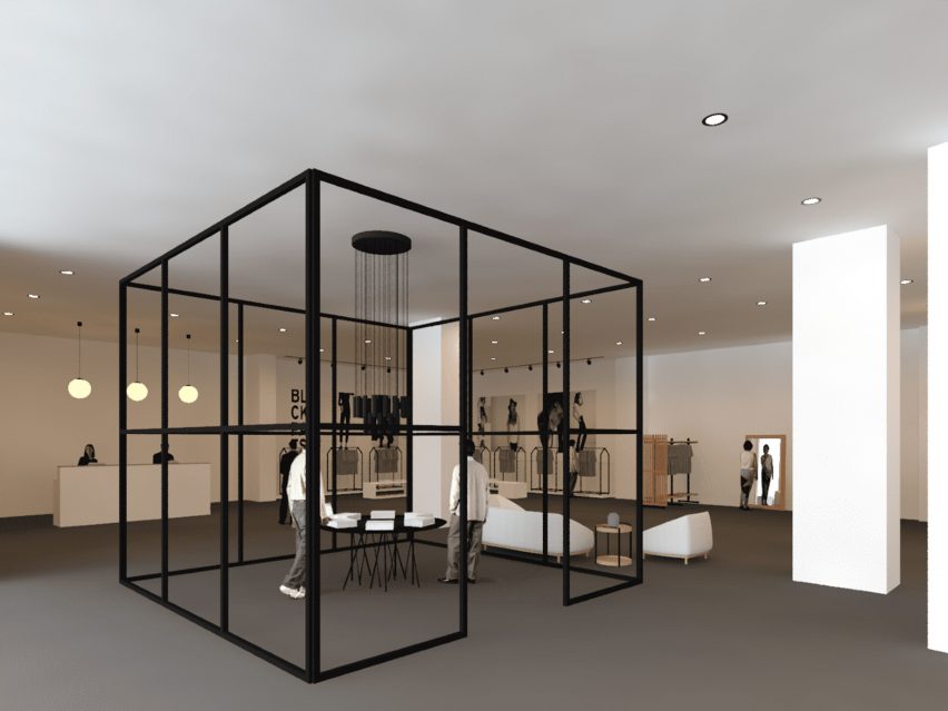
"In this project, the aim was to design a store and a cafe for environmentally conscious clients using sustainable products and finishes. The project brings together Scandinavian simplicity, minimalism and functionality with European elegance and sophistication.
"The focal point of the design is the installation area, which consists of a giant steel structure. This area is designed to host conceptual projects and exhibitions or to display the inspiration behind the fashion designer's collection.
"Furniture and accessories are from Sancal, Essem Design, Karl Andersson & Soner, Arflex, Egizia, Salvatori and Swedese."
Student: Ayse Begum Bozkaya
Course: BA(Hons) Interior Design
Email: aysebegumbozkaya[at]hotmail.com

Fernanda Espidio
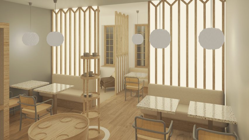
"This project is a coffee shop based on the concept of Japandi – it is a mixture of the traditional Japanese influence and Scandinavian design. The three concepts that guided the project were flow, hygge and origami."
Student: Fernanda Espidio
Course: MA Interior Design
Email: espidiofernanda[at]gmail.com
Ibrahim Mohamad Aljasem
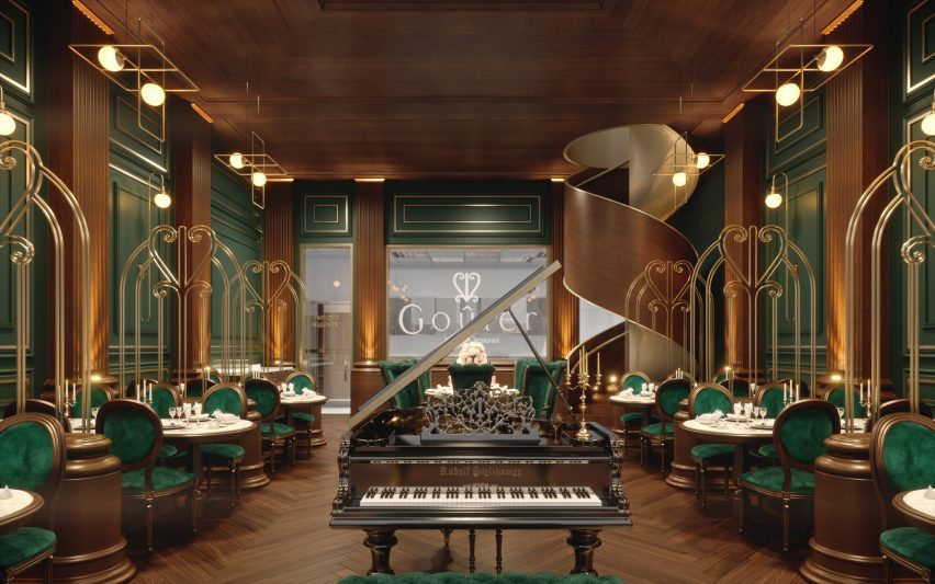
"This is a luxury French restaurant inspired by 1920's art deco beauty. It uses natural wood and furniture upholstered in lush green velvet."
Student: Ibrahim Mohamad Aljasem
Course: BA(Hons) Interior Design
Email: ibrahim[at]luxurious-studio.com
Kavindi Opatha
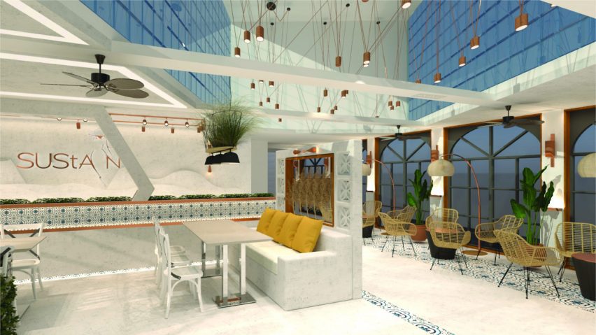
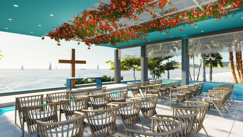
"Santorini is a pavilion inspired by the beauty of the Greek city of Santorini. The space reflects the beauty of Greece by capturing the essence and characteristics of the city.
"The flower ceiling, along with the colours blue, white and mild grey accompanied by simple furniture designs are meant to make the occupants feel like they are in Greece.
"When we think of this beautiful city, we visualise a seaside, white and magical blues. The pavilion design's primary function is to capture and simulate these emotions.
"The pavilion is placed on a pool to make use of the beach, which creates an infinity effect to the design while the overall design provides an exquisite, calming and a perfect finish to host magical wedding ceremonies."
Student: Kavindi Opatha
Course: MA Interior Design
Email: kavindiopatha[at]gmail.com
Mackenzie Morrison
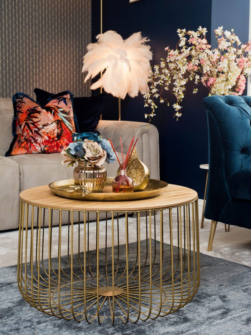
"Student digs to art deco lounge! The room was a dark magnolia space with mismatched furniture in an unliveable layout. My client wanted an art deco aesthetic and wasn't afraid to go bold.
"It's paid off tenfold, and her lounge truly makes you go 'wow' when you enter. Chevron and sunburst motifs signify more obvious deco design, and have been paired with more subtle references to make a striking but not cliche space."
Student: Mackenzie Morrison
Course: BA(Hons) Interior Design
]Email: mackenziepaigeinteriors[at]outlook.com
Marina Ternovaya
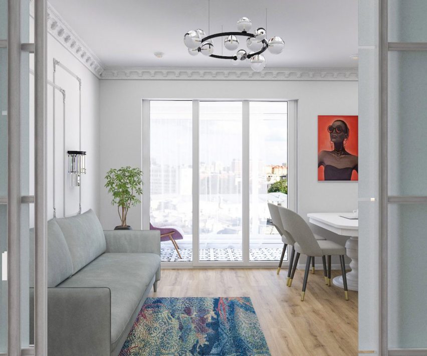
"My project has the spirit of the 1960s. It was designed for a modern young family in a house in the centre of Moscow, built in the 1960s. Throughout the project, it was essential to preserve the shade of the design of the Sixties in Russia but at the same time evoke a contemporary aesthetic.
"The project uses stucco, which was very popular in Moscow, and modern furniture and lighting to ensure the interior isn't outdated."
Student: Marina Ternovaya
Course: BA(Hons) Interior Design
Email: tma704[at]yandex.ru
Noor Kamal
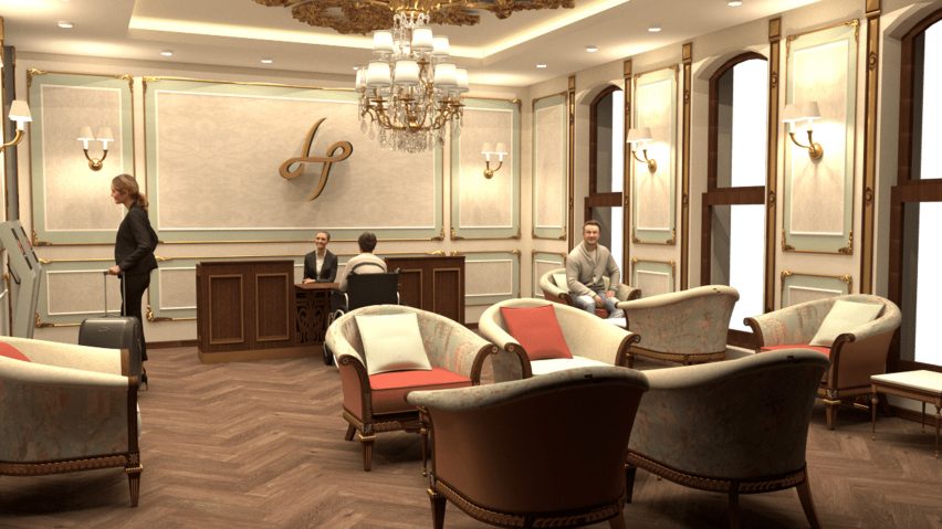
"The Hypnos Hotel is a commercial project that is in Lancaster Gate, London. This project consists of many spaces that required renovation and remodelling while embracing the building's era. Moreover, due to its location and target market, it was essential to find the ideal design. The building was Victorian, and the target market was for business people or tourists who want to enjoy the city.
"Therefore, the plan was a Victorian/modern interior to fulfil requirements. During the designing process, it was important to include DDA requirements and sustainable materials."
Student: Noor Kamal
Course: BA(Hons) Interior Design
Email: noor.mkamal[at]outlook.com
Philip Baldacchino Caruana
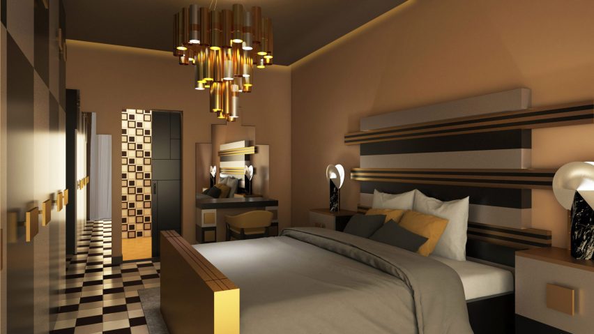
"The interior design conveys a distinct experience through storytelling which respects the local heritage of Zebbug, Malta. The design was developed from the De Rohan Arch's moulded edges found on the triangular pediment.
"The bed headboard displays decorative features through a linear gold, black and silver pattern. The gold and black designs increase in length as the headboard goes up.
"The headboard exhibits similar characteristics to the arch's neoclassical architecture through the grandeur of scale and simplicity of geometric forms. The beige walls paired with the brown ceiling accentuate the chandelier's golden features."
Student: Philip Baldacchino Caruana
Course: MA Interior Design
Email: philipcaruanadesign[at]gmail.com
Sabine Daly
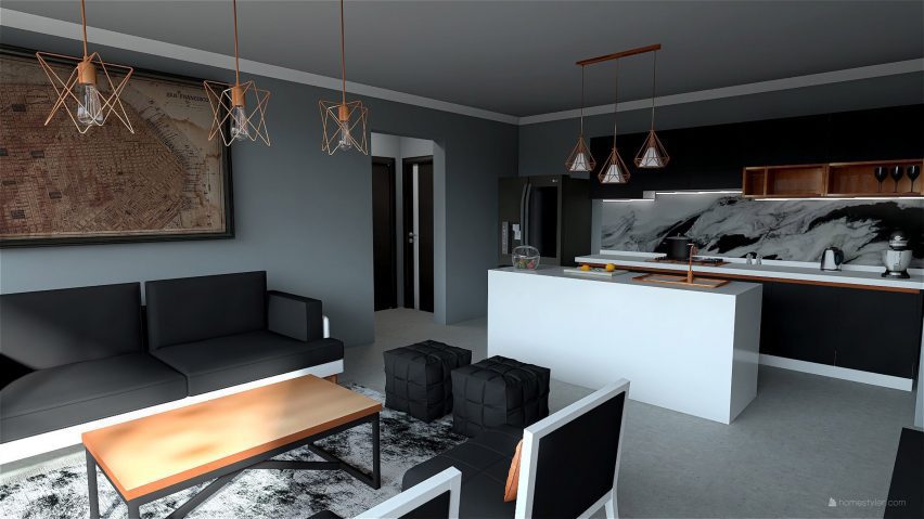
"The space was designed with the concept of being a modern industrial design with a slight nod to the steampunk concept through the use of copper as an accent. It includes concrete floors and exposed brick walls (not shown).
"The colours black, white and copper are used along with exposed brick to create a bold statement and since the colours and materials are bold the furniture and objects are simple in shape to not overwhelm the space. The marble backsplash is bold but at the same time simple, it has all three main colours – black, white and grey – it is what connects the whole design together."
Student: Sabine Daly
Course: BA (Hons) Interior Design
Email: sabinedaly[at]gmail.com
Partnership content
This school show is a partnership between Dezeen and National Design Academy. Find out more about Dezeen partnership content here.