AIM Architecture adds slide-like staircase to Shanghai store In the Park
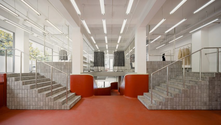
Shanghai studio AIM Architecture has inserted a red staircase that resembles a children's slide in the middle of this clothing store to create a playful interior.
Named In the Park, the Shanghai store was designed to reflect the playfulness of the clothing brand while drawing on the layout of traditional Chinese parks.
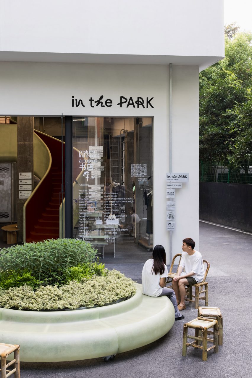
AIM Architecture wanted to transform what was once an inaccessible three-storey space in the middle of a busy shopping mall into something that felt interconnected and coherent.
The most prominent feature is a striking 4.2-metre-tall staircase made from fibreglass and rubber that resembles a children's playground slide or a skating bowl.
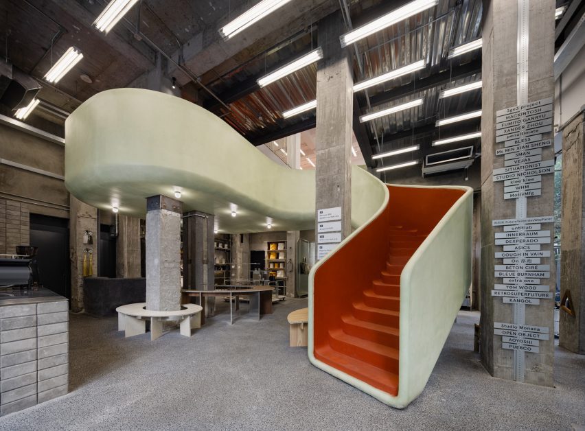
"The staircase is as inspired by a suburban skate bowl as much as it is an austere garden," Wendy Saunders, AIM's founder and principal architect, told Dezeen.
"We wanted to make the stairs more than just a way up but an experience in itself and at the same time breaking the high climb for the customers by adding an extra floor."
Red steps snake from the mezzanine to a halfway platform and continue on to the ground floor, connecting all levels inside the store.
"Making a connection between all the floors is an important part of the spatial identity," said Saunders. "The original site was three storeys high with no connection and a forest of columns, making parts of the space unreachable."
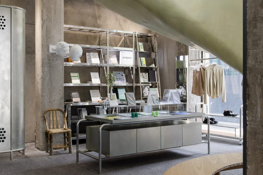
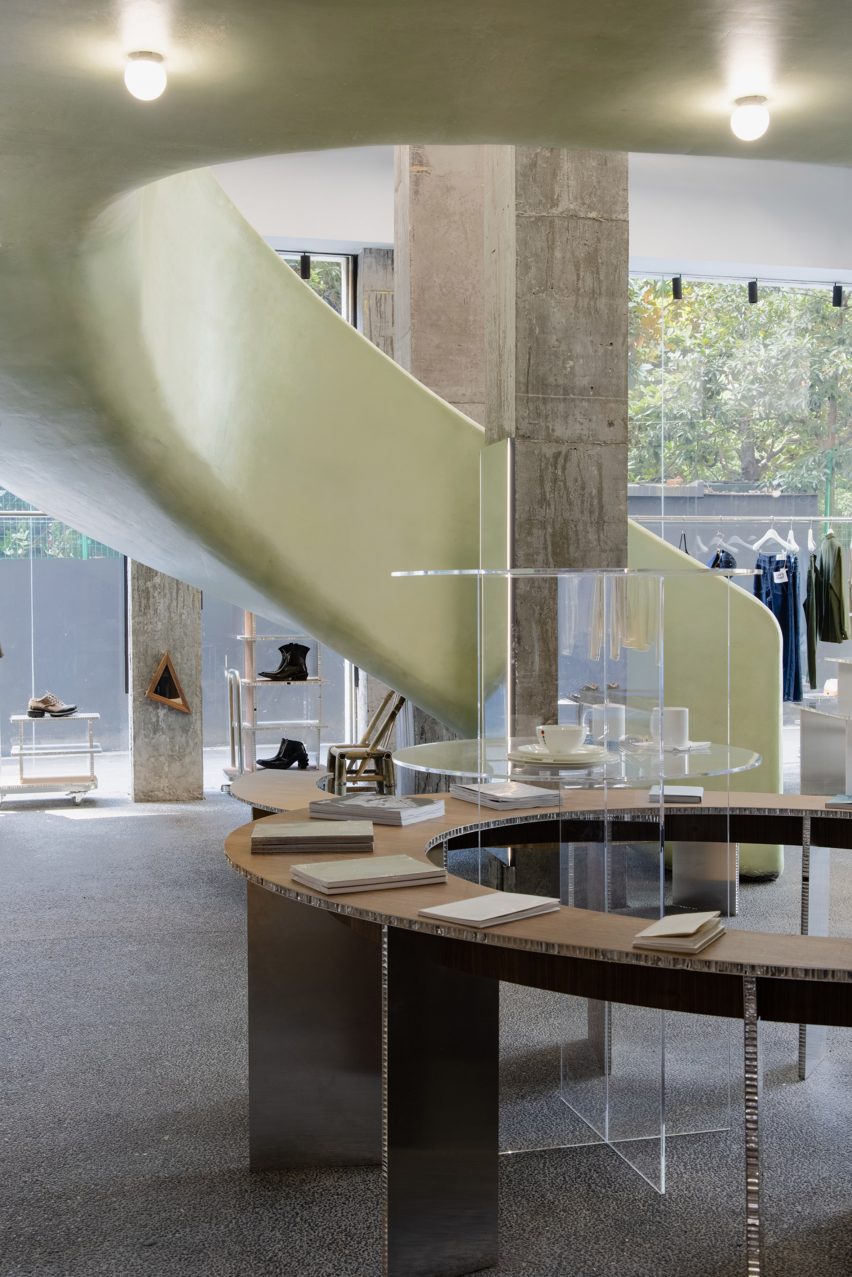
While shoppers entering In the Park are immediately confronted by the staircase, the brand's clothes, shoes and other homeware items are spread out sporadically around the space.
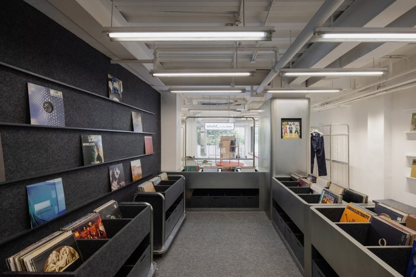
On the first floor, a record store has been tucked around a corner out of sight.
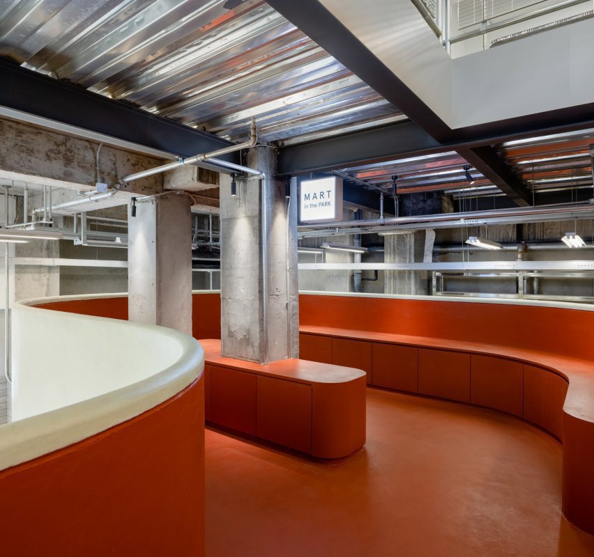
According to the designers, this echoes the arrangement of landscaping in China's parks and gardens.
"We were strongly inspired by traditional Chinese parks, where winding paths lead the visitor to secluded areas," said Saunders.
Several other decorative elements alongside the main staircase were used to contribute to the playful look.
Aluminium shelves informed by park benches wrap around "tree like" columns throughout the store. Outside, bamboo chairs and a large oval seat surround a bed of plants.
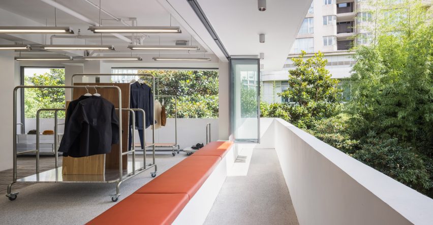
Playful hues and shapes in the store are set against minimal furnishings such as the steel shelving units and the muted grey colour palette.
Industrial, untouched pillars around the store also contrast the cheerful centre piece, giving the interior a more balanced feel.
This isn't the first time AIM has revamped part of a retail mall, having previously studio designed a lobby and a shopping centre inside Fuxing Plaza in Shanghai.
AIM also transformed an atrium in the Xintiandi mall in Shanghai by adding a number of natural materials and plants.
Photography is by Wen Studio.