Norm Architects designs New Mags bookstore in Copenhagen to reference old libraries
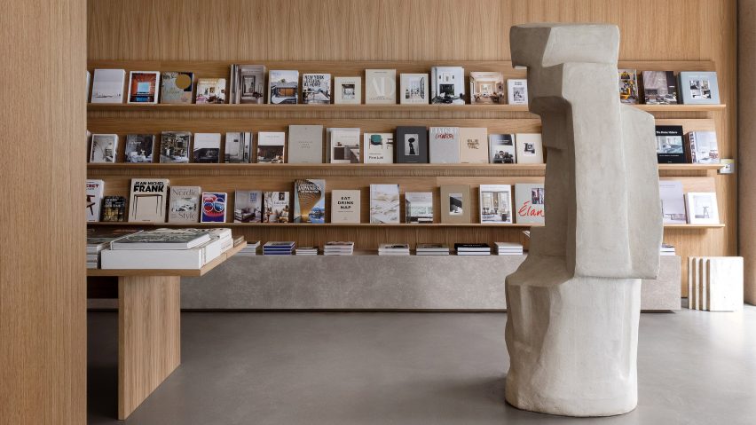
Danish studio Norm Architects has designed a flagship bookstore for distributor New Mags that features stone plinths and pivoting wooden walls.
Norm Architects looked to classic libraries for inspiration for the project, which was commissioned by a Scandinavian distributor of coffee table books.
"As inspiration for the project, we looked thoroughly at spaces that are a book-lover's paradise – the library," Norm Architects co-founder Jonas Bjerre-Poulsen told Dezeen.
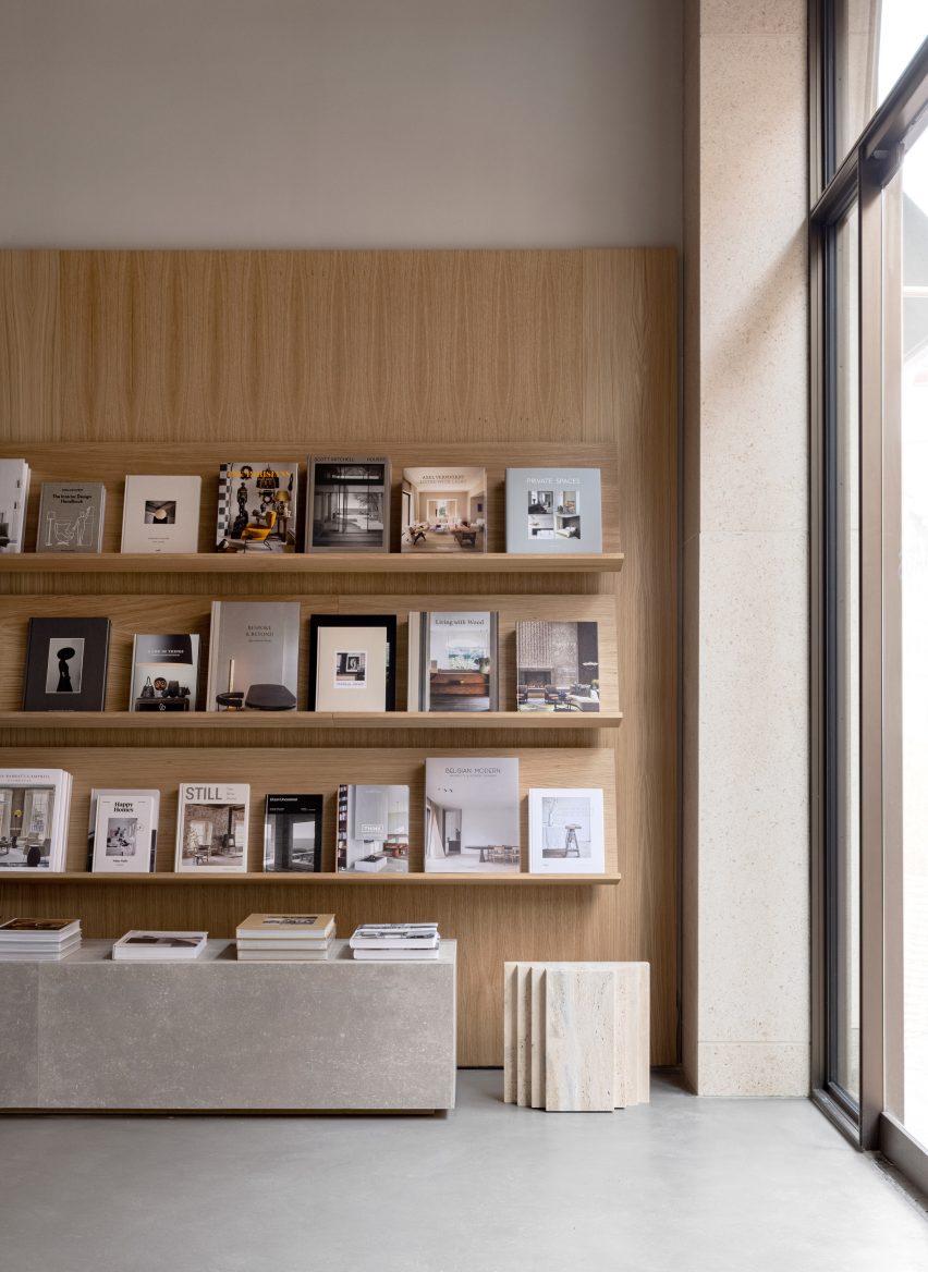
"We looked at old libraries with large wooden shelving, long study tables and library lamps in old buildings, where beautiful and large volumes were packed in shelves alongside prominent sculptures and ornamental moldings."
The local architecture studio wanted to transform the "silo-like" interior of the 100 square-metre space, which is set in a newbuild in inner-city Copenhagen, into a more easily manageable space that would also function as an office for New Mags' marketing department.
"The space was relatively small and with its high ceilings, it had an almost silo-like feeling," Bjerre-Poulsen said.
"The space had an irregularity and was quite narrow and deep but had large windows facing the street."
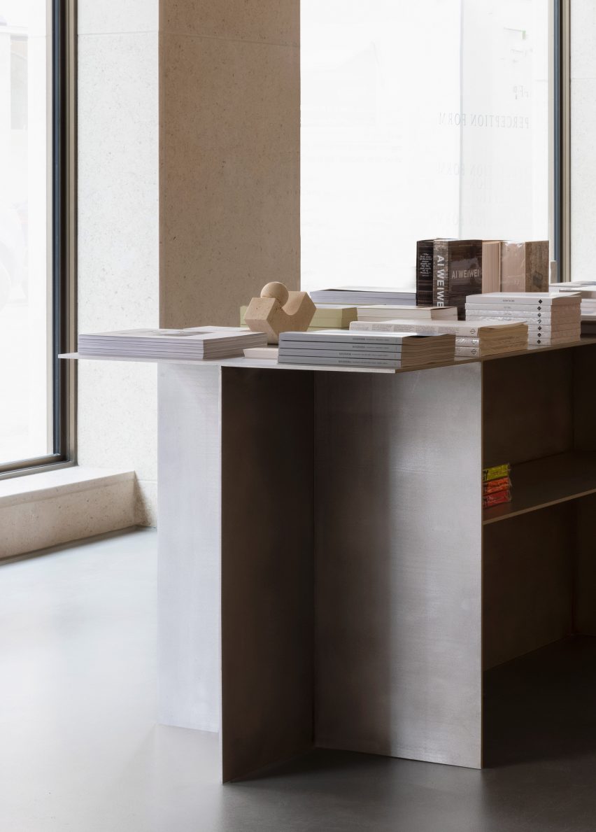
"The only thing we had to work with from the existing architecture, was therefore the light golden sandstone used on the facade of the building and the somewhat irregular and fixed layout of the loadbearing concrete walls," he added.
To connect the interior and exterior of the store, Norm Architects designed a cast-concrete floor in the same colour and on the same level as the pavement outside the shop.
The studio also chose marble paint from St Leo to give the walls of the store a warm and tactile "stony" character that references the sandstone facade.
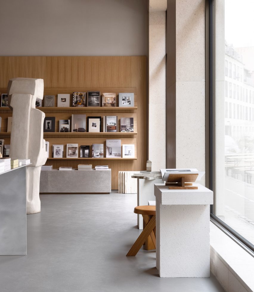
Wooden panels in natural oak were used for both the 2.8-metre-high display walls and to divide the store.
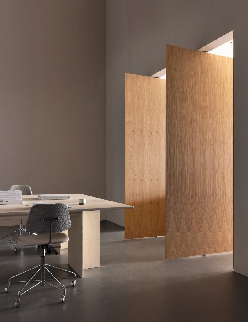
"The wooden panels that fold from one end of the space and continue along all the walls do not only make the vertical division that was needed, but it also divides the store space in the depth of the space," Bjerre-Poulsen said.
In one place the panels pivot, opening up to a room that holds two workplaces as well as the store's stock.
This space can be either opened or closed to the public.
"The idea is to connect the retail element with the core of the company and make room for occasional drop-down workplaces for New Mags’ employees, for meetings or for customers to sit in peace and flip through a book," Bjerre-Poulsen said.
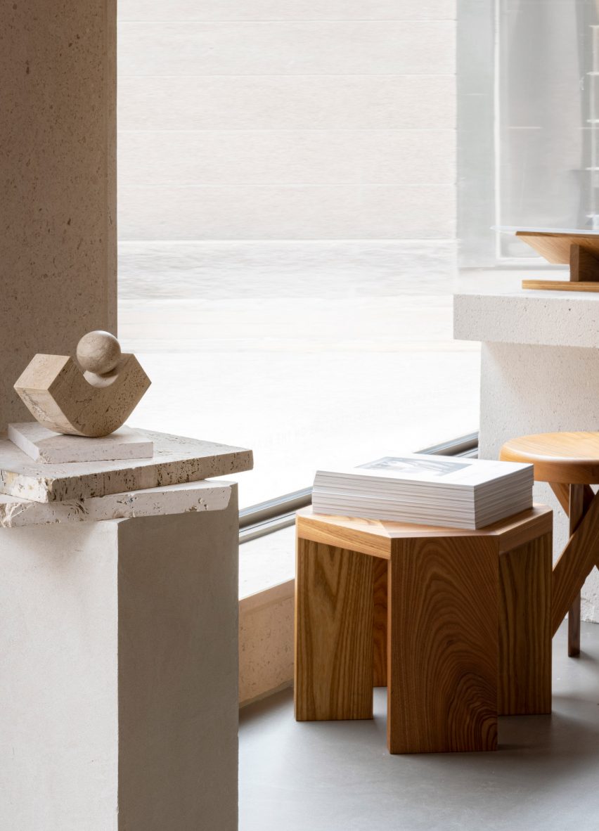
As well as plenty of wood, Norm Architects also used stone – including a large sculpture by Josephine Winding – to give the space an organic feel.
"First, it was our contemporary take on some of the reference images we looked at in the design phase from old libraries where you could see sculptures on plinths among the study tables and rows of shelves," Bjerre-Poulsen said of the sculptures.
"Secondly, it was a way to create a welcoming gesture to the space, create a bit of division and variance in heights as well as adding a soft and organic contrast to the straight-lined and architectural elements of the wall shelving, the stone plinths and the beam tables."
Large stone plinths underneath the wooden shelves are used for additional displays.
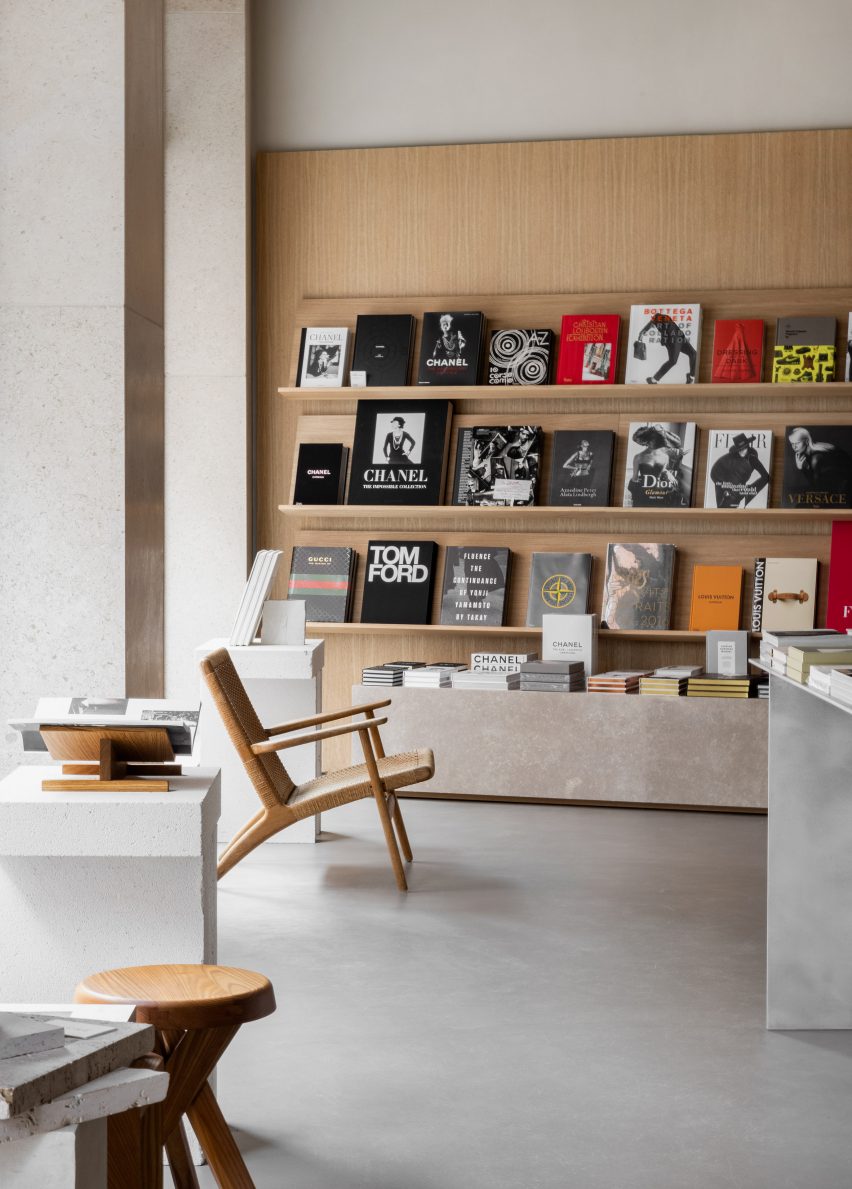
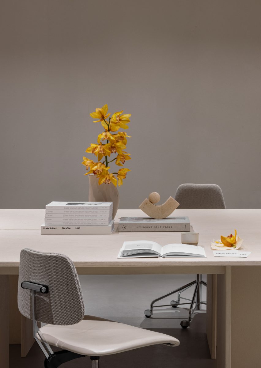
Norm Architects also added a long oak study table as a place for customers to read and for displaying books, as well as a brushed aluminium table and a lounge setting with a chair.
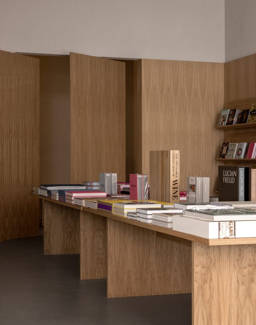
"We set out to design a contemporary and more minimalist version [of a library], where all the books could be displayed in different ways in a warm, cosy, and interesting atmosphere," Bjerre-Poulsen explained.
Among the studio's other projects in Copenhagen are a jewellery-store interior based on the studios of Picasso and Magritte and a hotel that doubles as a showroom.
Photography is by Jonas Bjerre-Poulsen and Sandie Lykke Nolsøe.