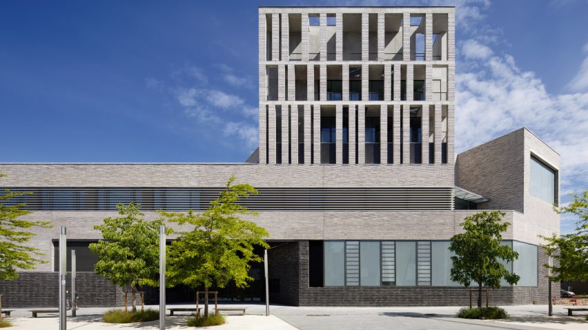
French studio Bruno Gaudin Architectes has completed a library clad in thin, grey bricks at the entrance to Paris Nanterre University.
Located in the town of Nanterre, west of the French capital, the brick-clad Contemporary International Resource Library marks the southern edge of the Paris Nanterre University campus.
Occupying a triangular plot, the building comprises a pair of low-lying blocks that run along two sides of the site. An entrance hall is positioned at its main street-facing elevation.
Where the blocks meet, the library rises to three storeys as a colonnaded "wind tower", acting as a landmark for the library as well as a viewpoint that embraces and overlooks the urban landscape.
"The contemporary project is part of a chaotic environment, it faces transport infrastructure: railroads and Bus tracks, it runs alongside large-scale buildings: the University of Nanterre, large buildings from the 1960s, imposing office blocks," Bruno Gaudin Architectes told Dezeen.
"From this, emerges a sort of lantern/colonnade, a wind tower that opens up to the urban landscape, and gives the public building its place in a horizon of large scale buildings."
The team clad the exterior of the building in long, thin, handmade bricks. They explained that the brick was chosen for its textural rock-like look and hand-moulded qualities.
"The brick that we have chosen here for Nanterre is a beautiful object, it is moulded by hand, a process which leaves a particular imprint on the shape: the sharp edge cuts through the light," said the studio.
Windows and openings have both a regular and irregular placement, which the studio described as a "musical rhythm".
Along the street facades, the fenestration follows a strict uniformed geometry, while the windows overlooking the garden have an asymmetrical arrangement with different-sized square openings that break with the uniformity elsewhere.
The entrance to the library was marked by a large recessed opening, framed by skewed walls that lead visitors to the building's main doors.
Reading spaces were placed on the ground floor, exhibition spaces and teaching rooms on the first floor, and offices placed within upper floors of the taller volumes.
Spaces are organised around a large double-height lobby that exposes and highlights the building's concrete structure.
Vaulted, concrete columns run throughout the interior between glass walls that zone the library rooms, and create the illusion of an open-plan interior.
A wide staircase fitted with seating is placed at the centre of the lobby. It leads up to the first floor, towards exhibition rooms and breakout spaces beside a wall of the asymmetrically scattered windows.
Breakout spaces overlook the ground-floor lobby, zoned by a glass balustrade that wraps around the double-height space.
Elsewhere in France, Dominique Coulon & Associés added a curved glass extension to a library in a former French manor.
In Norway, Kengo Kuma and Mad Arkitekter designed a curved library that was dedicated to Norwegian playwright Henrik Ibsen.
The photography is by Takuji Shimmura.
Project credits:
Client: Rectorat de Versailles
Contractor: EPAURIF
Architecture: Bruno Gaudin Architectes
Scenography: Studio Vaste

