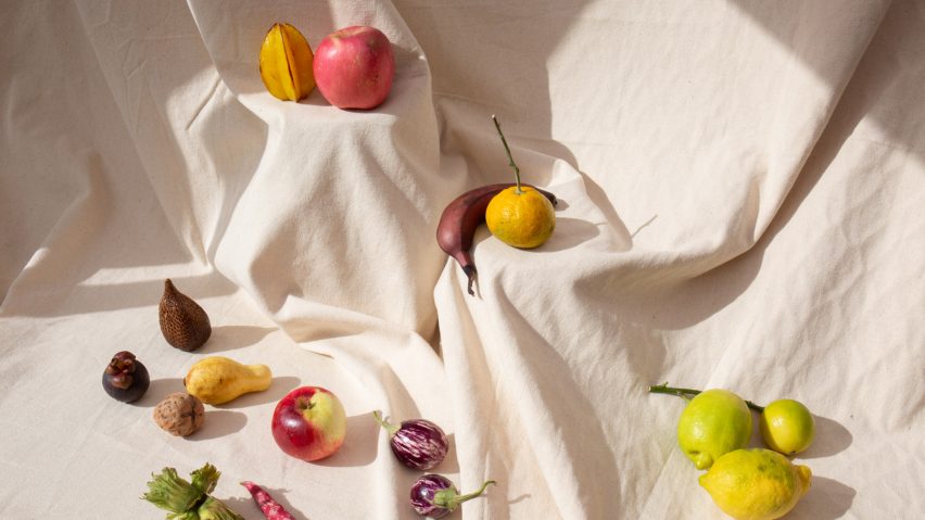
"Can we create a new aesthetic of scarcity?" asks Francesca Sarti
Supermarket shelves groaning with food are a symbol of our age of overproduction and over-consumption argues Francesca Sarti of Arabeschi di Latte in her Dezeen 15 manifesto. Instead, she asks, how can rationing become poetic?
Sarti's manifesto, called The Beauty of Scarcity, includes a proposal for a micro-retailing system that celebrates frugality and parsimony.
The idea is Sarti's contribution to Dezeen 15, a digital festival celebrating Dezeen's 15th birthday that invited 15 contributors to outline ideas that can change the world in the next 15 years.
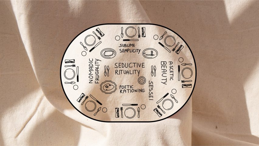
The Beauty of Scarcity
Why are we such inveterate consumers in spite of knowing that our over-consumerism and wasteful lifestyle is contributing to a global emergency? What can help us make a deep behavioural change?
I have always believed that convivial moments can grease the wheels of our collective spirit in favour of change. Over the years I have designed projects that facilitate human interactions and create new rituals for embracing change.
I have chosen joy to impact different aspects of daily life: from using disposable plastic bottles to recovering the pleasure of preparing food by hand or reconnecting with nature.
At this moment I think the most urgent change of perspective needed is in our relationship with prosperity and its counterpart: scarcity.
We are too addicted to the "beauty of abundance"
In a way, scarcity is the inevitable gloomy result of our behaviours. Simultaneously it is the solution. Most of the environmental issues related to food are due to exaggeration, excess, overproduction and over-consumerism. To put it simply, they are problems of quantity.
We really need a behavioural change and since we also eat with our eyes, I think it is important to build an alternative visual narrative to educate ourselves on the “beauty of scarcity”.
We are too addicted to the "beauty of abundance". From our daily shopping experience, where plenitude is the standard, to the ubiquitous celebration of abundance at gatherings and events.
Why don't we completely rethink the aesthetic of our food shops? Why don't we forget the piles of fruits and vegetables, the towers of jars, the overcrowded fish and meat displays? Whether they are supermarkets, exclusive food halls or fancy delis, it seems they can be desirable only when they display a beautifully arranged abundance that inevitably becomes the seed for a wasteful lifestyle.
Why don't we completely rethink the aesthetic of our food shops?
Instead of this, can we create a new aesthetic of beautifully arranged scarcity?
A few years ago I bought Window-Shopping Through the Iron Curtain, a book by David Hlynsky, which contains a collection of 100 photos of shop windows taken in the Soviet Union between 1986 and 1990. Since then, the images of these empty, sober but somehow beautiful shop windows have stuck in my mind. I saw the potential for something.
This manifesto literally puts on the table some keywords that want to contribute to open a discussion and define a new narrative to find new forms of desire, pleasure and beauty that are more likely to encourage frugal modes of consumption and a certain sustainable jouissance.
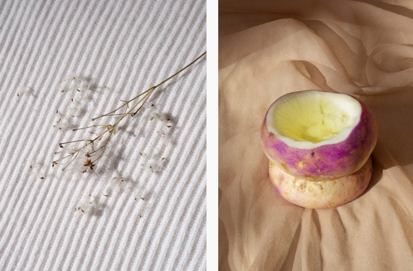
Testing age-old traditions alongside new ideas, I have imagined applying the principles of the manifesto to a micro-retailing system in the style of Arabeschi di Latte. The principles are intentionally naïve in their design. Their simplicity and vernacularity can serve as examples for new forms of gratification, poetising the shopping experience and paying honour to the small things.
As part of my manifesto, I propose five conceptual kiosks that could be used to bring the aesthetic of scarcity into our lives. These are outlined below:
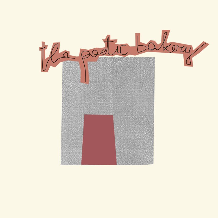
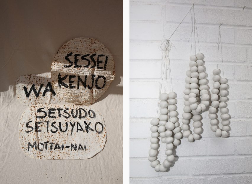
The Poetic Bakery
We need to eat less and reduce our consumption. How can rationing become poetic? What if the product on display itself gives us messages like the ones sailors used to write to their loved ones on hardtack (ship's biscuits) during long journeys at sea? Japanese words like sessei (moderation), setsudo (restraint), wa (harmony) and setsuyako (economising) could perfectly serve the purpose.
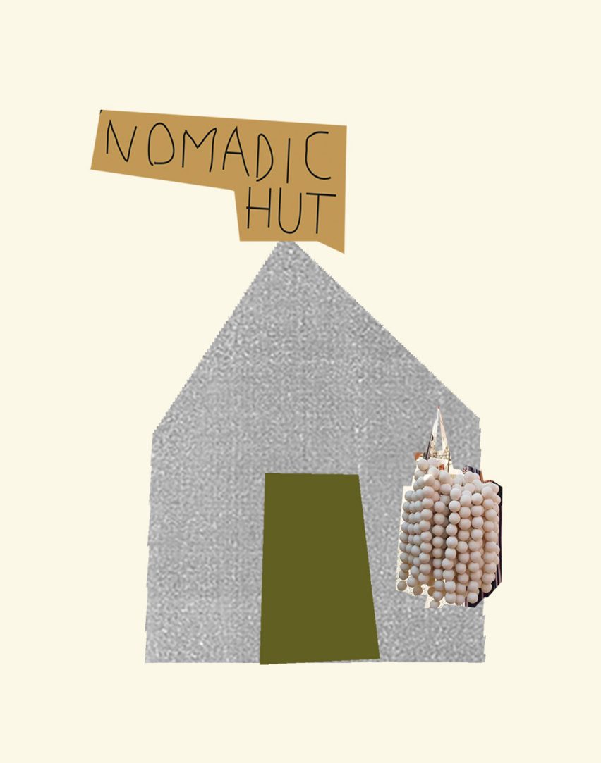
The Nomadic Hut
Frugality and parsimony have always been hallmarks of nomadic food traditions, from the pilgrim's scrip – a wallet used to carry food – to the Berber bouillon and qurut, the long-lasting fermented milk of the Asian steppes. All are fascinating examples of food preservation.
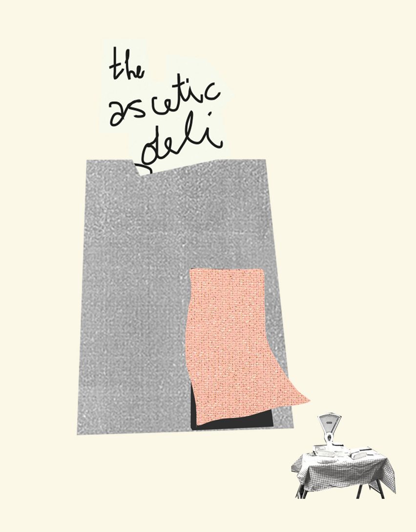
The Ascetic Deli
Inspired by the humble aesthetic and parsimonious design of the mujin hanbaijo, unmanned shops in the Japanese countryside of Japan. These feature a simple stand, only a few products and a money box. An example of trust and humble ascetic aesthetic.
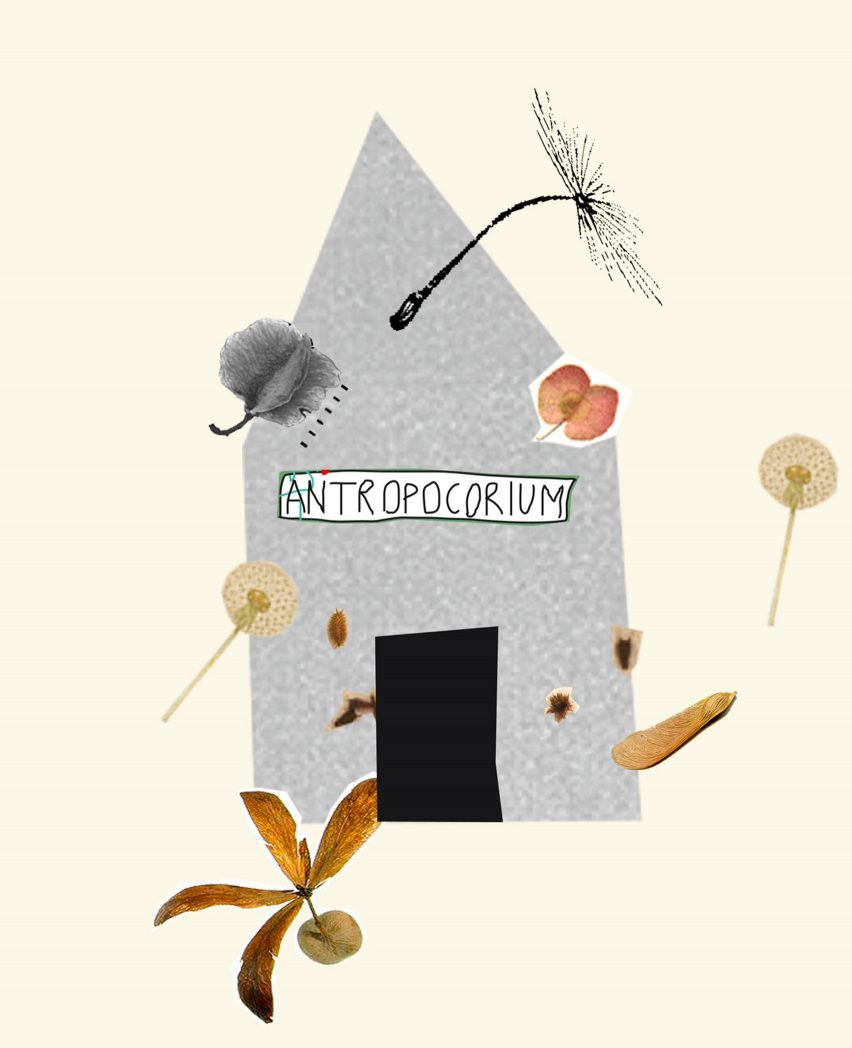
Anthropochorium
Humans have dispersed seeds by many various means and some surprisingly high distances have been repeatedly measured. Seed dispersal by humans is called anthropochory. The display at the Antjropochorium consists of only plant seeds that have travelled with men, beyond many borders. It is an unexpected commensalism.
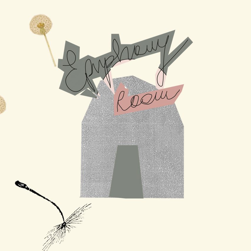
The Epiphany Room
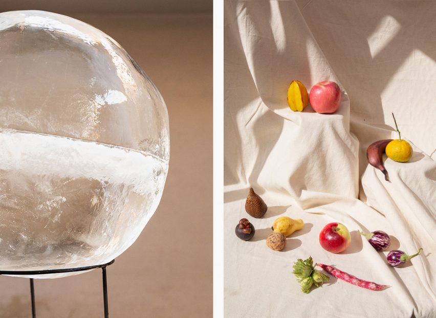
Summer heat, an empty room, a block of ice to sit around and cool down together… at night, blooming flowers, a warming light in the dark… A space to celebrate the sublime simplicity, a poetic reflection on our bodily needs. A reflection on how simple objects can be transformed with minimal effort into healing tools to relieve and enhance our wellbeing.
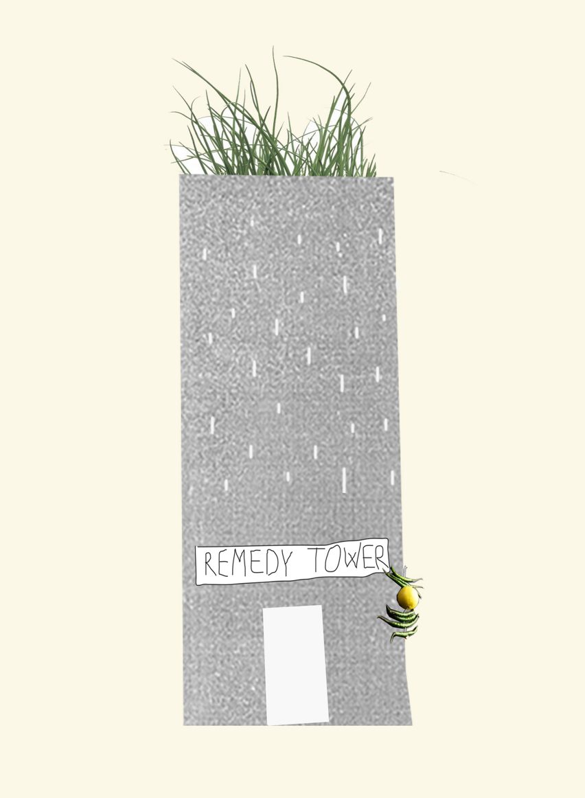
The Remedy Tower
A tiny shop collecting vernacular methods for purifying the home, the spirit and the body: an idea for naturalising and crafting retail, gracefully.

Interdisciplinary designer Francesca Sarti is the founder and creative director of the experimental food design studio Arabeschi di Latte. She established the Italian studio in 2001 to blur the boundaries between design, architecture, art and food.
Her work takes the form of exhibition curation and set design through to interior architecture, art direction and styling.
Find out more about Arabeschi di Latte ›