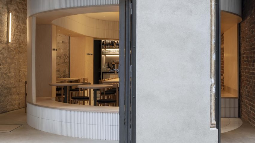
Dezeen Awards 2021 interiors category winners revealed
The 11 winning interiors projects for Dezeen Awards 2021 have been revealed, including an online order collection point in Helsinki, a post office in China, and a bicycle garage in The Netherlands.
Other winners, unveiled in the Dezeen Awards 2021 interiors show hosted by LionHeart and Nelly Ben Hayoun, include a house for two young musicians in North London, a multi-coloured hotel in central Tokyo and a restaurant in Kyiv made from primarily natural and recycled materials.
Sher Maker Studio by Sher Maker was named the overall interiors project of the year.
The winners were decided by a master jury consisting of London-based architect Ben Allen, Julie Eizenberg of KoningEizenberg Architecture, Amit Gupta of STIR, Petra Blaisse of Dutch studio Inside Outside, South London-based interior designer Alexandria Dauley and interior designer Susie McLaren of SHH.
There were 1,314 entries for the interiors categories at this year's Dezeen Awards, which is sponsored by Longboard, Dodds and Shute, Norse Projects, Kingspan, Tom Dixon and Kvadrat. Of these, 62 projects were shortlisted by our jury of 28 leading figures from the world of interiors.
The winners of the architecture categories were announced yesterday, the design categories will be unveiled tomorrow, the sustainability and media categories on Thursday, and finally the studio categories on Friday.
To find out about more Dezeen Awards 2021 subscribe to our newsletter.
See the winning interiors projects on the Dezeen Awards website or read on below:
House interior of the year:
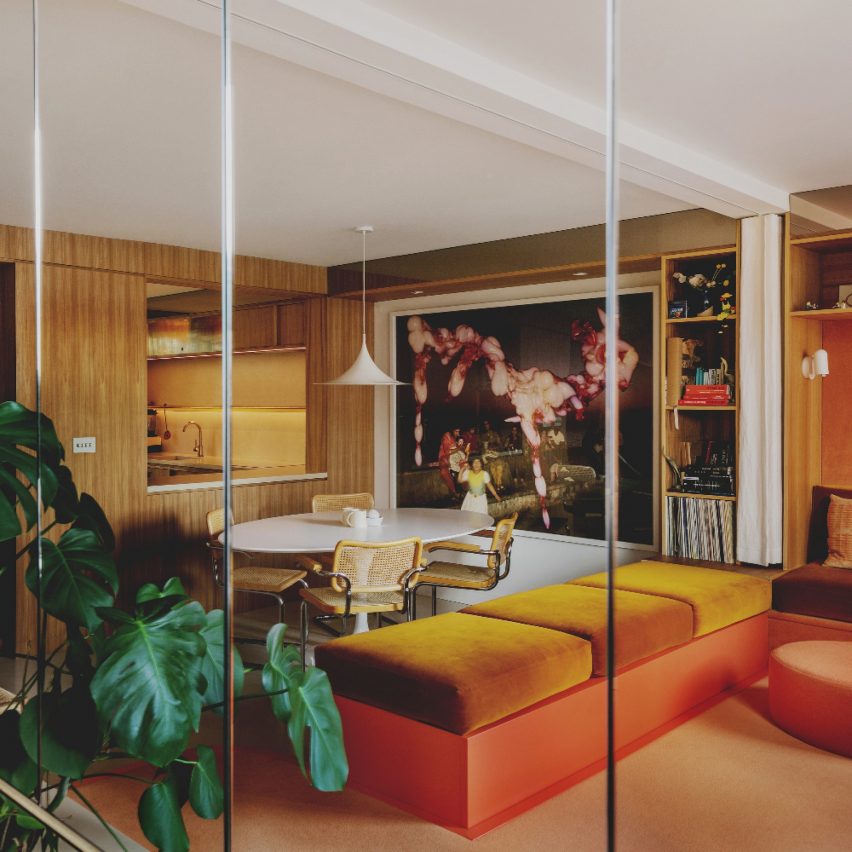
Canyon House by Studio Hagen Hall
Canyon House was conceived for two young musicians who wanted to recreate their affection for modernist Californian homes when renovating a dilapidated 1970s terrace in North London.
The house is divided into three distinct parts: a flexible upper ground floor living space and open kitchen for entertaining; calm, intimate sleeping quarters on the upper floor; and a professional, acoustically isolated writing and recording studio on the lower ground floor.
"This project has a very beautiful selection of materials," the judges on the interiors jury said.
"The space feels timeless and really brings all the different elements together naturally. You can tell the designer has put careful thought into every decision. There is a narrative that takes you through the house with a lot of really complex detail."
Apartment interior of the year:
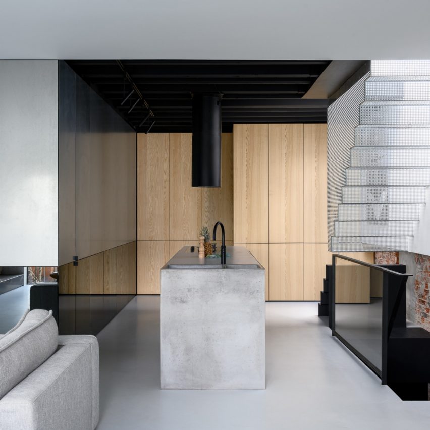
Reflections of the past - an Amsterdam loft by Firm Architects
Firm Architects has designed a private residence in Amsterdam that explores the concept of old and new.
The apartment features a sharp line of contrast that runs the perimeter of the space at 95 centimetres above the floor. Everything above this line is a new interpretation and everything below is a reflection of the old. These concepts are conveyed through the use of contrasting materials such as exposed brick, polished concrete, wood and glass.
"It takes a bold creative to punctuate extremely pristine, clean lines with muted raw finish. The brick wall and stairs is a reinforcement of that courageous experiment that makes the project stand out." said this year’s interior master jury.
Restaurant and bar interior of the year:
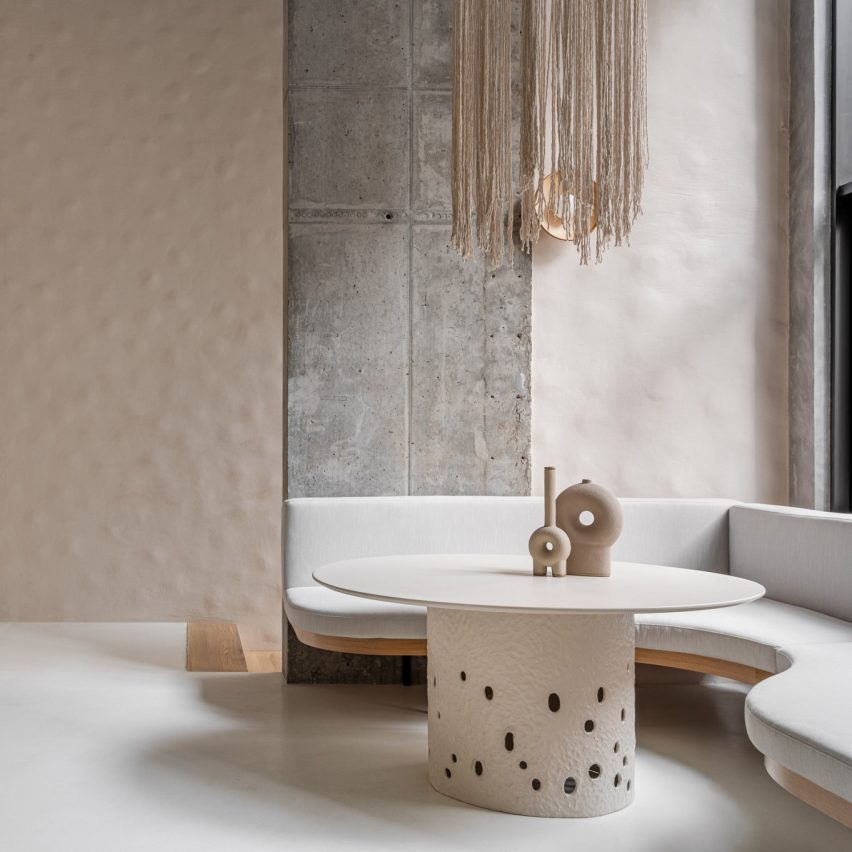
Istetyka by Yakusha Design
Istetyka is a healthy fast food restaurant in Kyiv, Ukraine by Yakusha Design. The Kyiv eatery contrasts rough concrete with polished stone and smooth steel.
Local studio Yakusha Design focused on creating clean lines and using natural and recycled materials to create a calm dining space. The space was designed using traditional Ukrainian techniques.
The judges commented: "The space is quite surreal and has an interesting use of material and texture. The design is so simple yet manages to have so many textures with stunning composition. The designers have managed to create an overall clean, simple interior that still holds a cultural connotation."
Hotel and short-stay interior of the year:
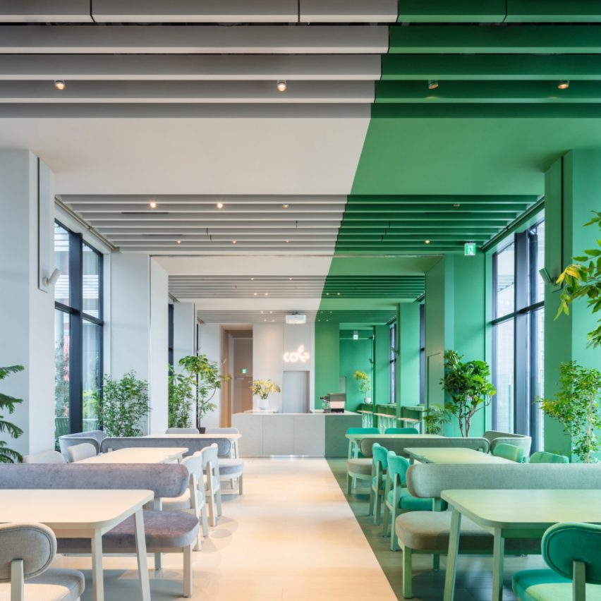
Toggle Hotel by Klein Dytham Architecture
Klein Dytham's Toggle Hotel features colourful two-tone rooms that were designed to be an uplifting contrast to the predominantly grey urban fabric of central Tokyo.
Its triangular site is bound on one side by the elevated Metropolitan Expressway and by the Chuo Line railway tracks on the other.
Within its striking yellow and grey exterior, inspired by the graphic patterns of the expressway, floors of two-tone rooms come in 12 vibrant colours and six contrasting colour combinations.
"This interior has a very interesting cultural mix up with a highly graphic approach," the judges commented. "The clever use of colour helps cover-up services while enhancing the interior. Impactful and brave, creating interest out of simplicity."
Large workspace interior of the year:
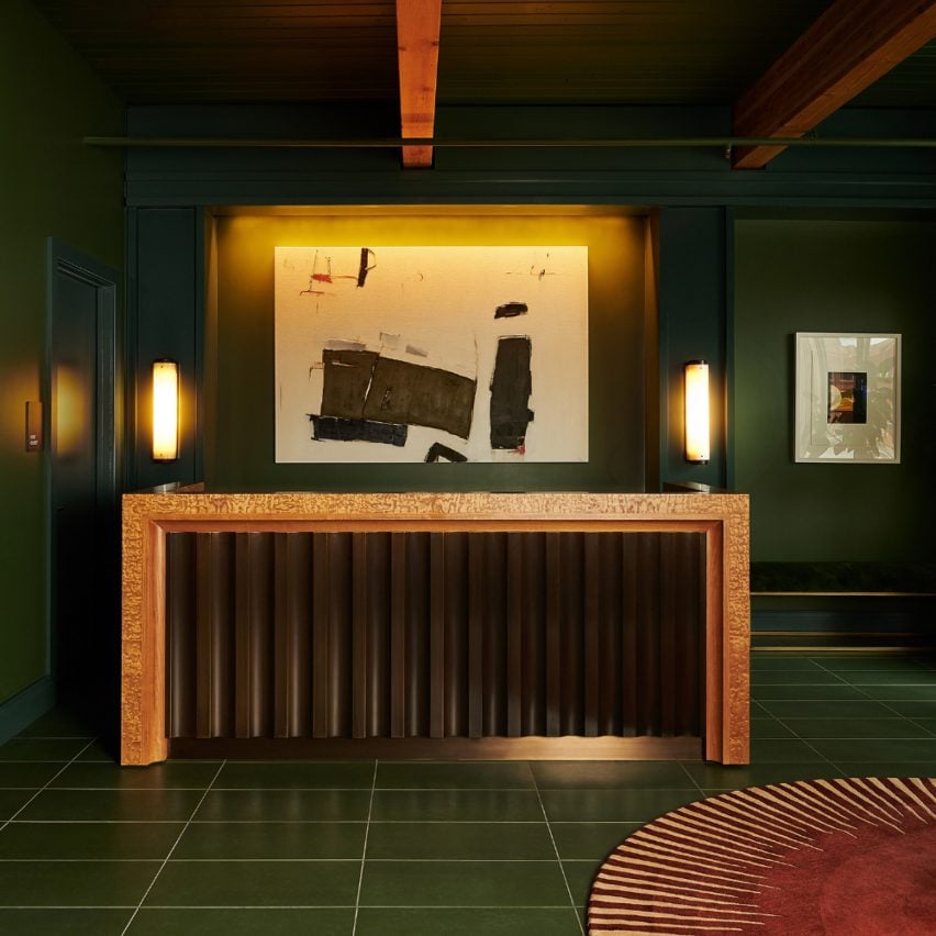
Chief Chicago by AvroKO
Chief Chicago is a modern pied-à-terre intended to serve as a third space for women to find supportive connection and empowerment.
The interior features a mix of design-forward and vintage furniture pieces, while the expression of the existing architectural wood beam structure is celebrated with workshop detailing in millwork and cabinetry details.
Art features emphasise the workshop atmosphere, with bold canvasses laid out in the space as if in mid-process.
The judges said that "the language of design, supported by choice of colours, compositions and material truly empowers."
Small workspace interior of the year:
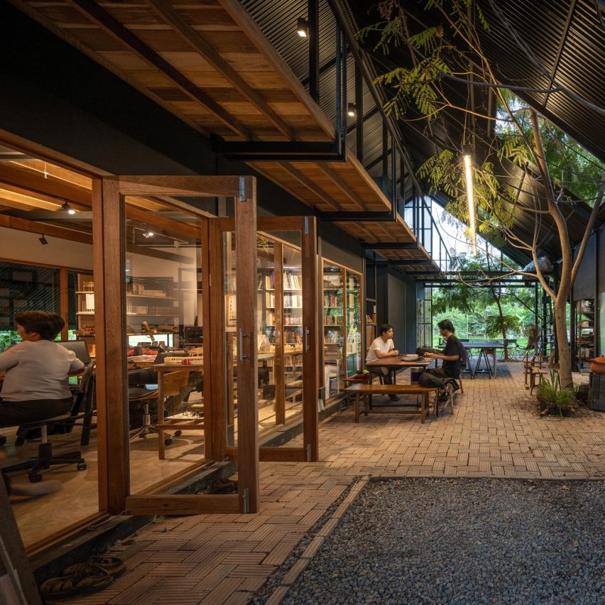
Sher Maker Studio by Sher Maker
Sher Maker designed its own working space to accommodate its multidisciplinary architecture and design practice.
A studio from Chiang Mai, Thailand, Sher Maker's work is orientated around local technology and materials. Its studio space was designed on a vacant lot and features a gable roof and a wood and steel frame structure.
The aim was to blend interior and exterior, as well as work and play, and create an inspiring space to occupy whilst working on other projects.
"This is a workspace people dream about since Covid," said the judges on the interiors master jury. "It is ideal, in the countryside, open with nature inside and outside. It is an inside and outside space with a very simple structure. It creates a beautifully simple shared space. The studio has reinvented something simple in an elegant way."
Large retail interior of the year:
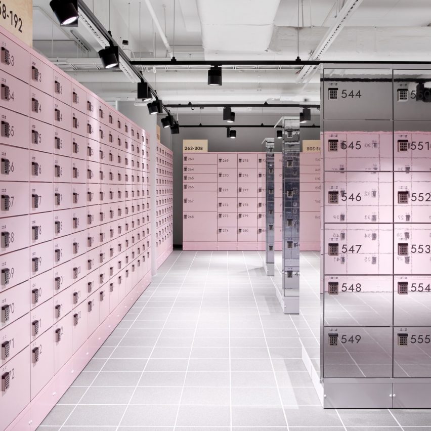
Box by Posti by Fyra
Box by Posti is an online order collection point in Helsinki, Finland, that lets buyers try on their online purchases.
The space includes a section for online retailers to showcase their latest products, a seating area where visitors can grab a coffee, an unboxing area, changing rooms, and kiosks where return shipping for packages can be arranged and paid for.
The jury's recommendation read: "This is a timely concept with a distinctive colour and material palette that is beautifully coordinated to make a highly functional yet enticing series of spaces. A deserving case study addressing psychology of design to adaptive consumer behaviour."
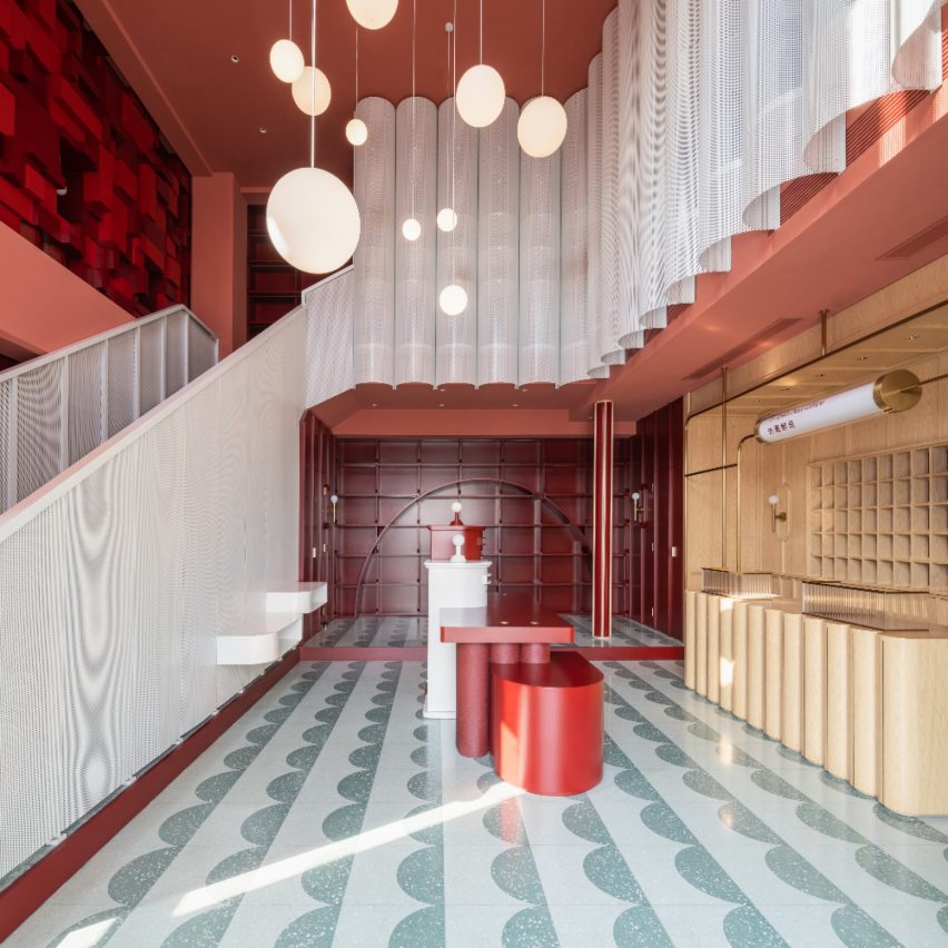
Small retail interior of the year:
Bund Post Office and Shop by Yatofu Creatives
Yatofu Creatives has designed this post office in Ningbo's Bund, Waitan, China. The project is the first of its kind in the province.
In establishing a new location on the banks of the Yongjiang River, the Bund Post Office sought to revive post offices' former significance and re-establish their role as the centre of the community.
The new premise needed to evoke a sense of nostalgia and at the same time provoke the boundaries of what is traditionally associated with the concept of the post office.
The judges said: "The design has so many different shapes and patterns but is impressively put together. The space is playful, engaging and beautifully done. There is incredible attention to detail and the overall effect is quite sweet."
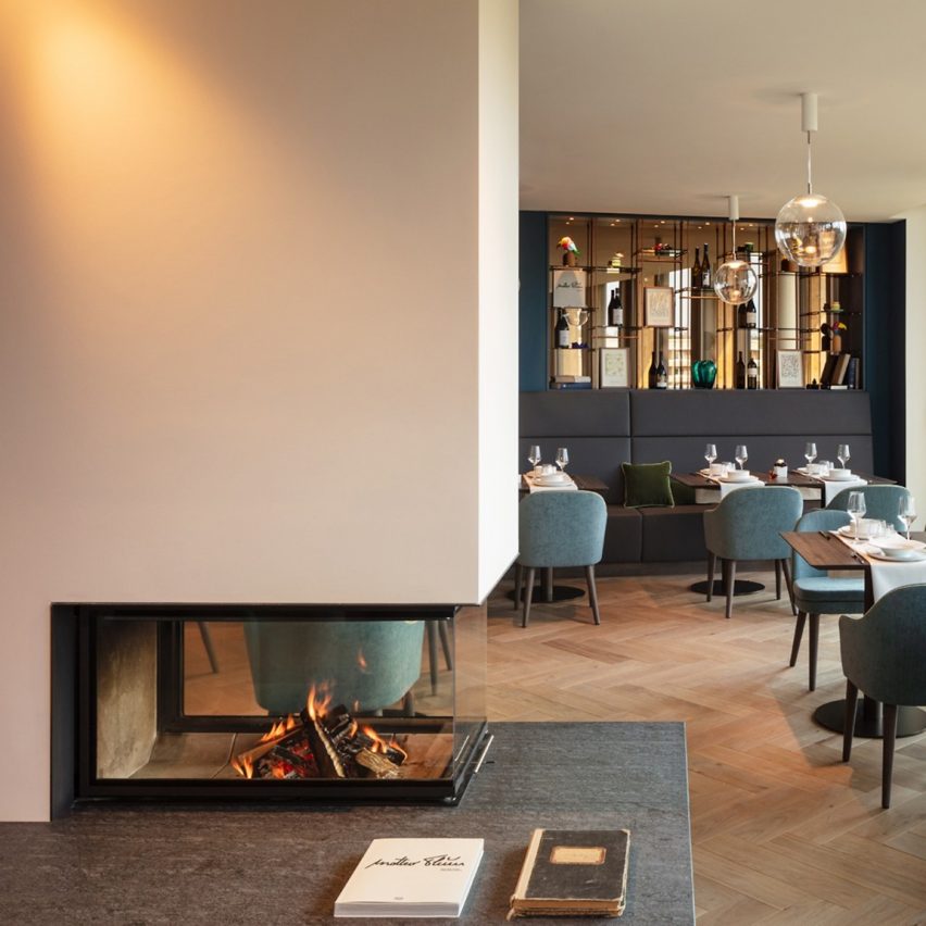
Leisure and wellness interior of the year:
Waldkliniken Eisenberg by HDR and Matteo Thun
HDR Germany, in collaboration with architecture firm Matteo Thun, planned and implemented the new construction of the Waldkliniken "Forest Clinic" in Eisenberg.
The aim of the project was to create a clinic campus with a consistent design for patients, employees, and visitors in terms of design, concept and functionality.
"This project felt warmer than the others, not so clinical," said the judges. "This is a sensitive and considered design for purpose and location. The connection with the surrounding forest is clearly apparent with all the benefits this brings."
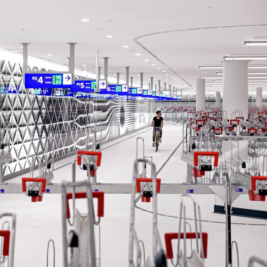
Civic and cultural interior of the year:
Bicycle parking garage The Hague by Silo
One of the world's largest underground bicycle parking garages has been built in front of The Hague Central Station in the Netherlands.
The unconventional design concept transforms parking your bike into a museum-like experience. It aims to enhance comfort and safety for thousands of daily users while promoting cycling as a healthy and sustainable way of life.
"The studio has taken bicycle parking to a different level," the jury said. "This is a very brave design that jumps out. This space gives off a lot of attitude in an unexpected location. This is an impactful proposal with great infrastructure benefits and mobility. The clean and dynamic graphics enhance user experience and attractive interaction."
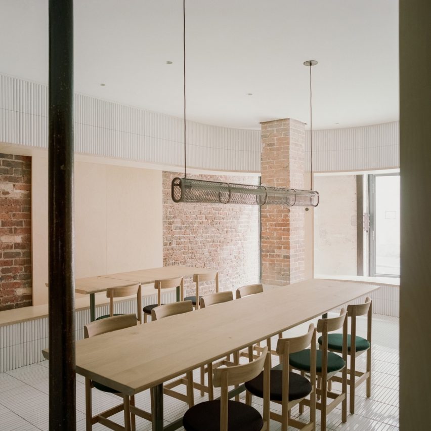
Small interior of the year:
The Arena-Papi by Neri&Hu
Located on the ground floor of a typical late 19th-century Haussmann building in Paris, Neri&Hu's design concept celebrates the layered material heritage that narrates Parisian history.
During the dismantling phase, the existing site was treated carefully; by stripping back the strata of finishes that have built up through the decades, the beauty of the bare materials is revealed. Each fragment represents a different period in Paris' history.
The judges said: "The restaurant has an unexpected and brave facade. The design is so effortless and is a beautiful combination of old and new, considering the beauty in the aged elements. There is an innovative use of the space adding the curves and flow of direction. Every single detail and material is carefully integrated with the existing elements."

