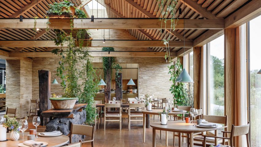
Ten texture-heavy restaurant interiors filled with natural materials
Rough clay walls, river-stone flooring and a seating topography formed from OSB panels feature in our latest lookbook, which rounds up 10 restaurant interiors that bring in natural elements.
Although defined by a reverence for their local context, the projects included hail from all over the world, ranging from a healthy fast food eatery in Ukraine to a cave-like Japanese BBQ joint and the BIG-designed, three-Michelin-starred Noma in Copenhagen.
This is the latest roundup in our Dezeen Lookbook series providing visual inspiration for the home. Previous articles in the series showcased homely office interiors that are good enough to live in, as well as homes with striking fireplaces, domestic gyms and cross-laminated interiors.
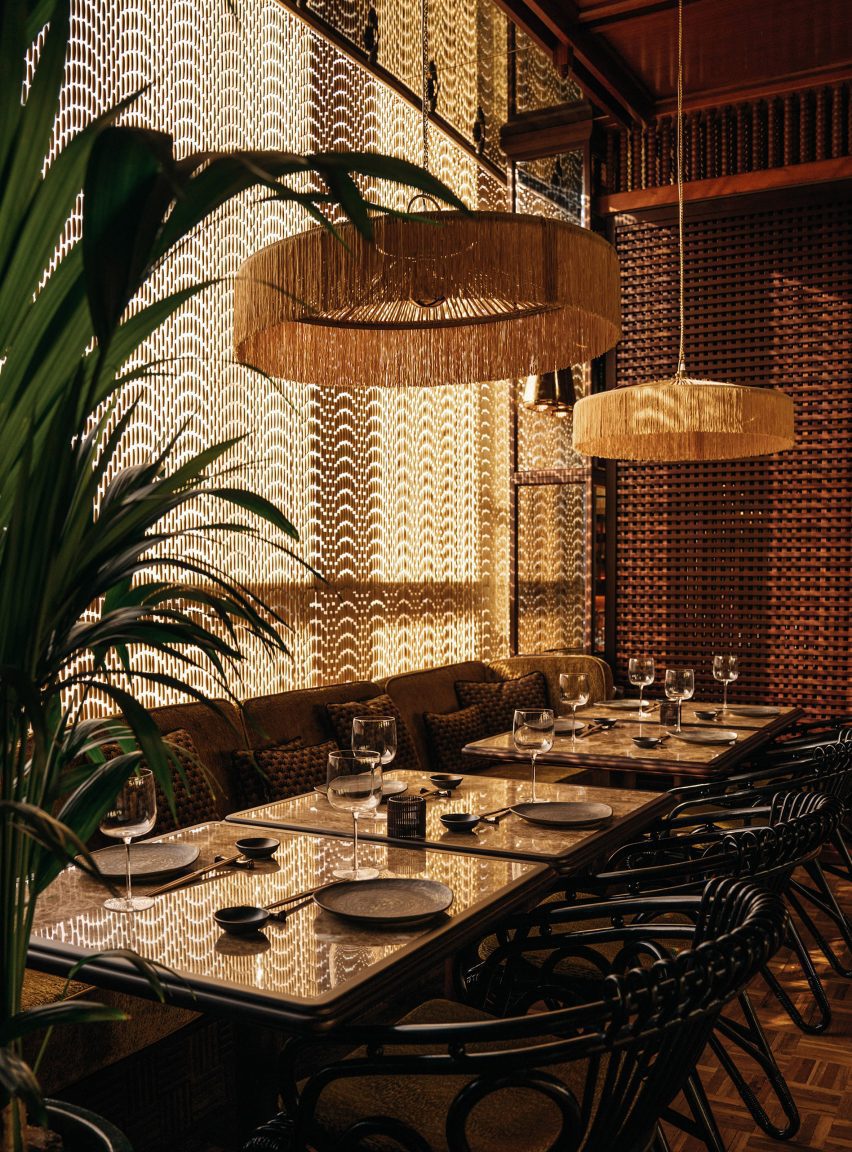
Mimi Kakushi, United Arab Emirates, by Pirajean Lees
Lattice screens, rattan chairs and wooden bead curtains come together to recreate the old-school glamour of Japan's jazz age in this Dubai sushi restaurant, which is housed inside a former nightclub.
All of the eatery's electrical and mechanical equipment, as well as the ventilation system, is hidden behind a straw ceiling grid to create a "residential feel" within the commercial space.
Read more about Mimi Kakushi on Dezeen ›
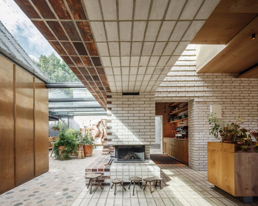
Noma 2.0, Denmark, by BIG and Studio David Thulstrup
When it came to designing a new location for Noma – named the world's best restaurant on five separate occasions – BIG and Studio David Thulstrup drew on a local material palette to mirror the eatery's foraged, seasonal menu.
River stones were used to form terrazzo flooring while a 200-year-old blackened timber beam was repurposed as a central counter and seaweed sourced from the seas around the Danish capital was turned into lampshades in collaboration with designer Jonas Edvard.
Read more about Noma 2.0 on Dezeen ›
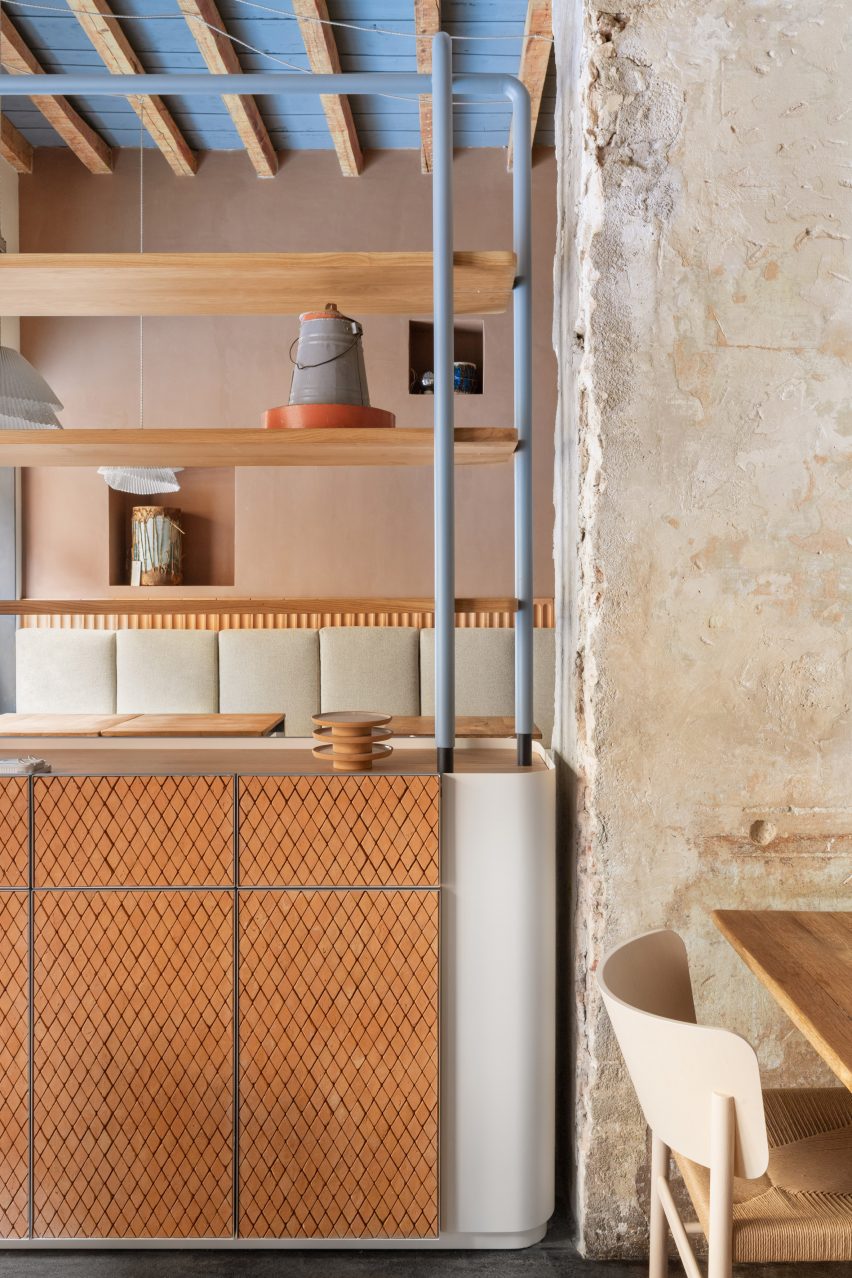
28 Posti, Italy, by Cristina Celestino
Pops of powder-blue are applied to shelving, table legs and the gaps between exposed wooden ceiling beams in this Milanese restaurant to keep its neutral-toned interior from looking too beige.
Italian designer Cristina Celestino, who was responsible for renovating the space, preserved a crumbling brick wall at the centre of the space but clad the remaining surfaces, as well as a few cupboard doors, in rustic terracotta tiles.
Read more about 28 Posti on Dezeen ›
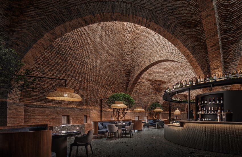
50% Cloud Artists Lounge, China, by Cheng Chung Design
Cheng Chung Design kept the interior of this restaurant in China's Kaleidoscope art museum deliberately simplistic in order to keep attention on the building's cavernous brick walls, which rise up to resemble giant termite mounds when seen from the outside.
Since the shadowplay created by the light and the earthenware bricks should take the main focus, the seating booths are rendered in dark wood and illuminated by simple woven straw shades, with trees interspersed throughout the dining area.
Read more about 50% Cloud Artists Lounge on Dezeen ›
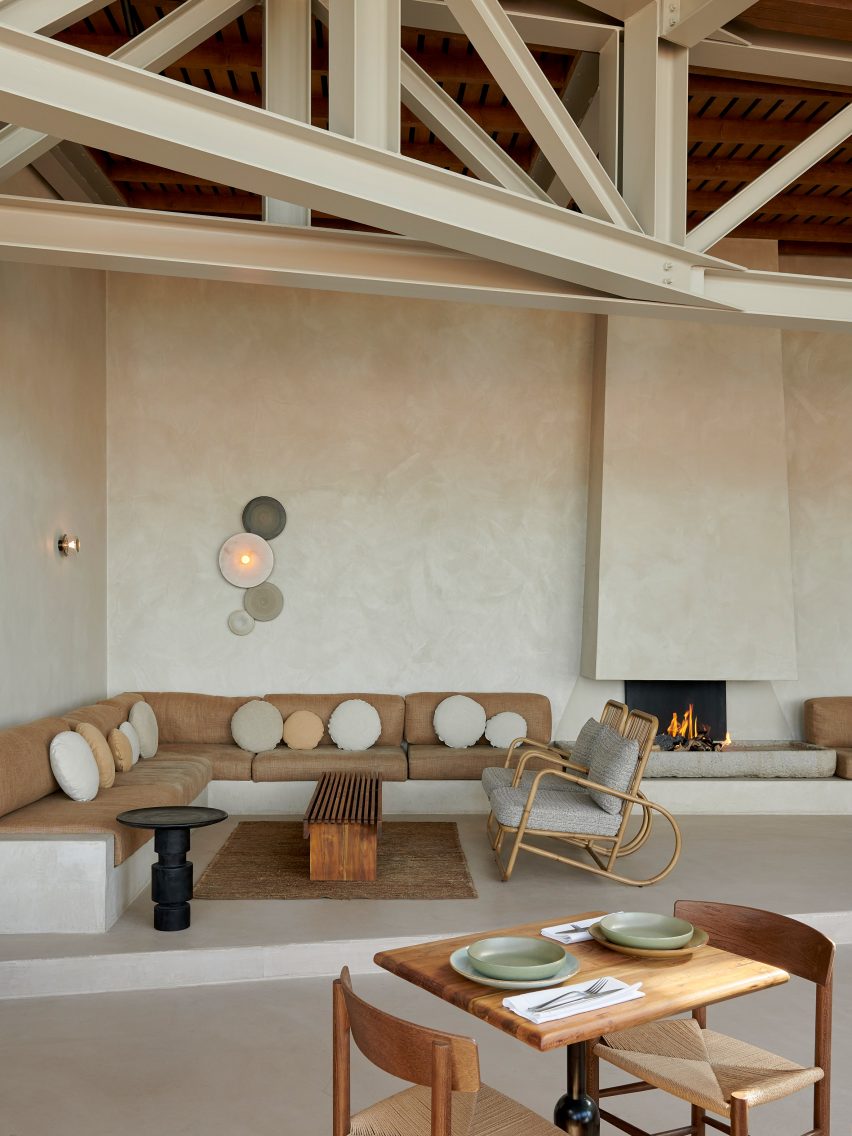
De Republiek, Netherlands, by Anne Claus Interiors
To bring a sense of warmth to this beachside restaurant near Amsterdam, local interior designer Anne Claus finished the walls in a bespoke sandy-hued plaster and brought in furnishings with an earthy palette and tactility.
Stacks of paper lanterns are arranged into theatrical hanging sculptures over some of the seating areas, which see cane armchairs are paired with low-slung bench seating, upholstered in taupe, ochre and nutmeg-coloured linen.
Read more about De Republiek on Dezeen ›
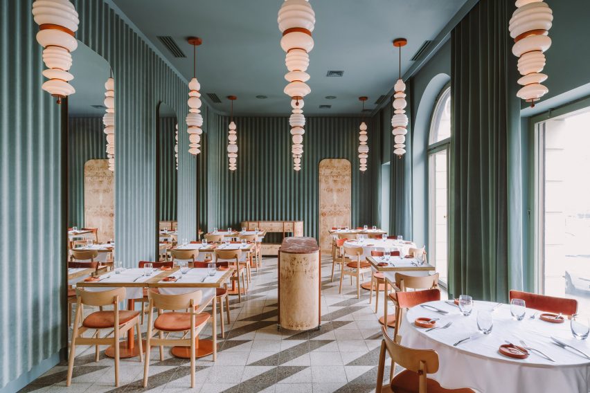
Opasly Tom, Poland, by Buck Studio
The distinctive marbled texture of burl wood, which is created when a tree's grain develops in multiple different directions as a result of environmental stressors, forms a defining feature throughout this eatery in Warsaw.
Applied to everything from cabinets to walls, doors and serving trolleys, it balances out the otherwise cool-toned interior, working in tandem with the simple wooden seating and red marble accents.
Read more about Opasly Tom on Dezeen ›
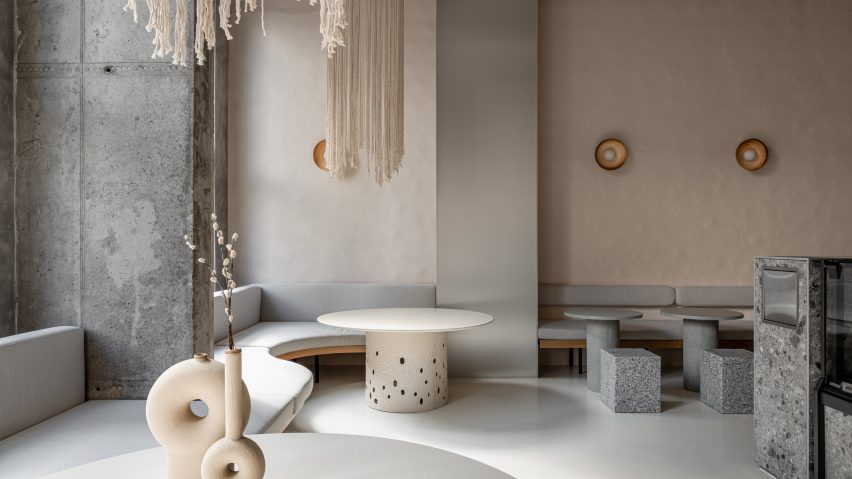
Istetyka, Ukraine, by Yakusha Design
Many of the furniture pieces and objects used to decorate the healthy fast food joint Istetyka in Kyiv were handmade by local artisans, including the dangling macrame lamps designed by Victoriya Yakusha for her brand Faina.
These are offset against bumpy clay walls and textured tables made from a ztista, a sustainable material developed by Yakusha that combines staw, wood chips, recycled paper and clay.
Read more about Istetyka on Dezeen ›
Nikunotoriko, Japan, by Ryoji Iedokoro
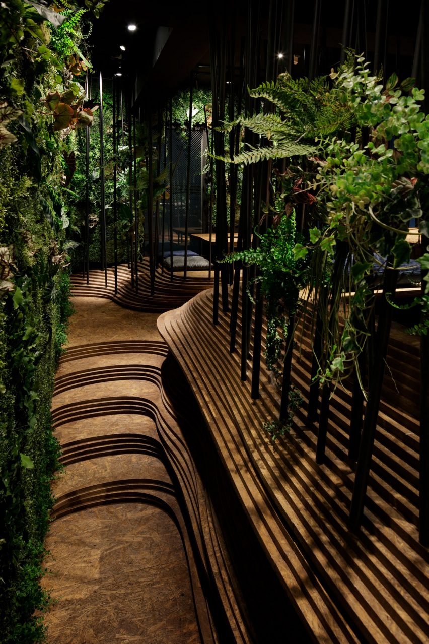
Undulating panels of oriented strand board (OSB) are staggered on top of each other to create an organic seating topography on the second floor of this Japanese BBQ restaurant in Tokyo's Roppongi district.
Meanwhile, the ground floor is designed to resemble a natural cave system with craggy, stone-effect walls and translucent herringbone flooring tiles that create the impression of walking on water.
Read more about Nikunotoriko on Dezeen ›
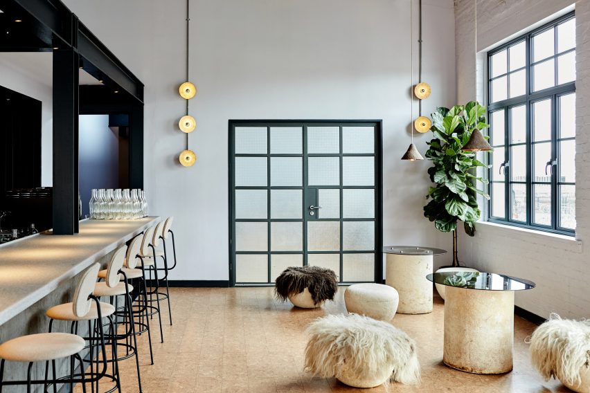
To match the sustainable ethos of zero-waste restaurant Silo, Nina+Co incorporated natural materials such as cork and ashwood into the interior while mushroom mycelium was used to form a small, informal seating area near the entrance.
Other details include recycled plastic tabletops and wall lights made from glass wine bottles that were melted down after being drunk during the restaurant's previous dinner services.
Read more about Silo on Dezeen ›
Abstinence, France, by Lizée-Hugot
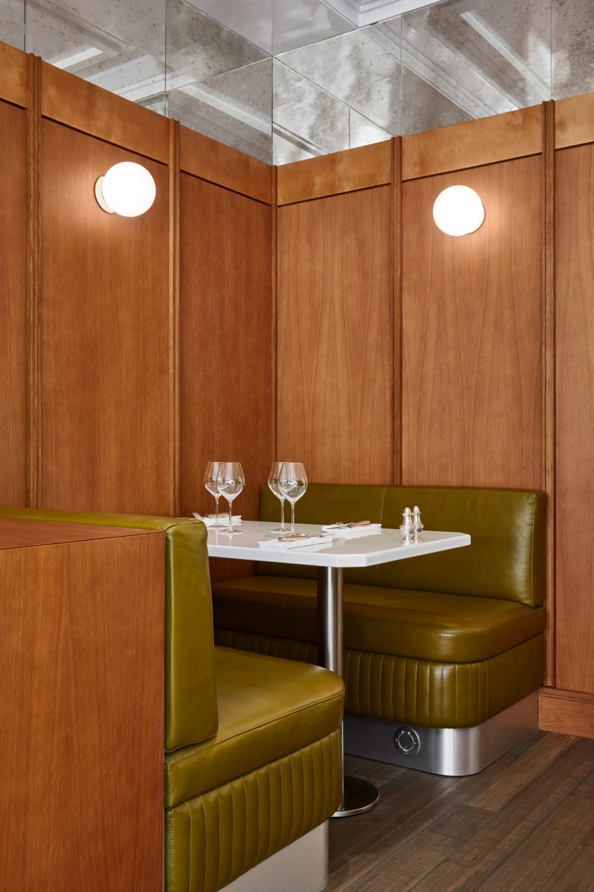
Studio Lizée-Hugot paid homage to the classic Parisian brasserie in its design for Abstinence, incorporating wall-to-wall wood panelling alongside cognac leather seating and enamelled lava stone tabletops.
This is paired with birdseye maple and tubular steel detailing to create the feeling of travelling back in time to the 1970s.
Read more about Abstinence on Dezeen ›
This is the latest in our series of lookbooks providing curated visual inspiration from Dezeen's image archive. For more inspiration see previous lookbooks showcasing homely office interiors, striking fireplaces and domestic gyms.