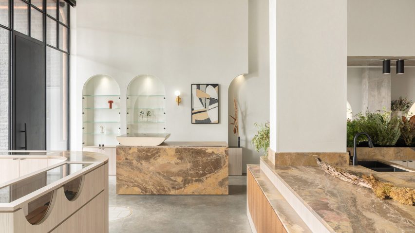
A floristry counter brimming over with flowers and foliage sits at the centre of this Vancouver lifestyle shop, which has been designed by studio Ste Marie.
Nestled along a parade of shops in Vancouver's South Cambie neighbourhood, Cadine sells a selection of high-end homeware, books, clothing and fine jewellery, as well as fresh floral bouquets.
Cadine's headquarters is located a short drive away in the city's Southlands area, occupying a 1920s farmhouse that looks out across the garden where the brand's flowers are harvested.
This verdant setting ended up being a key point of inspiration for Ste Marie's design of the store's interior.
The focal point of the store is a floristry counter that's meant to showcase the "beautiful chaos" of flower arranging. One side of the counter – which is crafted from beige leathered granite – features a planter that's spilling over with flowers and lush foliage.
The other side includes a sink, but has otherwise been left clear so that staff have enough space to prep, organise and wrap bouquet orders.
Whilst Ste Marie knew that creating floral arrangements is often messy work, the studio was reluctant to hide away the counter at the back of the store.
"We wanted to acknowledge the duality of living materials, as both beautiful and at times, unruly, all while delivering a visual and sensorial experience for the guest," explained the studio.
Surrounding surfaces have been punctuated with a series of arched alcoves, their shape intended to resemble "the delicate curve of a frond that sways in the wind".
Some of the alcoves have rows of glass shelves, while others have been inlaid with mirrors or fitted with black rails from which garments can be hung.
Alternatively, items can be displayed on timber storage units with glass-topped ledges that Ste Marie had custom-made for the store.
One of the larger units that wraps around a structural column has been inbuilt with a cushioned bench where customers can sit and relax.
The rest of the store has been kept understated with concrete floors, brass lighting sconces and white-painted walls, which were sanded down to create a slightly textured surface finish.
"The design intent was approachable luxury… both subtle and thoughtful, there is an inviting and effortless feel when you enter, yet the space is intentionally curated and focused, delivering a seamless guest experience," the studio concluded.
Ste Marie's Cadine was one of five projects that was shortlisted in the small retail interior category of this year's Dezeen Awards.
The category was ultimately won by a post office in Zhejiang, China designed by studio Yatofu. Decked out in festive hues of red, white and green, the striking post office also incorporates a gift shop and a community events space.
Photography is by Conrad Brown, styling by Kate Richard.

