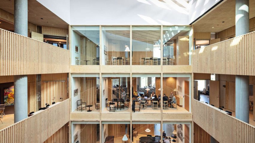
Wood-lined meeting areas that imitate the living room of a house are intended to create a sense of "hyggeligt" or coziness in this office building in Copenhagen, designed by Danish practice Henning Larsen.
Described as "A Home for Housing", the 7,400-square-metre office was completed for KAB, Denmark's largest administrator of non-profit housing which manages over 64,000 housing units across its capital city.
In addition to being an office for KAB, the building is a gathering place for 44 housing groups and some 120,000 residents, designed by Henning Larsen to be "representative of Denmark's approach to collectivism, welfare, and the home itself."
This informed the concept of the design, which was based on applying the traditional spaces of the home, such as the living room, kitchen, staircase and garden, to an office building.
"We were interested in the play between the office and the home – the two places in which we spend the majority of our daily lives – and how we could infuse the headquarters with the best of both worlds," said Signe Kongebro, global design director and partner at Henning Larsen.
The office is organised around a skylit, wood-lined atrium, with a large reception desk and office canteen sitting among large potted trees.
A wooden staircase at the centre of this atrium crosses back and forth up the six-storey building to connect to communal kitchen landings on each floor.
"The stairs are a play on the classic stairwell of residential buildings, which is typically the place you meet your neighbour," said associate design director Troels Dam Madsen.
Smaller meeting spaces look out onto this atrium, and to the west a grid of windows frames a series of rooms designed to resemble the interiors of a house, giving the impression of looking into the windows of an apartment block.
Floor lamps, paintings on the walls and more domestic-feeling furniture have all been used to create a feeling of homeliness in these spaces, with wooden wall finishes used throughout to give a "scent and texture not often associated with the workplace."
"When you peek into the windows of the meeting rooms from the stairs, you are observing a household at work," the practice said.
Around the perimeter of each floor is a ring of more traditional office areas, finished with exposed ducting and concrete and wooden dividers with built-in shelving.
At the top of the building is a rooftop garden for both visitors and employees, providing contrasting views in every direction of the building's crossroads site, including views of an adjacent railway.
The exterior of the office, treated with a robust finish of textured redbrick, was designed to have "no front or back", with each side featuring many thin windows and openings onto the surrounding garden spaces designed by landscape firm SLA.
Other offices that have looked to domestic interiors for inspiration include Polish architect Mateusz Baumiller's conversion of a military warehouse into an office for three production companies.
The photography is by Laura Stamer unless stated.

