6a Architects adds "glowing etched lantern" to community centre in Bloomsbury
UK studio 6a Architects has extended a gymnasium and multigenerational community centre in Bloomsbury, London, into a block called Holborn House with a facade designed by artist Caragh Thuring.
Created for the Holborn Community Association (HCA), the new structure extends an existing basement gym with a bright two-storey space that provides additional community spaces and greater street presence for the organistaion.
"HCA has an extraordinary 100-year-old history," said 6a Architects director Stephanie Macdonald.
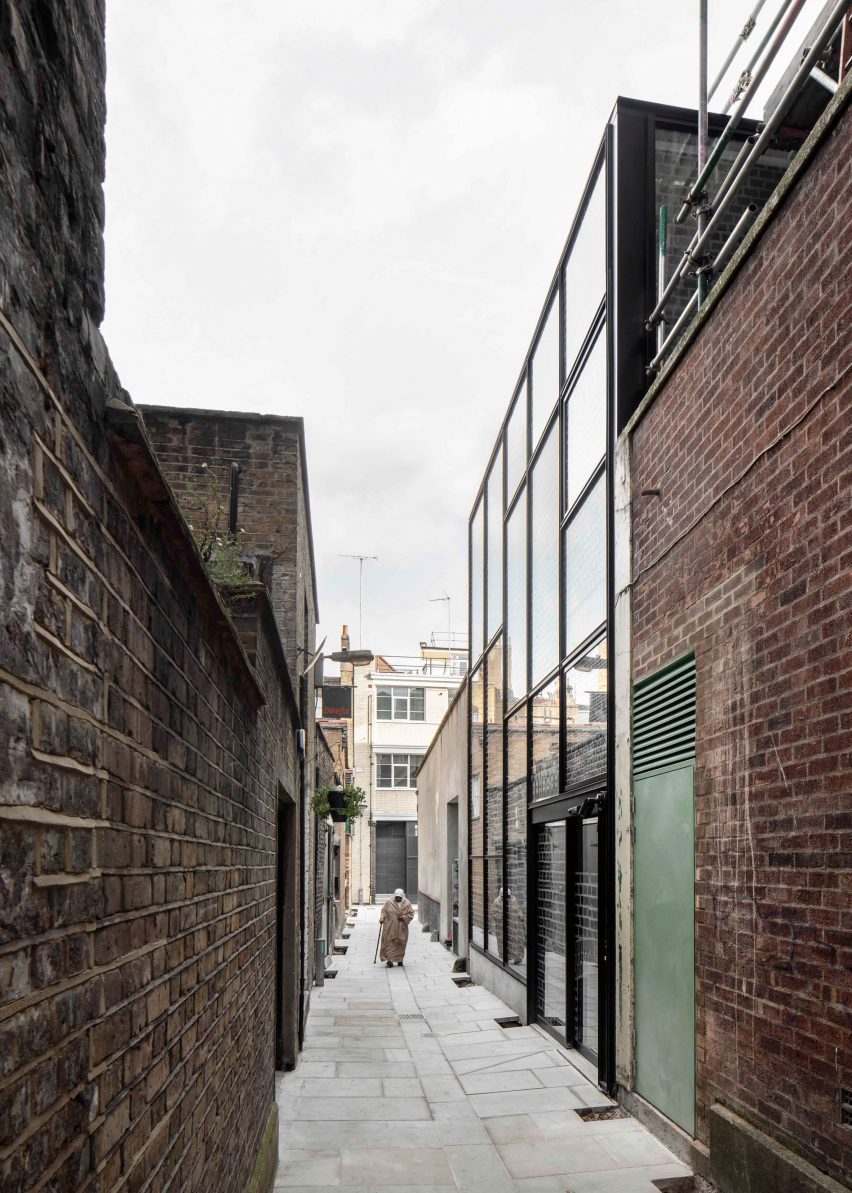
"The club was a much-loved, word-of-mouth resource but invisible outside of the people who used it, hidden away in its basement gym off a narrow and unloved alleyway," she told Dezeen.
"Our mission was for the new Holborn House to bring this quietly brilliant neighbourhood organisation into the public realm. It is visible for the first time, identifiable as an important and central part of the neighbourhood."
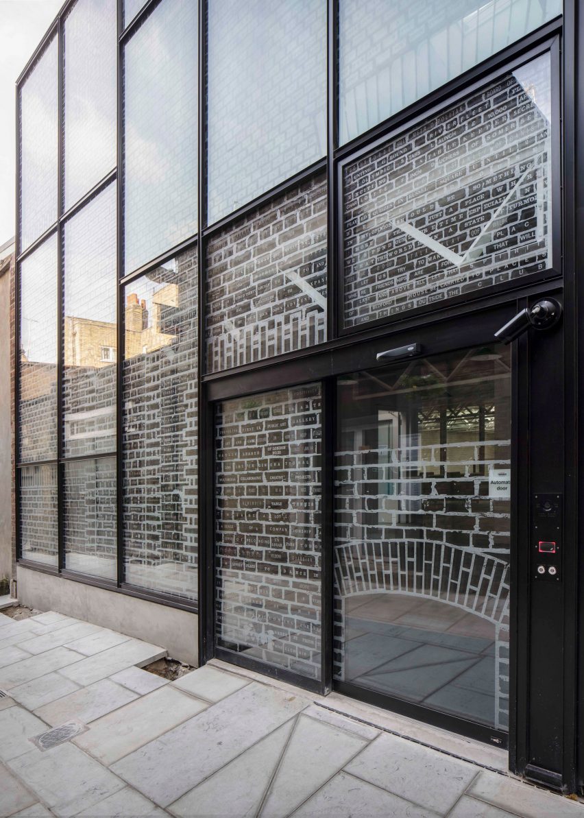
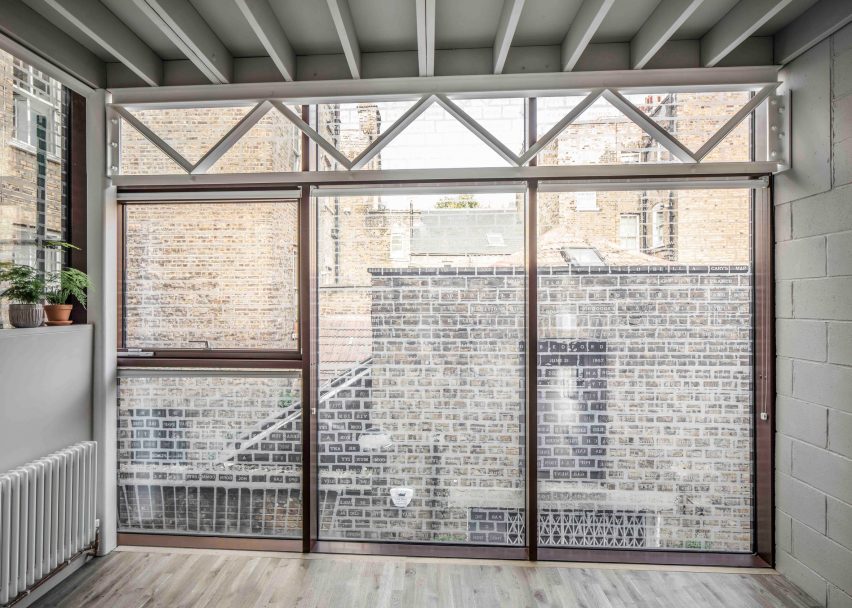
Responding to the narrow site, 6a Architects opened up the building's frontage with a glass facade that reveals the exposed, steel and blockwork structure within, and reflects the brickwork opposite.
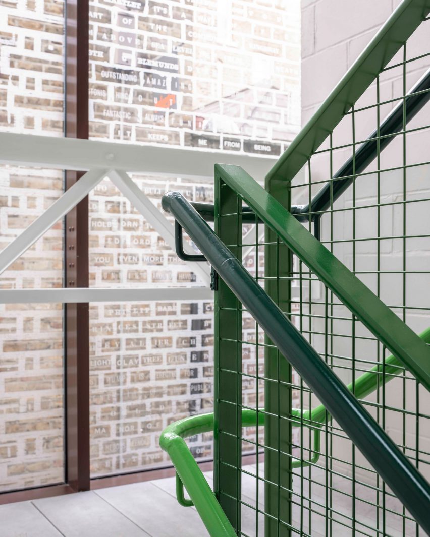
Etched onto the surface of this facade is a work by Thuring called Great Things Lie Ahead. It is comprised of a brick mortar line pattern filled with fragments of text drawn from stories and materials in HCA's archives.
"The facade evolved into a sort of glowing etched lantern, airy and transparent," said Thuring.
"Emerald Street is such a narrow alleyway that you can't step back to look at the building, so it became a sort of breathing physical entity rather than a flat surface with an image on it."
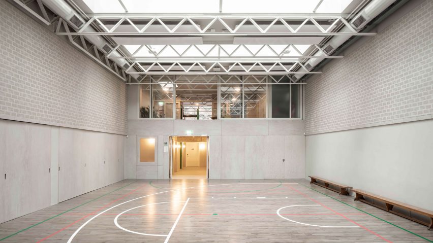
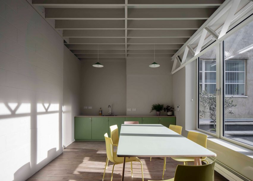
Behind this facade, the new two-storey structure contains studios, clubrooms, workspaces and a kitchen as well as changing rooms for the basement gymnasium.
All of the spaces have been designed with flexibility in mind, suitable "for a wedding as much as for two-year-olds soft play or a bunch of teenagers dancing or pensioners doing yoga," explained Macdonald.
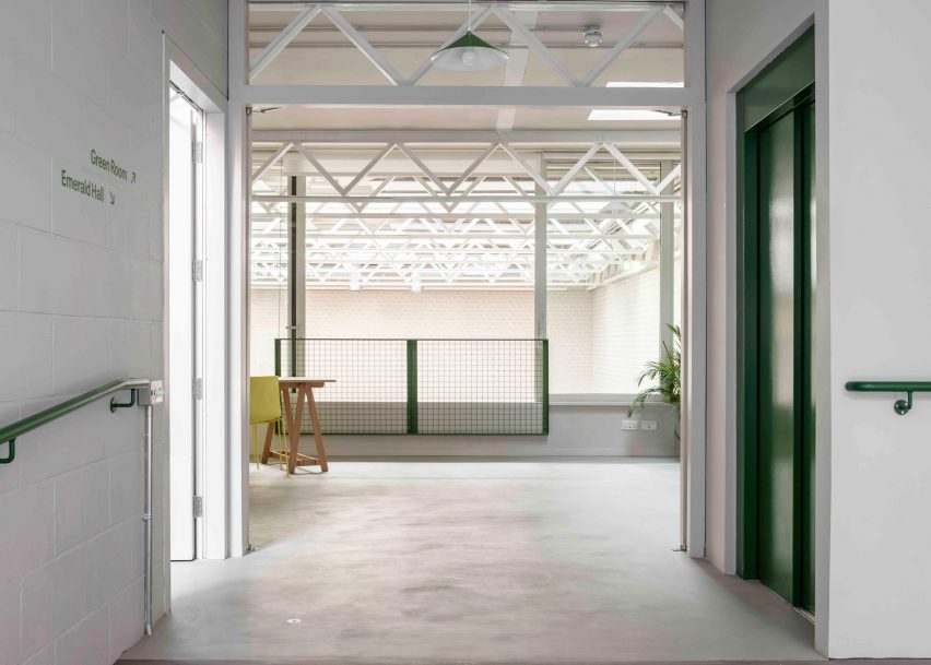
An area of the existing concrete ground slab was cut to insert an entrance ramp, and a new lift was inserted into the structure to make all of its floors fully accessible.
Focusing on creating a sense of "material legibility and spatial construction", the new spaces were constructed using white steel ceiling trusses and white-painted blockwork.
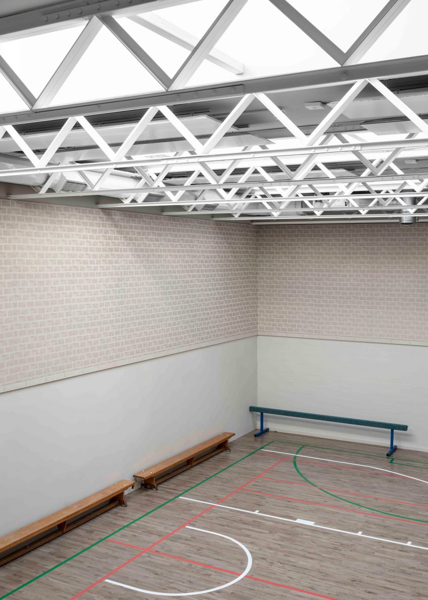
"Material choices are a mix of practicality and transparent – what can be easily constructed and transported down a narrow Georgian alleyway," Macdonald told Dezeen.
"It was important to leave the structure visible, as it is simply constructed and understandable to children to see how materials stack onto each other to make the spaces," she continued.
In the gym, a "lantern-like" roof of trusses and skylights sits above a frieze of fabric designed by Thuring that wraps around the space, woven with a brickwork pattern.
The colour scheme, also developed by Thurning, ties together the building, with the green colour used to highlight the staircase, lift doors and railings informed by Holborn's history as a forest.
To further increase the visibility of the building on the narrow site, planters and a tree have been added outside creating a space for visitors to meet as well as gaze up at the glass facade.
6a Architects was founded by Stephanie Macdonald and Tom Emerson in 2001.
Other recently completed projects include the revamp of a coastal house in Devon and a geometric silver extension to the MK Gallery in Milton Keynes.
The Photography is by Johan Dehlin.