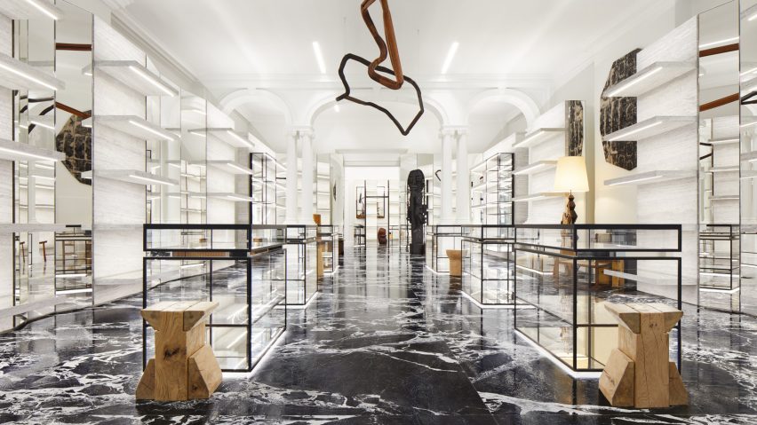
Hedi Slimane uses "French elegance" to define Celine store in London
Celine creative director Hedi Slimane has opened a flagship store in London for the French fashion house, which balances historic Edwardian features and a gallery-style aesthetic.
Located within a Grade II-listed Edwardian building on New Bond Street – a luxury shopping destination in the city's West End – the new flagship store has a floor area of 466 square metres dedicated to men's and women's accessories, ready-to-wear and fragrance collections.
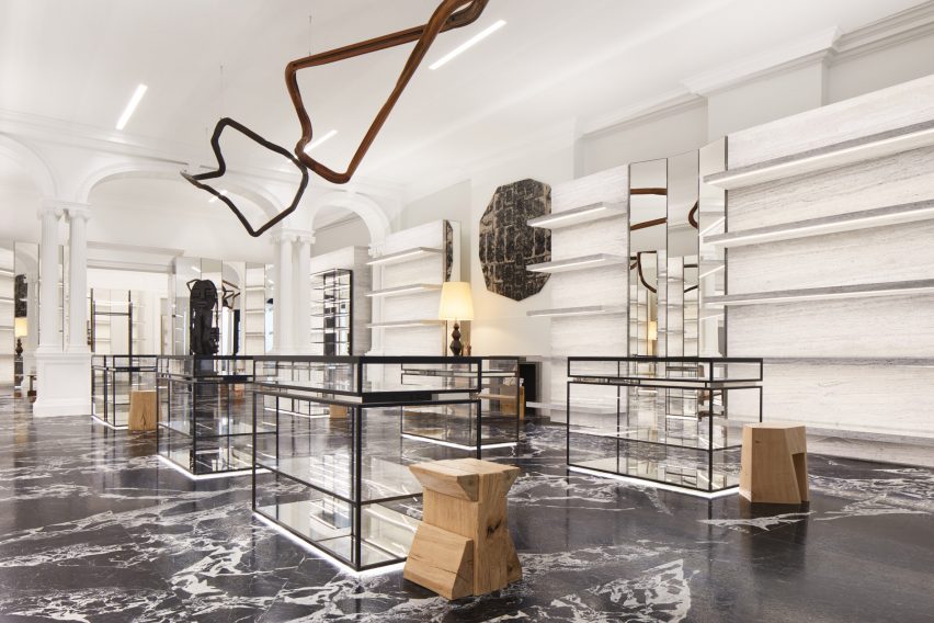
The ground floor houses women's ready-to-wear, accessories, fragrances and homeware collections, and is enswathed in metres of marble and stone.
"The ground floor is devoted to women and articulated around the idea of French elegance and vintage sensibilities," said the team at Celine.
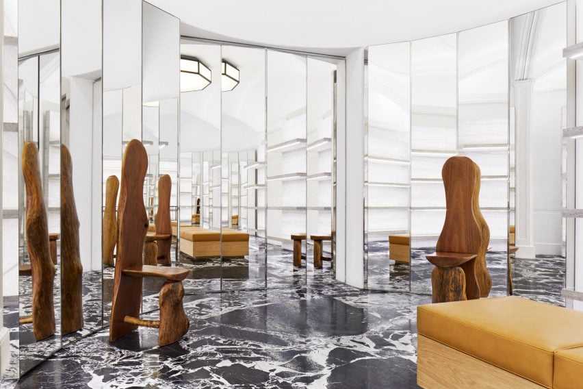
Folding mirrored screens, glass display cases and vintage furniture are organised throughout the store in a highly symmetrical arrangement.
Cabinetry and shelving rigidly line the walls along its length, mirroring the classical symmetry of the original Edwardian arches, columns and mouldings.
Art pieces by Leilah Babirye and Nika Neelova are suspended from the ceiling, placed between mirrored screens and positioned at the feet of cabinetry. These artworks gently break the store's rule of symmetry while adding natural and earthy hues, textures and forms against the largely grayscale interior.
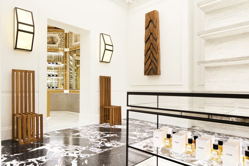
A salon-style octagonal space at the rear of the ground floor houses Celine fragrances and homeware, surrounded by walls adorned with golden baroque-style panels that echo the decorated jewellery boxes.
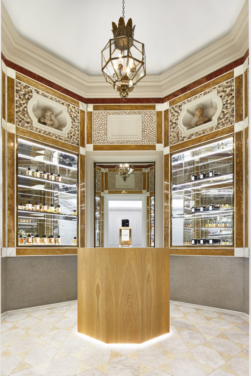
"It is an intimate space, somewhere between a 'cabinet de curiosités' and a jewellery box," said Celine.
Antique marble covers the floor, providing a depth of contrast in the colour and tone. The shelves, racks, fitting rooms and other elements unhook from the existing moulded walls and float in space."
Another pill-shaped room used as a shoe hall is similarly filled with folding mirrored screens. These endlessly reflect slivers of marble, oak, steel and granite, as well as sculptural art pieces by Anne Libby and Lukas Geronimas.
The basement plays host to the men's ready-to-wear and accessories collections, and contrasts the classical language of the upper floor – a nod to Slimane's introduction of a men's line to the 77-year-old women's fashion brand.
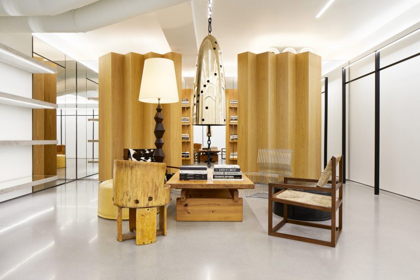
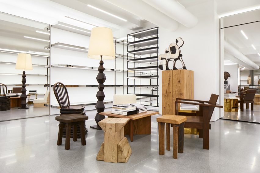
This space boasts a white cube gallery-style look, and is populated with mismatched furniture and sculptural artworks atop a vast concrete floor.
Pieces by artists Davina Semo and Mel Kendrick are suspended above the furniture, while large square mirrors are set into the walls between rows of floating shelves. Decor includes piles of books by famed architects, artists and designers.
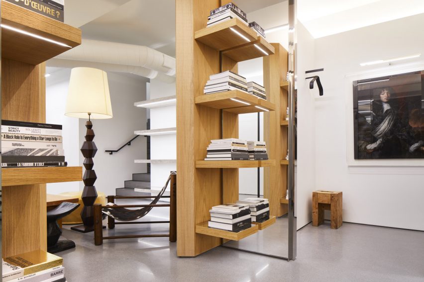
A large wooden screen conceals a library that doubles as the basement's fitting rooms. In one of the two rooms, between stacks of books, a 17th-century classical oil portrait hangs on the wall.
Overall, the store's modernist yet classical aesthetic speaks to the neo-bourgeois vocabulary that Slimane has developed for Celine since replacing Phoebe Philo as creative director in 2018.
After Slimane's appointment, the former head of Saint Laurent and Dior Homme dropped the accent from Celine's 'E' to evoke a more simplified and balanced proportion to its logo, and also speak to the Celine collections of the 1960s.
In 2019 Slimane developed a new visual identity for the stores of Celine, overhauling its New York, Paris, Tokyo and LA locations with marble, steel and mirrored interiors.