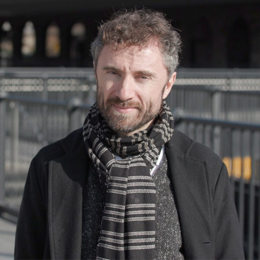
"We all need places that trigger a response" says Thomas Heatherwick
With Thomas Heatherwick's controversial 1,000 Trees project recently opening in Shanghai, the British designer told Dezeen why he believes the top of structural columns is "the best possible place" to plant trees in this exclusive interview.
Heatherwick designed the project to be a distinctive shopping centre that he hopes will become the "heart of a district that had no heart before."
"Typically, big building projects like these are big, sterile blocks," Heatherwick told Dezeen.
"Mixed developments with shopping and restaurants can weirdly sterilise places in spirit. We didn't want to be the people that built a big cheesy wall next to the main art district."
By covering the building in trees, Heatherwick aimed to both "humanise" the project and add environmental benefits in a way that the designer claims is preferable to "heavy" green roofs.
Nature "affordable way" to make complex facades
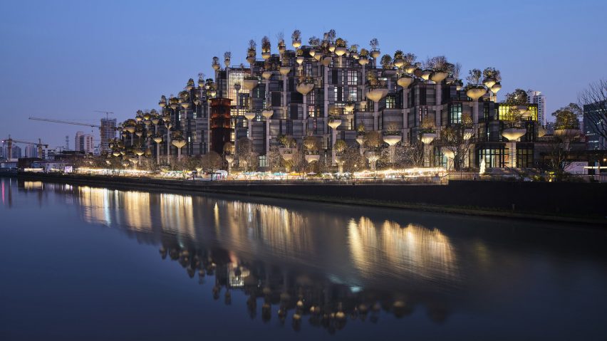
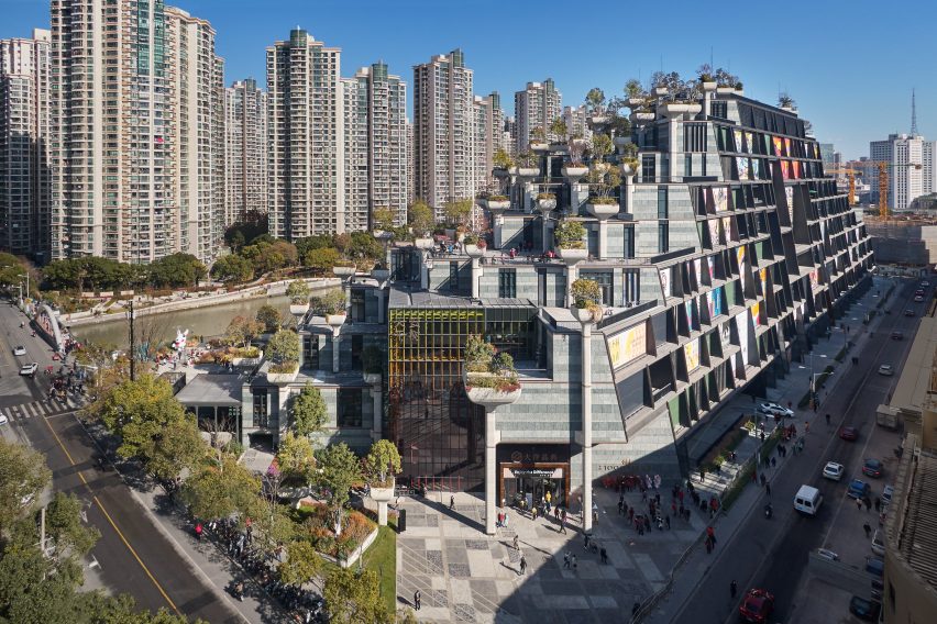
As the name suggests, the shopping centre is covered in 1,000 trees and 250,000 plants supported in large planters that sit at the top of the building's structural columns.
According to Heatherwick, this planting has many environmental benefits, but also contributes to breaking down the scale of the large building.

"The integration of plants was in response to the scale," said Heatherwick.
"How can you affordably build in the complexity that your eye needs to have variety and human scale rather than monolithic imposition in every way," he continued.
"So every part of the project, we've looked at how we can break that down. To me, integrating nature is a very affordable way to get complexity and movement into the facade."
Green roofs have "little actual contribution" to architecture
Although a simple green roof may give similar environmental benefits, Heatherwick argues that the trees on this project add to the overall architectural impact.
"There's a tendency to think greenery is only for environmental reasons in terms of greenhouse gas emissions – and those are benefits – but a big part of the reason in this project is the emotional engagement, to humanise it," said Heatherwick.
"A sedum roof, or something like that, has little actual contribution to the larger architecture that we all experience."

Heathterwick also argues that placing the trees at the top of the columns is a logical structural decision due to their weight and the weight of the soil required for planting.
"If you look at buildings with wholehearted green roofs, the challenge is that that green is very heavy," said Heatherwick.
"The best possible place if you want something heavy on top [of a building], is to put it on top of the column, don't put it on the beam, then that load goes straight to the foundation. So there was an efficiency to that," he continued.
"The load is transferred straight onto the columns, the irrigation and illumination, and they're all accessible."
"Typically, the architect's role is decorating the box"
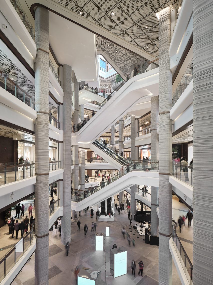
The nine-storey shopping centre, which contains 166 stores and restaurants, was designed to look like a greenery-covered mountain.
Along with the numerous trees and plants, the exterior of the centre is covered in balconies, meaning that there was no need to wrap the building in cladding.

"Typically, the architect's role is decorating the box," said Heatherwick.
"So it's playing out how are we going to do louvres, are we going to do frit on the glass. What if we could, instead of playing the game of spending the money on this box – we hate cladding, everything's covered in cladding these days – what if the hero isn't cladding and we just let the structure be that hero."
The shopping centre officially opened in December and according to Heatherwick it is being visited by 100,000 people a day. Overall, he sees this traffic as vindication that the project has engaged the local people.
"This was driven by making something that we hope is engaging people," he said.
"I think the 100,000 people a day are proof that we all need places that trigger a response. "
Heatherwick's studio has designed numerous talked-about projects in the past few years, including Little Island, an elevated park in New York's Hudson River that is similarly designed on top of columns.
It recently revealed designs for two residential skyscrapers in Vancouver that will be covered in curved green balconies and a proposal for a Nottingham development that would incorporate the ruins of a shopping centre.
Read on for an edited transcript of the interview with Heatherwick:
Tom Ravenscroft: What was the overall idea for the project?
Thomas Heatherwick: What was exciting for me about the project was that it wasn't in the conventional, high-powered centre of the city. There was a district with a lot of tombstones of grey, faceless towers around with a lot of people, but no real urban heart. There was a river that had been heavily polluted and had just been turned around into something where fish are actually alive again.
Then in the middle of it, there was the main art district of Shanghai with this derelict site next door. There was no real heart to the neighbourhood. The whole point was that it was something that was for everybody. And so how do you make somewhere that will connect with people, that is a gathering spot and that reconnects people with the river.
Typically big building projects like these are big, sterile blocks. Particularly mixed developments with shopping and restaurants, can weirdly sterilise places in spirit. We didn't want to be the people that built a big cheesy wall next to the main art district. How could we allow the spirit of the art district to grow, rather than consolidate its edge.
The second phase is right next to the district. The form comes down to meet the same height as the edges. So it's coming down to the river, coming down to the park, it's coming down to the art district. And on the eastern side, it's coming down. And then on the south-facing side, it's sliced open. So that's where we worked with the 16 different artists, on the aspects of the skin of the building, but then we also work with a number of them inside.
Tom Ravenscroft: So it was important to make a form that would become the heart of the area, and not be a standard shopping centre. Was it important to make a building that grabbed people's attention?
Thomas Heatherwick: When I was originally studying it was like real architecture only happened if something was a museum. I felt that that shouldn't be how we think about the world around us and that the same love could be applied to something that was for a different kind of aspect of our life. Culture isn't just the arts, every aspect of our lives is culture.
And so a place that has restaurants and shops and kindergarten and workspaces and all the different varieties of aspects of life, that's as cultural as you get.
Tom Ravenscroft: How did you decide on the form?
Thomas Heatherwick: Those kinds of mixed-use developments that include shops and things like that, the outside is regarded as not necessary to be meaningful to an area and you get no sign of life.
You know, unless someone puts an advert on the outside, you just get these impersonal sterilisers, unless someone is engaging internally in the commercial activity, and we wanted to make something that contributes in multiple ways.
Pre-Covid, I've found it fascinating that we said yes to working in spaces where we were hermetically sealed in. It seemed bizarre that the place you spend more time in your life used to be your workspace and you spend less time in your home, yet your home was the place with the garden, your home was the place with the balcony.
So why can't workspaces have outdoor space. And so this is why we developed of the design so that we could have hundreds of outdoor spaces, and even a shop space had an outdoor space as well as a workspace.
Tom Ravenscroft: So by creating the hilly form you have lots of outdoor space?
Thomas Heatherwick: What it is making as many terraces, which means you've got activation, external. Instead of looking at a building, which is just a facade decision that a little gang of people has made, you're looking at something that has people using it.
It feels to me that people are one of the best forms of inlivener and you can have, rather than some decision about cladding that I make.
The integration of plants was in response to the scale. How can you affordably build in the complexity that your eye needs to have variety and human scale rather than monolithic kind of imposition in every way.
So every part of the project, we've looked at how we can break that down. To me, integrating nature is a very affordable way to get complexity and movement into the facade. We've got 28 different tree species. We've got hundreds and hundreds of different shrubs and creepers. And those things move.
You know, facades never move. Simultaneously it has a bunch of other benefits. There are more studies than ever or showing the mental health dimension. We're more interested in the mental health impact of place now. So gradually, there are studies that are showing and giving really good evidence that things like street trees, really reduce crime statistics and the mental health aspects, but also reduce noise, take out dust and particles out of the air.
The mental health side and the emotional side was what drove the decisions that led to this. But it happens that there are also other things that we know about. But I am not going to say that those were the starting point. But they are, there's just a whole lot of things in and around that help feel at this scale, a project like this needs, integrating many things into it.
Tom Ravenscroft: So my understanding is that the starting point was a grid of columns and you tried to work out how to take a grid of monotonous grid of columns and make it more intriguing?
Thomas Heatherwick: One thing was this relatively small, but precious art district, then you've got the park next door on the corner of this peninsula, then you've got these two government land plots that we had with a split in the middle. In a way, we were trying to integrate an art district, a piece of scraggy park that hasn't really found its feet. It seems the thing that could stitch them together was that the park could be the key that the nature.
If you look at buildings with wholehearted green roofs, the challenge is that that green is very heavy.
When you start having 800 to 900 millimetres of wet soil, organic roots and tree trunks and plant material, that's a very heavy thing to put on the roofs. So if you put them on a flat roof the beams would have to increase probably by 40 centimetres or something like that.
So the ceilings will get lower as there's a heavy sink, and that's to transfer all that weight sideways till it finds a column that can get down to the foundations.
So there was this parently with these parallel thoughts of how do we get really meaningful nature into this, but then also not have all these forced down ceilings, because we've got big, chunky heavy beams.
Separately, it's sort of fascinating, I think when you get big projects, you go into the car park and there are these columns. You know, when you see speeded up, David Attenborough nature programmes and there's a seed stem growing in the dark as it's coming up from the seed.
It's going there through four storeys of car parking, it's then going to go some past someone in a kindergarten, then it's going to go past someone drinking, someone eating, it's then going to go past someone sitting at a desk working someone else having a meeting further up.
It felt like the story. To make a flexible frame that can be reused over the future that is of a human scale that can really last this nine metre by nine metre grid emerged.
Then it felt like there was something romantic about that column that is the core to holding everything together. Yet that's also the best possible place if you want something heavy on top [of a building], put it on top of the column, don't put it on the beam, then that load goes straight to the foundation. So there was an efficiency to that.
Tom Ravenscroft: So even though it appears to be an elaborate form, you're saying it's based on structural logic?
Thomas Heatherwick: It's great, it's an absolute grid. There are no curves in the building itself at all. Typically, the architect's role is decorating the box. So it's playing out how are we going to do louvres, are we going to do frit on the glass. What if we could, instead of playing the game of spending the money on this box – we hate cladding, everything's covered in cladding these days – what if the hero isn't cladding and we just let the structure be that hero.
That means we can spend less money on the actual thing we would normally call the facades of the project. And that could be more straightforward, most just more normal.
I found that buildings became flatter and flatter. That to me is the big downside of the amazingness of modernism has been the flatness, that's just such a shame to have no shadows, bright spots and curiosity.
You can read buildings too quickly, you can look at them in about 20 seconds, you never need to look at it again. Whereas the best projects, your eye wants to keep looking because you keep seeing more into them. Nature does that just automatically by itself.
Tom Ravenscroft: I think you may have seen some people's criticism of the building – saying that the trees are a gimmick. So how would you respond to people who say that there are more sensible ways of greening a building?
Thomas Heatherwick: This is a three-and-a-half-million-square-foot project. The load is transferred straight onto the columns, the irrigation and illumination, and they're all accessible. Nature has been pushed out of the hearts of our cities. A sedum roof or something like that has little actual contribution to the larger architecture that we all experience. And at this scale, trees, major creepers and shrubs are something that can really impact. This has been driven by human experience and, trying to really make somewhere that people can love.
I think that the world of architecture has been led very much so from a theoretical side, I think for a long time, and not enough from an emotional experience side. And so what's thrilling for me is seeing 100,000 people going every day and engaging with something that is the heart of a district that had no heart before.
We were often not confident enough in the West. We don't actually have the confidence to make places that are so engaging for people In China they have more openness about what's possible,
Tom Ravenscroft: So this is more engaging than a standard green roof?
Thomas Heatherwick: There's a tendency to think greenery is only for environmental reasons in terms of greenhouse gas emissions – and those are benefits – but a big part of the reason in this project is the emotional engagement, to humanise it.
The focus of my studio's work is largely driven by the urge to humanise a world of buildings that I found, astonishingly, unhuman, as I grew up, and looked at new things that were built. You couldn't believe why something got built, and how we allowed it to happen. To be so sort of deaf to how the emotional response would really be, and how people would feel.
So this is driven by making something that we hope is engaging people and I think the 100,000 people a day are proof that we all need places that trigger a response. And you don't have a single response. Everything's got multiple responses and questions and provocations in that. And I think we've spent too much time making places that aren't, don't have enough layers of diversity within them to respond to.
Tom Ravenscroft: So to make it more intriguing?
Thomas Heatherwick: That's what the old buildings that we like have, they have many layers. You don't just look at them and 30 seconds later think I never need to look at this building ever again.
Dezeen is on WeChat!
Click here to read the Chinese version of this article on Dezeen's official WeChat account, where we publish daily architecture and design news and projects in Simplified Chinese.