Shanghai studio AIM Architecture has transformed the second floor of a business park in Hangzhou, China, into a store that resembles a 1970s office for cosmetics brand Harmay.
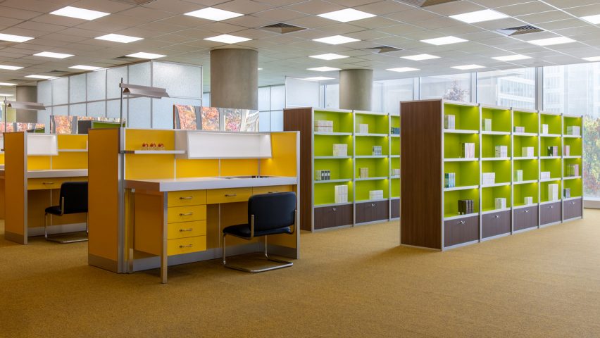
The studio reimagined the space as a retro-looking office complete with desk chairs, phoney bookshelves for makeup items and boardroom tables for other cosmetic products.
AIM Architecture (AIM) chose a colour palette of muted yellows, oranges and browns that were popular during the 1970s for the 1,382 square-metre space.
This retro colour scheme is paired with a woollen carpet by German brand Findeisen, frosted-glass sliding "meeting room" doors and contrasting lime green shelving.
Other office touches throughout the two-floor store include bookshelves, cushioned stools and industrial structural columns.
Rows of yellow desks similar to ones you might find in an office from the time period have been used to display the brand's cosmetics, including perfumes and make-up. Extra stock has been stored inside the desk drawers.
Porthole windows give customers a glimpse of the internal transit warehouse that is also housed in the building complex, while mirrored walls in the store's centre are designed to transport customers away from reality.
The studio wanted the shop to be a tribute to working life and to help customers realise the benefit of in-store shopping experiences versus purchasing online.
"We really wanted to use this concept to celebrate daily life and see the beauty in it," AIM founder Wendy Saunders told Dezeen.
"Here in China, the reality is that people shop online for everything, anywhere, anytime," she said. "As physical shopping is just for fun, we wanted to create a colourful version of it."
As well as paying homage to the specific decade, the studio wanted the store to echo the surrounding offices within the mixed-use business park.
The store is located in the recently opened OōEli complex, a large-scale urban development project designed by Pritzker-winning Italian architect Renzo Piano.
"Sometimes the building dominates and inspires the site you get to work in: it sets the mood," explained Saunders. "This site was one of those."
"Creating an 'old fashioned' physical retail experience in an actual office space just seemed a fun way to translate this duality of space and time," she added.
Other recently completed stores in Shanghai include MVRDV's design for a Bulgari store which took cues from the glamour of art deco architecture, and a clothing shop called Canal St designed by Sò Studio to look like the New York subway.
Dezeen is on WeChat!
Click here to read the Chinese version of this article on Dezeen's official WeChat account, where we publish daily architecture and design news and projects in Simplified Chinese.

