Graypants converts slender space near Seattle into Tomo restaurant
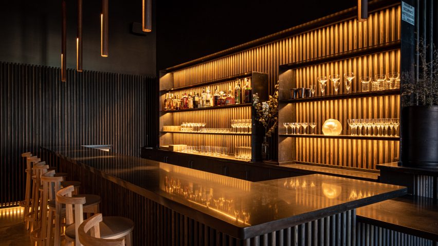
Dark-toned wood and golden light are found in this Washington bar and eatery by design firm Graypants that alludes to a Japanese urban alleyway.
Tomo is located in the community of White Center, which lies just south of Seattle. The dining establishment – which specialises in eclectic, seasonal cuisine – is named after the owner's grandmother, Tomoko, and the Japanese word for friend, tomodachi.
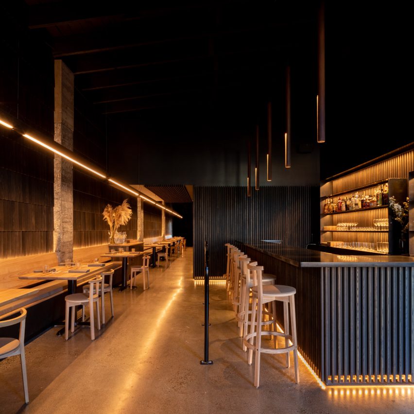
Graypants, which has offices in Seattle and Amsterdam, was charged with creating a distinctive space on a limited budget.
"The brief was to create something handcrafted in a short amount of time, using a modest budget, offering room for as many guests as possible, while ensuring each seat felt like the best one in the house," the team said.
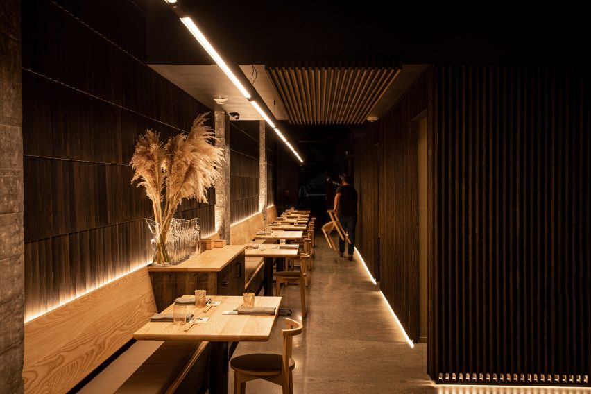
Housed in a low-slung building along a main thoroughfare, the restaurant has a long and slender floor plan. The front facade features storefront-style glazing and charcoal-coloured brick.
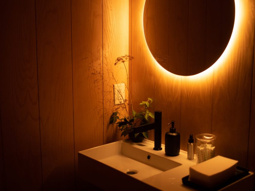
Guests step into a dark-toned room with golden lighting and ample wood.
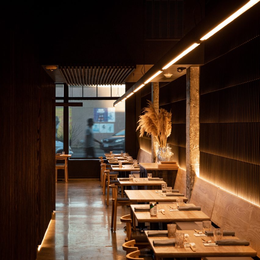
"Narrow and inviting, the experience references an evening in one the endless alleyways of Japanese cities," the studio said.
"The architecture aims to be demure and humble, letting the food be the centre of the experience," the team added.
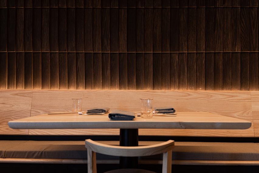
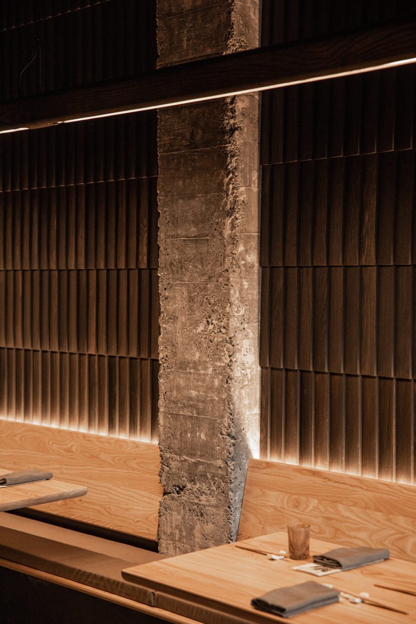
Lining one side of the restaurant is seating, which stretches along a wall clad in oak shingles arranged like fish scales.
To the other side is a bar, along with a kitchen enclosed within slatted walls made of ebony-stained ash.
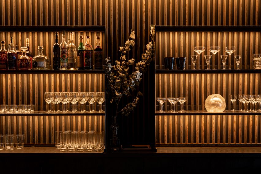
"Wood is a centrepiece of the space," the team said. "The mingling of wood throughout the space creates an understated, monochrome texture."
Most of the lighting elements were integrated directly into wall panels, bench seating and bar shelves, enabling them to be "felt but not seen", the designers said.
The exception is an 80-foot (24-metre) linear fixture that extends the length of the restaurant.
The team sought to save money wherever possible, without compromising on design quality.
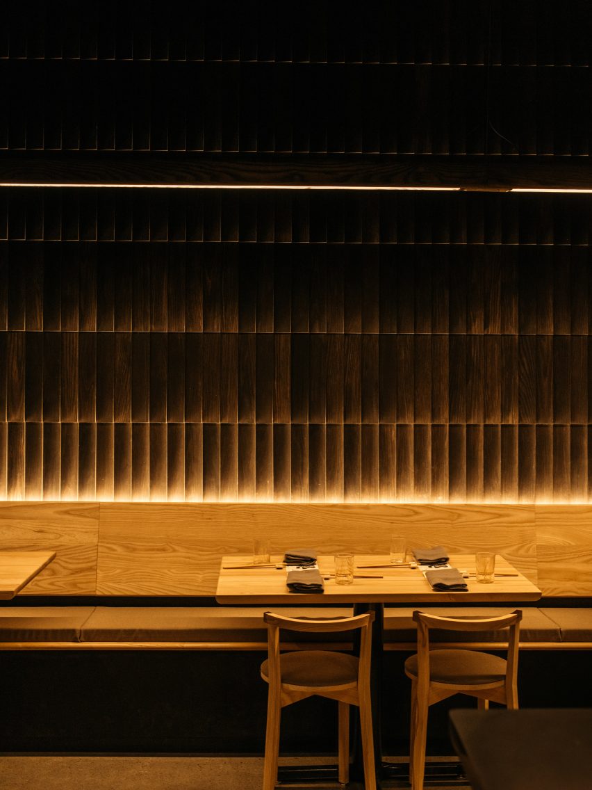
Graypants, with help from the studio Fin, designed and fabricated most of the fixtures and furniture, including the lighting, seating and tabletops. This helped reduce costs and shorten the construction timeframe.
Each piece of furniture was finished with a zero-VOC topcoat.
The outdoor tables, kitchen cladding and bar-back were fabricated using Richlite, a durable and locally sourced material that is made of resin-infused paper.
"The team carefully chose their moves – like simply polishing existing concrete floors and investing in finishes that feel complex but are efficient to install, lowering construction cost," the studio said.
"The cost per square feet of this project is, conservatively, 35 per cent below the benchmark."
Other restaurants in the Seattle area include the Samara bistro by Mutuus Studio, which features rustic materials and earth tones that create a "sense of timelessness and comfort".
The photography is by Adam Joseph Wells.
Project credits:
Designer: Graypants
Design team: Seth Grizzle, Bryan Reed, Caleb Patterson, Alan Marrero
Furniture designer and manufacturer: Fin
Owner and chef: Brady Williams
Operations: Jessica Powers
General contractor: Shawn Landis