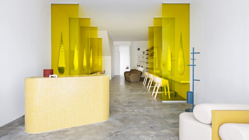
Yellow-tinted glass partitions and droplet-shaped mirrors give a unique personality to Australian hair salon Mitch Studio, renovated by interior designer Danielle Brustman.
Mitch Studio is located in a double-storey 1950s building in the Melbourne suburb of Ashburton, in a shopfront that had already operated as a hairdressers for a number of years.
Brustman's client wanted to update the space to reflect their brand, which uses yellow as its signature colour. The designer set out to give the space a fresh and modern feel while using the sunny hue as a key part of the colour palette.
The designer started by gutting the space entirely, leaving only the original concrete floor, which has been polished to achieve its final look.
She reconfigured the layout across two floors: on the ground floor is the reception and waiting area along with hair washing and cutting stations – the latter separated with the distinctive yellow glass partitions.
The partitions create privacy and personal space while also, Brustman points out, proving useful when social distancing is required.
The droplet-shaped mirrors at these stations were chosen to give the salon a bespoke touch, while referencing ideas of water and washing.
"There is something lovely about the way the droplet mirrors create an infinity effect in the space, adding to the spaciousness," Brustman told Dezeen.
All the joinery on the ground floor is bespoke, including a reception desk clad in mustard-yellow glass mosaic tiles and a retail display shelf with similar white tiles.
Most of the surfaces and finishes are in white, as is the sculptural six-arm chandelier by US design studio Entler.
Upstairs, there are additional haircutting stations along with bathrooms, a kitchen and a small worktable – meant for customers who want to pull out their laptops while waiting for their hair treatments to take effect.
The haircutting stations here have a different configuration, facing each other but divided by mirrors. Completed with pale moulded plywood chairs, they give the space an almost cafe-like appearance.
"We wanted to keep the spaces light and airy with a great deal of airflow and enough room for the clients and staff to feel spacious and comfortable in their surrounds," Brustman said.
She also paid attention to the employees' workflow and aimed to design the space to be intuitive and relaxing for them. For instance, there are hair-recycling bins integrated into the joinery, so that stylists can dispose of waste on the spot.
Brustman is a Melbourne-based interior designer whose previous work has included the Brighton Street Early Learning Centre – a childcare centre with a different bright colour palette in every room.
The photography is by Nicole England.

