Commenter calls collection of light switches crafted from animal bones "fascinating"
In this week's comments update, readers are impressed by a collection of light switches crafted from bovine bones and discussing other top stories.
ÉCAL graduate Souhaïb Ghanmi has catalysed conversation by turning waste bovine bones from the meat industry into a collection of light switches and electrical outlets.
The Elos range features sinuous silhouettes modelled on different parts of the human skeleton, including a socket designed to resemble the head of a thigh bone that is capable of rotating in its baseplate like a hip joint.
"Very interesting idea and cool designs"
Readers are impressed. "Very interesting idea and cool designs," praised H Bray. "Just make sure the bone smell is long gone. I would hate to have my dog start chewing the wall sockets and get zapped."
"I'm in love with this," added Charles Kelso. "The material is fascinating, but the forms are incredible. The light switches, in particular, are a lovely mix of organic and minimalist design."
Tara agreed: "They are so beautiful and it makes sense to have more flexibility regarding directional use. The materials are waste materials, so I can't see why it matters what the materials actually are. Waste should be used? I guess the aim is to move away from factory farming, but until we reach that day let's make use of the waste created by such industries."
"One for the vegans..." concluded Logomisia.
Do you agree with the comments? Join the discussion ›

Commenter says they would "prefer to change architecture than cut an old tree"
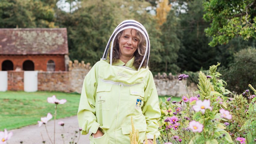
Readers agree with bee expert Paula Carnell, who says architects should include wild areas in their projects, plant trees in the ground rather than in pots and discourage urban beekeeping to encourage biodiversity.
"Plant more plants, everyone," said Chris.
"Old trees are valuable," continued The Bee Keeper. "I would prefer changing the architecture instead of cutting an old tree."
"Most plants in our roof garden in Notting Hill are bee supporting," concluded Cezary Marek. "I love watching the selfless creatures working hard. No idea where they fly in from, but they always do. Seems right that we gave up on installing a beehive there."
Do you have an opinion on encouraging biodiversity amongst bees? Join the discussion ›

Reader calls design for federal courthouse in Florida "elegant, dignified and fuss-free"
Commenters are discussing Skidmore, Owings & Merrill's (SOM) design for a new 10-storey federal courthouse in Fort Lauderdale, Florida. It features a fluted metal and glass exterior informed by classical architecture.
"Looks elegant, dignified and fuss-free," said Romeo Reyes. "Interesting how the sunlight will enhance the fluted surface of the metal cladding. It will definitely stand the test of time. If Mies could pull off design feats in the distant past that are still admired to this day, why shouldn't this one?"
Apsco Radiales agreed: "Straightforward, 1960s design with no apologies made. No fanciful claims about it saving the world from all that nasty carbon. I like it."
"It's very poor form blaming classical architecture for dull, uninspiring design," said JB on the other hand. "The architect should really put the whole thing underground."
Are you a fan of the Fort Lauderdale Federal Courthouse? Join the discussion ›

Commenter says Los Angeles home "captures the qualities of some of the better modernist spaces"
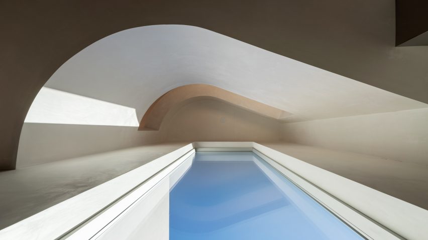
Readers are intrigued by a residential project in the Venice neighbourhood of Los Angeles. The building has a sculptural composition thanks to its rounded walls, which also enhance the home's natural light.
"What is really awesome about this house is that it manages to capture the qualities of some of the better modernist spaces," said Ballista, "and the enjoyment of how modernism plays with basic geometry in a fairly normal domestic scale. Really special!"
Apsco Radiales continued: "Must give credit to the construction guys. Excellent job."
"That front facade is so well-composed," concluded JZ, "but behind it is a relatively average sequence of spaces that rely on rich materials rather than spatial nuance. That courtyard is so beyond average, so nihilistically spec-grade. The image of the stair rail where the sloped cap meets the horizontal rail on the second floor makes my teeth itch."
What do you think of The Radius House? Join the discussion ›
Comments update
Dezeen is the world's most commented architecture and design magazine, receiving thousands of comments each month from readers. Keep up to date on the latest discussions on our comments page.