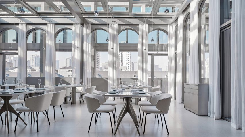
Design studio Linehouse has filled a restaurant in a Shanghai art museum with mirrors and arched details informed by eastern and western art and design.
Located inside the UCCA Edge museum, the New Wave by Da Vittorio restaurant was named after the original UCCA museum's opening exhibition The New Wave Art Movement, which also set the tone for its interiors.
New Wave, a 20th-century art movement in China, is renowned for its bold experimentation that brought Chinese art into the modern art world.
“The concept for the restaurant comes from the collision of these opposing elements and the process of change,” said Shanghai-based Linehouse.
To enter the restaurant, guests pass through a narrow passage that leads from the public museum space into a more intimate dining area.
The restaurant, which measures 620 square metres, also holds a bar, private dining rooms and an outdoor terrace.
A sequence of arches was added to the restaurant in reference to the use of colonnades in classical architecture, while matching arched mirrors create an illusion of spatial progression.
New Wave by Da Vittorio also features a ceiling installation formed by arches designed in a more eastern style.
The installation consists of hanging fins made from a Japanese triaxle fabric with a woven texture, which has been cut into vaulted shapes to create a softness that evokes floating clouds.
The sheets of fabric are placed in a repetitive order with a pattern that only emerges once you see through one sheet to the next. The studio hoped this would evoke the contradiction between order and chaos.
“Throughout the restaurant, we seek contradiction in materiality to create qualities of soft and hard, rough to smooth, order to unordered and solid to transparent,” Linehouse co-founder and lead designer Alex Mok told Dezeen.
The studio used stone for the main bar counter, which it sculpted into a curved, fluid shape to further explore the juxtaposition between soft and hard surfaces.
Linehouse deliberately chose a stone with a smaller repetitive pattern to create a continuous piece.
The bar area also has a floor patterned with different kinds of stone while in the private dining rooms, precision-machined stainless steel and curved lacquered timber were paired to create another form of contradiction.
“Materials are manipulated as a catalyst for creating disorder, dissipation, fragmentation and surprise,” Mok said.
Linehouse also recently finished a space-theme cafe for Australian chain Black Star Pastry's first Chinese outpost.
The studio was named emerging interior designer of the year at the 2021 Dezeen Awards.
The photography is by Jonathan Leijonhufvud.
Project credits:
Architect: Linehouse
Design lead: Alex Mok, Briar Hickling
Design team: Jingru Tong, Inez Low, Aiwen Shao, Leah Lin, Jiabao Guo, Cherngyu Chen
Dezeen is on WeChat!
Click here to read the Chinese version of this article on Dezeen's official WeChat account, where we publish daily architecture and design news and projects in Simplified Chinese.

