A nursery by Junya Ishigami and MAD's Cloudscape of Haikou feature in our latest lookbook, which highlights 10 softly contoured interiors from the Dezeen archive that were modelled on the sinuous shapes of clouds and wind-smoothed caves.
Whether crafted from plaster, concrete or wooden panels, undulating walls can help to bring a sense of intimacy to otherwise large, impersonal spaces.
Beyond just looking pretty, they can also be a practical solution to integrate everything from seating to storage into the fabric of the interior, while concealing unsightly mechanical and electrical systems.
This is the latest in our series of lookbooks providing curated visual inspiration from Dezeen's image archive. For more inspiration see previous lookbooks showcasing bright-white kitchens, cosy conversation pits and self-designed homes by architects and designers.
Design studio OPA subverted the rational modernist grid of this house near San Francisco by overlaying a series of cloud-like architectural features on top of its existing structural shell.
Its load-bearing columns are now enveloped by bulging white walls, while ceilings droop down to form a series of intimate seating nooks as well as a cove that surrounds the freestanding circular tub in the bathroom.
Ferrari flagship, Italy, Sybarite
Going down a sleeker, more space-age-style route, London studio Sybarite carved out a sinuous display area at the centre of Ferrari's lifestyle concept store in Maranello to house the carmaker's debut fashion collection.
The otherwise open-plan interior is cast in shades of glossy red and white and also incorporates touches of mahogany, which was used to make Ferrari's original Enrico Nardi steering wheels of the 1950s and 1960s.
Find out more about the Ferrari flagship ›
Cabin at Norderhov, Norway, by Atelier Oslo
Curved birchwood panels engulf the walls and ceilings of this cabin, turning it into a cosy refuge on the banks of Norway's Lake Steinsfjorden while sweeping windows provide panoramic views over the natural landscape.
Like a winding tunnel, the interior was designed as one continuous space, with the bedroom cordoned off from the open floor plan by a heavy grey curtain.
Find out more about the Cabin at Norderhov ›
Two Holiday Houses in Firostefani, Greece, by Kapsimalis Architects
Three rocky vaulted caves, which once provided additional storage space for a traditional dwelling on Santorini, were smoothed out and finished with earthy-hued plaster to create this summer house by local practice Kapsimalis Architects.
Colours, finishes and fittings throughout the interior were designed to reflect the building's humble origins, incorporating arched niches and doorways, flush built-in storage and furniture made by local craftsmen.
Find out more about Two Holiday Houses in Firostefani ›
Cloudscape of Haikou, China, by MAD
Designed to evoke "a wormhole that transcends time and space", the interior and exterior of MAD's library on Hainan Island were cast as one continuous vessel without any right angles.
On the inside, the sinuous white concrete shell forms small reading nooks and bookcases recessed into the walls, while concealing all of the building's electrics and plumbing.
Find out more about Cloud of Haikou ›
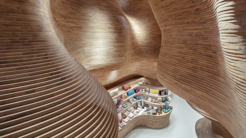
National Museum of Qatar gift shop, Qatar, by Koichi Takada Architects
Around 40,000 slabs of wood were stacked on top of each other and assembled by hand to form the soaring walls and built-in shelves of the gift shop in the National Museum of Qatar.
The interior, much like the Jean Nouvel-designed building, pays homage to Qatar's desert landscape – particularly the crystal-crusted cavern of Dahl Al Misfir, which tunnels deep into the earth outside Doha.
Find out more about the gift shop ›
Myrto, Sardinia, by Studio Wok
Studio Wok looked to the way that the wind carves granite rocks on the Sardinian coast into sinuous, almost architectural structures when designing this pizzeria, set in the island's port town of Porto Cervo.
This erosive process is referenced in the restaurant's curved, sandy pink plaster walls and arched windows, which are complemented by custom furnishings including a tiled counter in varying shades of green that echo the colours of local shrubs.
Cloud Garden, Japan, by Junya Ishigami
Rather than covering up the bulky columns found in this high-rise office block in Atsugi, Junya Ishigami converted its former cafeteria into a nursery by inserting wiggly concrete partitions, creating archways and pathways as well as various spaces for play.
"There are crevices that only children can pass through, and absent spaces that are considered large even for adults," Ishigami said. "It is a space that softly ties in various objects and scales."
Find out more about Cloud Garden ›
TT Pilates, China, by Wanmu Shazi
Designer Wanmu Shazi used micro-cement to cover up not just the walls but also most of the windows in the TT Pilates studio, which is located in a typical high-rise office building in Xiamen.
Only a few organically-shaped openings allow visitors to catch glimpses of the sky while letting light dapple into the interior, in a bid to shut out the usual hustle and bustle of the Chinese port city.
Find out more about TT Pilates ›
Cedarwood panelling creates an undulating terrain inside this sauna in Canada, curving up from the floor to form stepped seating and skewed porthole windows as well as enveloping the wood-burning stove.
Set on a craggy outcrop on the shore of Lake Huron, it was designed to resemble a seaside grotto carved out by the water, while its exterior was moulded perfectly to the rock formation using a 3D scanner.
This is the latest in our series of lookbooks providing curated visual inspiration from Dezeen's image archive. For more inspiration see previous lookbooks showcasing bright-white kitchens, cosy conversation pits and self-designed homes by architects and designers.
Dezeen is on WeChat!
Click here to read the Chinese version of this article on Dezeen's official WeChat account, where we publish daily architecture and design news and projects in Simplified Chinese.

