Nordic functionalism informs Stockholm beauty clinic by ASKA
Swedish architecture studio ASKA has drawn on the existing 1930s architecture for its refurbishment of Stockholm beauty salon MBS by Malika, adding arched shapes and oak veneer panelling.
The beauty clinic in central Stockholm is located in a building designed in the Scandinavian modernist style known as Nordic functionalism – or simply funkis in Swedish.
ASKA, which is led by Polina Sandström and Madeleine Klingspor, made a number of structural changes to the space as part of the refurbishment, but wanted to keep the interior design both functional and stylish.
The studio tore down most of the interior walls in the 70-square-metre salon to make more space for private rooms for its beauty therapists.
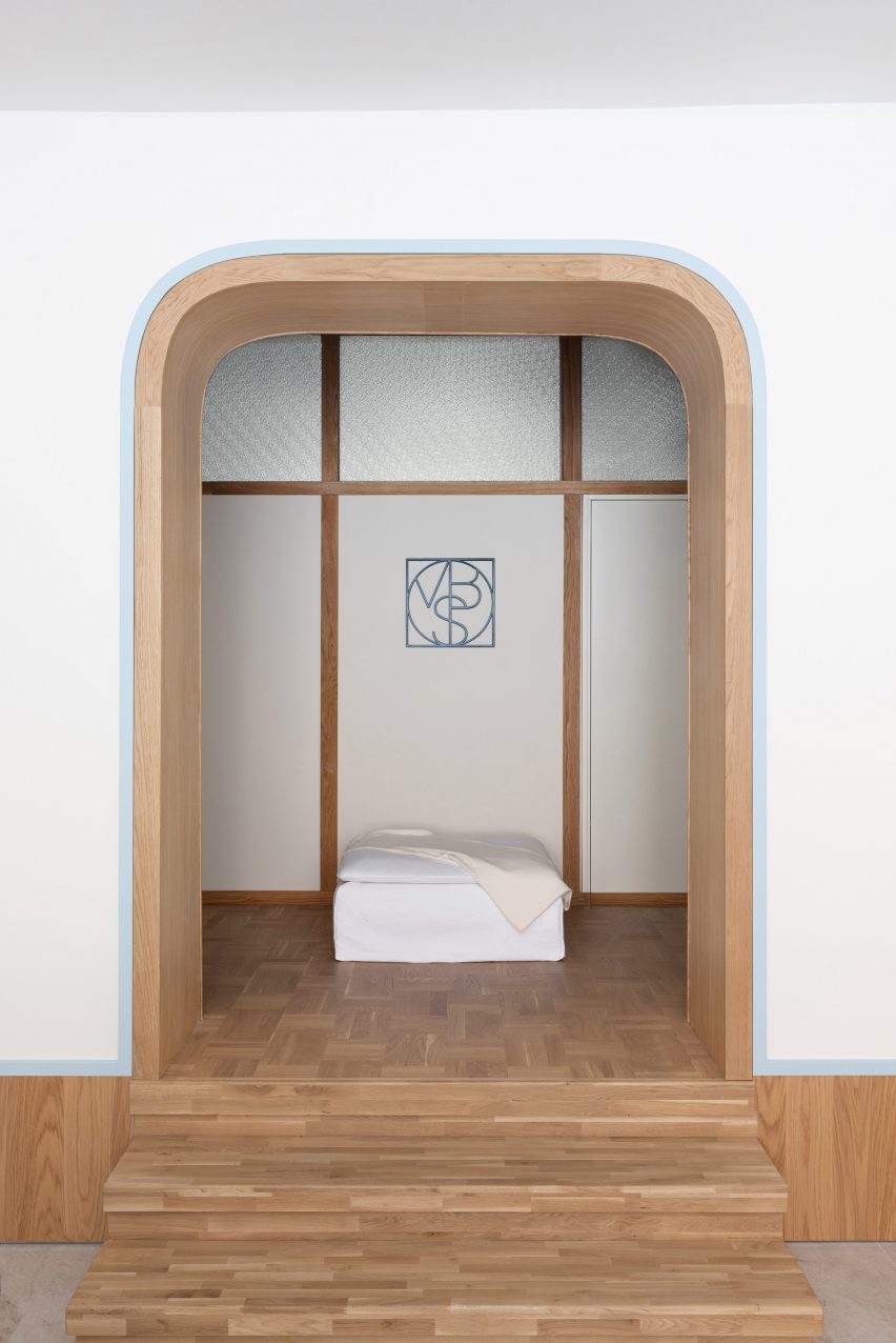
Additional walls were designed with the building's modernist architecture in mind.
"The new walls were designed in a way so they would go hand in hand with the rest of the architecture with oak detailing and structured glass, which also helps the daylight to get through the whole space," Klingspor told Dezeen.
"The centrally-placed dividing wall with the pseudo three arch was also an addition by us," Sandström added.
"From a functional aspect, it helps separate the public part of the clinic from the more private one."
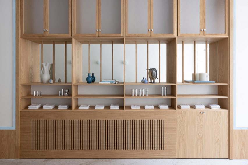
Wood was used throughout the space, with oak veneer chosen as it was popular during the era when the building was constructed.
The material added "the right nostalgic association" to the interior, while balancing out the otherwise clinical aesthetics and the salon's cool colour scheme.
ASKA aimed to create a light, clean atmosphere for the salon and chose to work with blue and white hues, with a pale blue shade lining the wooden skirting boards and door frames for a stylish contrasting detail.
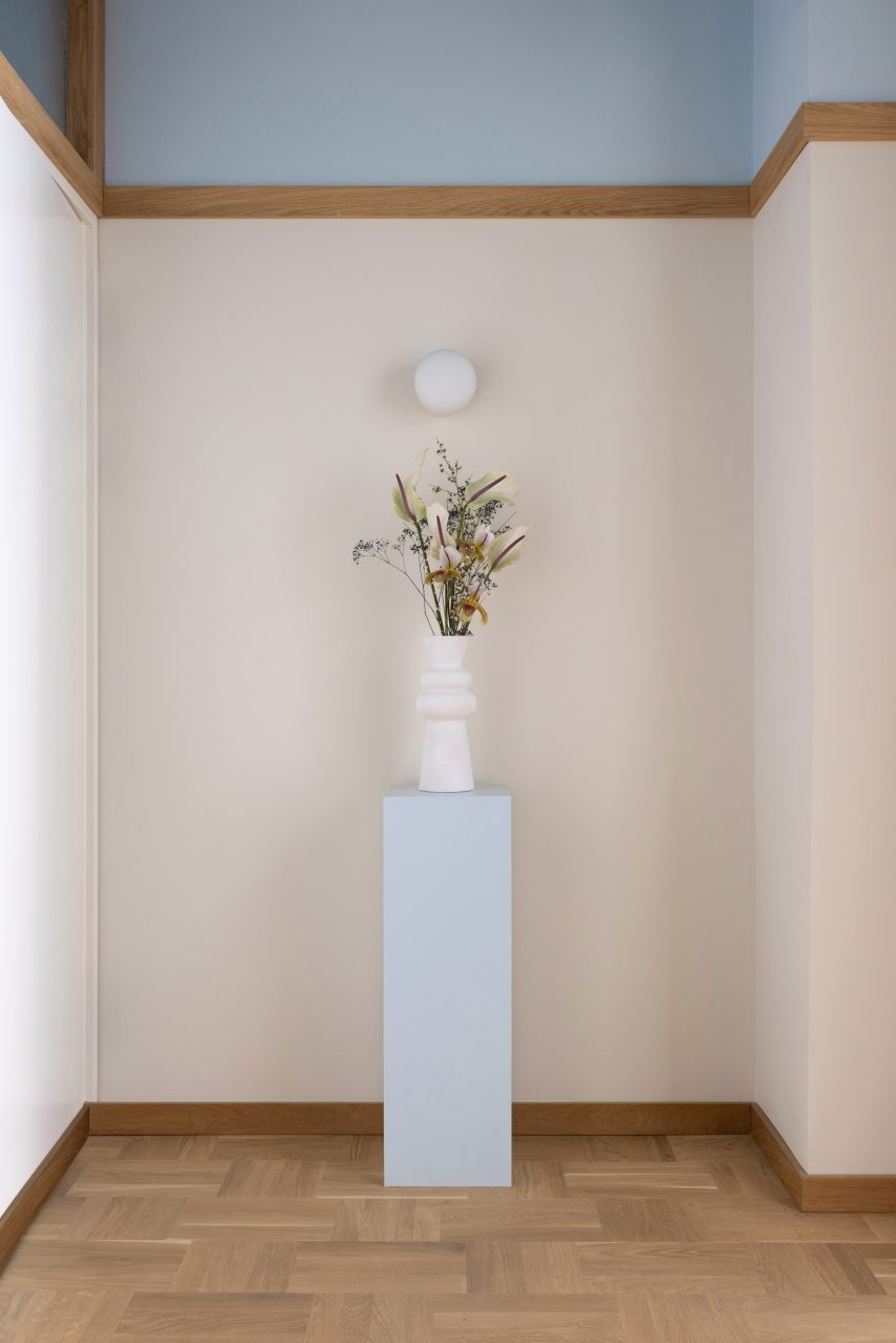
"We chose to add the popping blue colour because it works as a good contrast against the warm oak adding a fresh and clinical touch, while at the same time being a somewhat unusual choice for a beauty salon – adding a surprising element to the design," Klingspor explained.
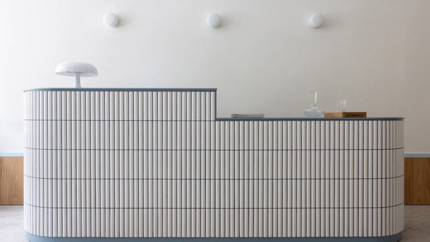
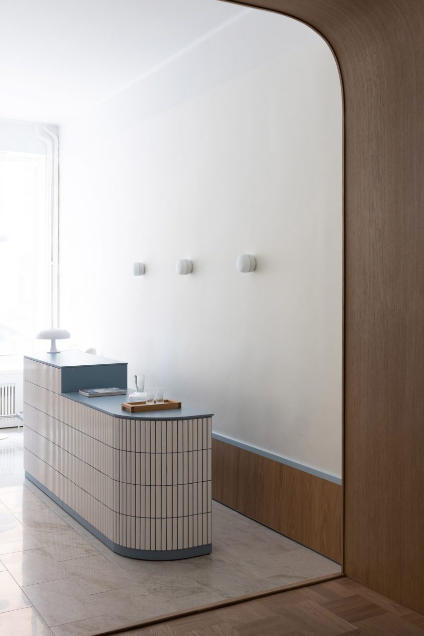
In addition to changing the layout of the space, the studio also created a new showpiece for the salon, a tile-clad reception desk that greets visitors and references Finnish modernist architect Alvar Aalto.
"The reception desk is something of a key element that captures the essence of the concept in one piece – a homage to the functionalist era with a modern twist," Sandström said.
"The white tiles were inspired by Aalvar Alto's interior designs and help define the shape of the desk-corners thanks to their slightly rounded aesthetic."
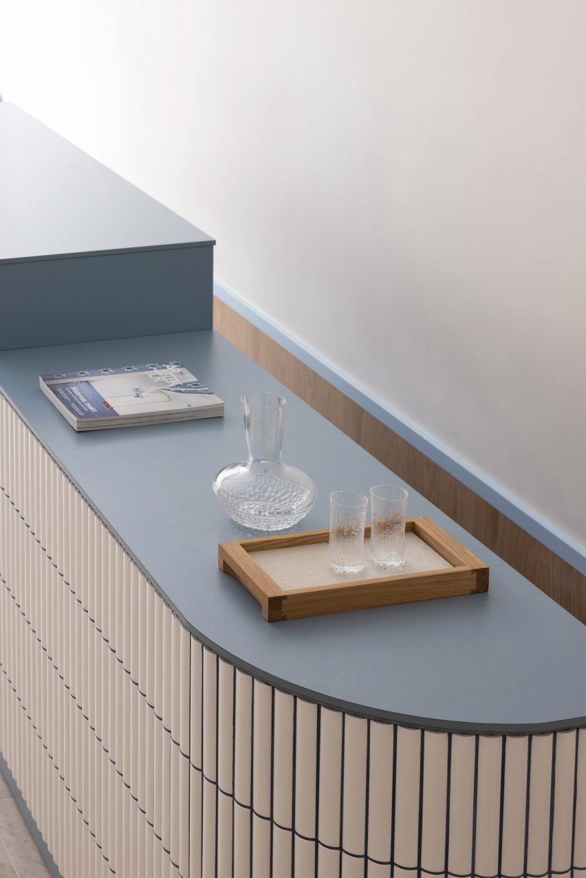
Both the shape of the desk and the materials were also chosen to evoke the era.
"The compact laminate was also a material choice that is true to the mid-century design era, whilst the blue colour and dark blue grout add a bold, unique element to the expression," Sandström added.
"The different heights of the desk helps to create two different areas in a true 'form follows function' manner."
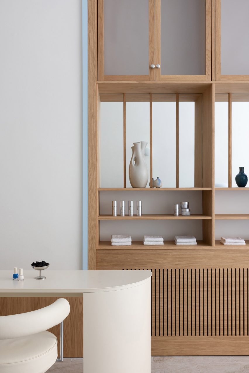
ASKA also designed cream-coloured lounge tables and nail manicure stations for the salon.
The studio has previously created a hair salon in Stockholm that features an undulating ceiling installation that looks like dripping shampoo, as well as a pastel-coloured cafe that references Wes Anderson's film aesthetic.
The photography is by Mikael Lundblad.