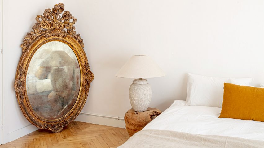
Ornamental details including a stone fireplace and a gilded mirror take centre stage in this minimal revamp of a Barcelona apartment overseen by Jeanne Schultz Design Studio.
Located on Passeig de Grácia, the two-bedroom flat boasts a range of period features including a Catalan vault ceiling, wooden parquet flooring and an antique chandelier.
These ornamental details command attention, yet Barcelona-based Schultz and her team have managed to make the interior feel bright and spacious by adding new furniture sparingly and adopting a sensitive colour strategy that enhances what's already there.
"We maintained almost all elements of the flat," Schultz told Dezeen. "Architectural interventions were all in the interest of preserving the home and refinishing it."
Passeig de Grácia 97 is owned by a young entrepreneur who recently relocated from Paris. As he is often travelling, he wanted his home to feel both functional and peaceful.
Schultz felt it was important to retain as many of the apartment's existing features as possible, but to make them feel fresh by pairing them with characterful modern pieces.
"The client wanted just the essentials, so the space is carefully curated," she explained. "Each object plays with our core ideas of earthiness, handcrafted, local and comfortable."
The starting point for her design was the living room, where a pink stone fireplace with chequered green tiles is set against a wall of wood panelling and shelves.
"One the things that struck me most about the flat was the living room with its charm: all the existing wood shelving and millwork, the crown moulding and antique details," said Schultz.
To complement these elements, a green tone was added to doors, window frames and ceiling mouldings, to announce this room as the centre of the home.
The same green features in the velvet dining chairs, which surround a wooden table at one end of the room.
Other key details in this room include a curvy white armchair, a bulky black side table and a bulbous leather floor lamp.
For the rest of the home, Schultz was keen to maintain the vistas through the floor plan.
The flat has an unusual layout that contains no corridors. The lobby, kitchen, living room and dining space are laid out in sequence, connected by arched doorways, while two bedrooms and bathrooms are set alongside.
"There is a linear focal point starting from the entry leading to the terrace, which allows for this amazing procession through the spaces," said Schultz. "The sunlight hits all the way from the terrace to the entry."
To highlight the lighting contrasts, the walls in different rooms are painted in subtly different shades of white.
The gilded mirror was found in the apartment, but was deemed too large to be hung from a wall. Instead it is propped up in the corner of the main bedroom, offering cloudy grey reflections of the room.
To balance the visual of this element and emphasise the high ceiling, Schultz chose a low, platform-style bed.
The biggest challenge for the designer was the project timeline; she was given just five weeks to complete, which provided challenging when many existing elements – the patios, for instance – needed to be repaired.
To ensure she completed on time, Schultz sourced all of the furniture from retailers with shops in Barcelona, including Dareels, Kave Home and Oliver.
Other examples of refurbished apartments in Barcelona include a geometric design for a flat in Ricardo Bofill's Walden 7 and a yellow scheme for a home in Sarrià-Sant Gervasi.
Photography is by Adrià Goula.
Project credits
Design: Jeanne Schultz Design Studio
Project team: Jeanne Schultz, Tomas Romero Talley, Mateus Sartori

