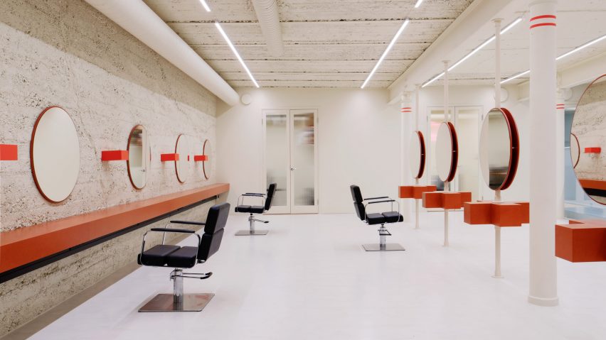
Westblom Krasse Arkitektkontor has designed the interior for a minimalist hair salon that was informed by architect Carlo Scarpa's geometric designs and the muted colours of 1920s swimming baths.
Called Little Faktory, the salon was designed and renovated by the local architecture studio for hairdresser Sofia Geideby and is located in a former office in Stockholm, Sweden.
Westblom Krasse Arkitektkontor overhauled the 220-square-metre basement space, which is over one hundred years old, to reveal its original textured concrete walls and exposed steel structure.
As the salon is located underground, the studio explained that it also had to be "very careful working with artificial light".
Its design for Little Faktory was intended to be minimalist and streamlined.
"Our aim was to declutter the former office and create one big open space, making its four pillars the heroes of the main room again," studio co-founder Jesper Westblom told Dezeen. "The challenge was to reduce, rather than to add things."
In line with this pared-back approach, the firm painted the salon's walls in a delicate, light yellow hue that intends to brighten its basement setting and maintain but soften the space's industrial feel.
Circles and squares are dotted throughout the salon in the form of mirrors and furniture. According to Westblom, they were informed by the geometric shapes seen in the late Italian architect Scarpa's designs.
The studio also drew on Scarpa's use of contrasting colours.
Freestanding haircutting stations are arranged in the centre of the salon's main studio. These feature thick side tables shaped like plus-signs, as well as round mirrors mounted on powder-coated steel tubes.
On one side of the main space, black leather chairs sit opposite a floating table that lines the concrete wall, above which embellished circular mirrors and square-shaped display shelves are positioned.
A washing station can be found on the other side of the room, which is subtly separated from the rest of the area by a cloverleaf perforated metal screen that echoes the plus-shape used elsewhere.
"The customer and the hairstylist represent one square each, on both sides, resulting in the plus shape," Westblom explained.
A colour lab, VIP area and private office space are located behind bespoke, glazed double doors, while the entrance stairwell is illuminated with spidery neon lights by designer Josefin Eklund.
Also among the salon's bespoke elements is a rectilinear mirror with a bulbous blue frame by Gustaf Westman, a design that the Swedish artist recreated in a custom colour specifically for the project.
All of Little Faktory's interiors are created in a muted combination of the primary colours of red, yellow and blue, which Westblom explained is an ode to the salon's slogan, "the colourful kind".
"We looked at some early, inspirational images that set the tone of the project," he said.
"One image, in particular, was of 1920s public baths with beautiful cream-coloured tiles, orange and red details and, of course, a blue swimming pool. This ended up forming our main colour scheme."
The project's emphasis on colour is repeated in the customer toilet, where playful mirrors shaped like paint splashes are arranged opposite each other in an attempt to create an infinity effect.
Little Faktory's material palette includes rubber flooring, reeded glass and dyed fibreboard, which intend to complement the salon's existing elements and provide functional solutions to its customers' needs.
Jesper Westblom and Robin Krasse founded their eponymous Stockholm-based architecture firm in January 2021.
Other recent hair salon designs that have colour and texture at their core include Danielle Brustman's Mitch Studio – a Melbourne salon that features yellow accents and glass partitions – and Mood, a hair studio by Casa Antillón in Madrid with bold mint-green ceilings sprayed with insulation foam.
The photography is by Mikael Olsson.

