Ten interiors that use innovative room dividers instead of walls
A pastel-pink wardrobe and a theatrical silver curtain feature in our latest lookbook, which highlights 10 creative ways to split a space into different sections by using room dividers.
Whether they're lightweight and movable such as screens, fixed yet adjustable like curtains, or built into the framework of a building like a shelving unit, room dividers can be a practical and inexpensive solution to break up a space and provide more privacy.
The interiors in this lookbook, which range from homes in Spain and Australia to hotel rooms in Japan and exhibition spaces in Brasil and the US, showcase innovative solutions for how to partition a large room.
This is the latest in our series of lookbooks providing curated visual inspiration from Dezeen's image archive. For more inspiration see previous lookbooks showcasing homes with parquet flooring, compact bedrooms and self-designed studios by architects and designers.
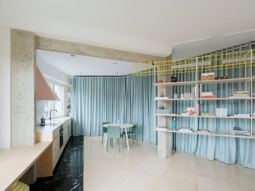
Ready-made Home, Spain, by Azab
Pale blue curtains slice through the middle of this whimsical home in Bilbao, designed by architecture studio Azab.
Challenged with a floor plan in the shape of a semi-circle, the studio decided to section off the two bedrooms and the bathroom using sheathes of the vibrant fabric, injecting a playful element into the apartment.
Other colourful features include a pink extraction hood above the cooking stove, a yellow lacquered steel storage unit and an exposed wall.
Find out more about Ready-made Home ›
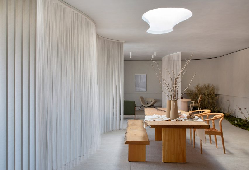
Casa Alma, Brasil, by Studio Melina Romano
This exhibition space looks more like a cosy apartment than a traditional exhibition hall, thanks to an array of homely features including gauzy curtains, low-slung coffee tables and mossy gardens.
Brasilian practice Studio Melina Romano hoped to create a sensorial atmosphere by using rounded elements and tactile materials for attendees of Casacor, São Paulo's annual festival of architecture and interior design.
Find out more about Casa Alma ›
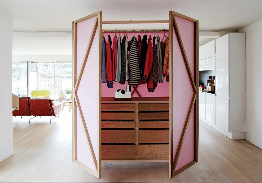
Metamporhic Wardrobe, UK, by Studiomama
East London-based design studio Studiomama devised a pastel-coloured wardrobe called Metamorphic, which has a set of large doors that open out into a partition.
The closet features a rail to hang clothes on, drawers in varying sizes and a set of doors that can be unfurled into a screen. The design showcases how room dividers made from furniture can be used as an innovative solution for creating private spaces in open-plan interiors.
Find out more about Metamorphic Wardrobe ›
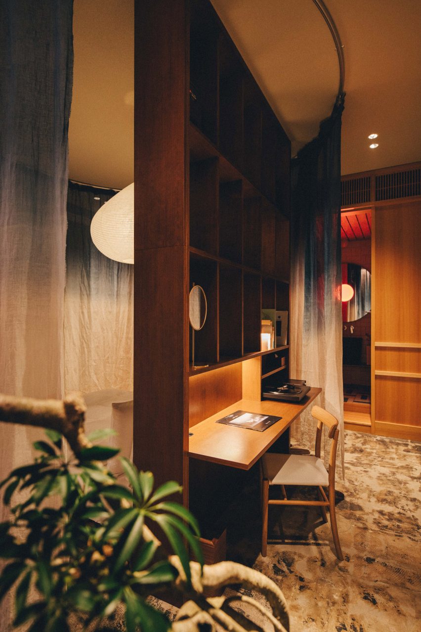
K5 Tokyo Hotel, Japan, by Claesson Koivisto Rune
A converted bank building in Tokyo, which survived bombing during world war two, was turned into a boutique hotel by Swedish studio Claesson Koivisto Rune. The practice aimed to transform the lodging into a warm, cosy place to stay by adding bespoke elements and furniture in deep brown hues.
In each of the 20 rooms, delicate blue ombre curtains surround a wooden desk and cabinet, which guests can use as a private space for personal activities. Similar hand-dyed curtains in blue and white colours also frame the beds.
Find out more about K5 Tokyo Hotel ›
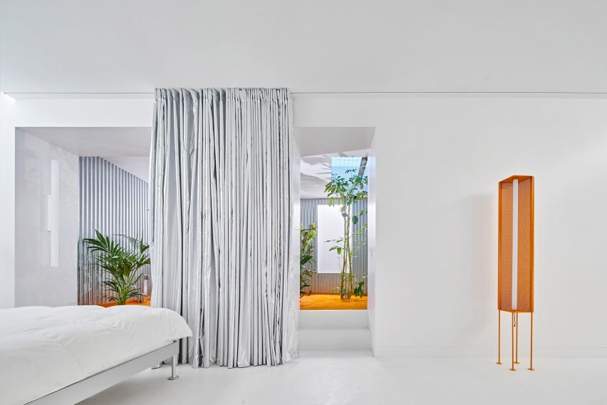
Casa A12, Spain, by Lucas y Hernández-Gil
An indoor courtyard, bright orange furniture and a series of shiny silver curtains are some of the quirky features that Spanish studio Lucas y Hernández-Gil added to enliven the basement of this Madrid apartment.
In an effort to counter the lack of light and space on the lower level, the studio painted the walls white and used dramatic full-height curtains that can be pulled back to seal off the bedroom suite.
Find out more about Casa A12 ›
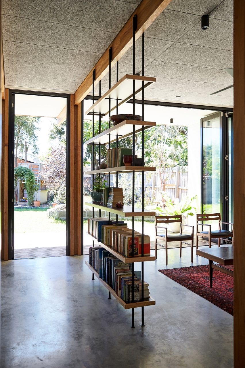
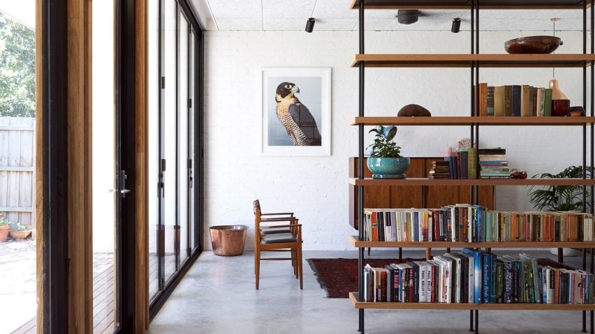
Timber Frame House, Australia, by Foomann Architects
Tasked with refurbishing a single storey home in Melbourne into a home for a young family, Australian studio Fooman Architects decided to keep the building's original wooden beams and use them as decorative, structural elements throughout.
A timber bookshelf in the centre of the home helps to break up the combined living, kitchen and dining area while simultaneously ensuring that natural light can pass through the communal space without obstruction.
Find out more about Timber Frame House ›
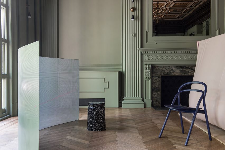
Study Screens, US, by Philippe Malouin
London-based designer Philippe Malouin exhibited a series of 13 experimental room dividers inside the historic interiors of WeWork Bryant Park, a 1902 building by New York architects York & Sawyer.
While some are constructed from pale pink foam or dyed leather, this curved screen is made from perforated metal and acts as a barrier for occupants to sit behind. Its mint-green colour matches the paint on the nearby fireplace and the walls.
Find out more about Study Screens ›
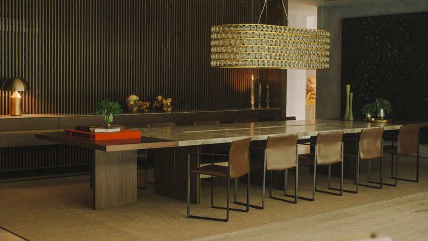
AdH House, Mexico, by Simon Hamui
The interior of AdH House, a two-storey home in Mexico City, is furnished in a range of natural and wood materials including eucalyptus wood, glass, quartzite, marble and brass, giving the place a decadent look.
A slatted screen divider made from wood and brass crosses between the dining room, living room and hallway, giving diners privacy while still allowing light to filter through.
Find out more about AdH House ›
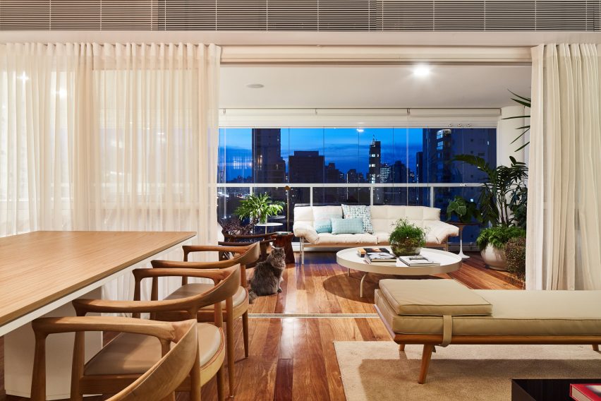
AML Apartment, Brasil, by David Ito Arquitetura
Located in a tall tower that has panoramic views over São Paulo, AML Apartment has large floor-to-ceiling windows designed to maximise views of the city.
Designed by David Ito Arquitetura for a client who wanted to focus on hosting guests and social events, it has a glass curtain wall and a set of sliding doors between the main living and dining areas to create plenty of space to entertain from.
Find out more about AML Apartment ›
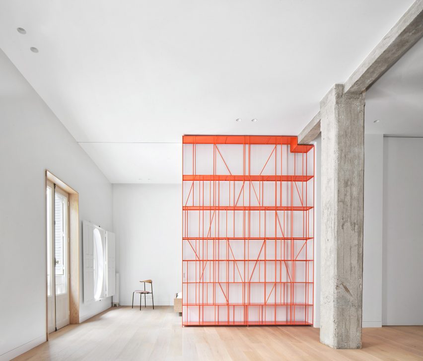
Casa P82, Spain, by Lucas y Hernández Gil
The walls in this Madrid apartment have been exchanged for full-height partitions in a bright pop of orange, which contrasts the rest of the home's muted colour palette.
Set inside a 20th-century building in the city centre, the once cramped apartment has been renovated to appear spacious, modern and filled with light.
Find out more about Casa P82 ›
This is the latest in our series of lookbooks providing curated visual inspiration from Dezeen's image archive. For more inspiration see previous lookbooks showcasing interior courtyards, co-working offices and escapist holiday homes.