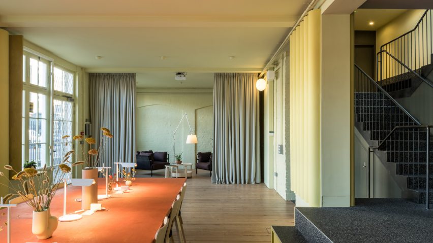
Materials like cardboard and recycled rubber are paired with softly contrasting colours in the London office of Bakken & Bæck, designed by local architects Archmongers.
The ambition was to create a distinct identity for the Norwegian tech design agency's London team, but to achieve this in the most eco-friendly way possible.
Archmongers founders Margaret Bursa and Johan Hybschmann felt the best way to make a bold statement was to develop a playful palette of colours, similar to Bakken & Bæck's offices in Oslo, Amsterdam and Bonn.
They selected muted shades of red, yellow and green, creating subtle but memorable colour contrasts.
"The space is flooded with daylight, which helped us choose strong colours to work against the neutral background," Bursa told Dezeen. "We worked with various combinations until we arrived at the right one."
To minimise the carbon footprint of the design, the architects chose some natural and recycled materials.
Fast-growing Douglas fir provides the frames of glazed partition walls, while recycled rubber was chosen for the flooring. Cardboard tubes were also used, to create an unusual scalloped wallpaper effect.
"We found some cardboard tubes that are used for concrete formwork, but we used them to give parts of the space definition and warmth," said Bursa.
The studio occupies two floors of De Beauvoir Block, a workspace community in east London.
The lower level offers conference and lounge spaces, while the upper level contains an office and three smaller meeting rooms.
Curtains and colour-blocking help to create definitions between different zones.
On the lower level, the red conference table stands out against the mint-green walls, while the two lounge spaces are characterised by deep purple tones.
Upstairs, the same shade of red draws attention to the meeting rooms. The effect was achieved using natural wood stains.
In the office, ceiling beams and surfaces are all painted the same shade as the walls, while a small kitchen features dark fronts and a monochrome terrazzo surface.
"We focused our efforts sourcing a materials palette that is sustainable and hardwearing, but also enduringly beautiful," said Hybschmann.
The Archmongers duo often use colour to add an extra layer of interest to their projects, with examples including a renovation in the modernist Golden Lane Estate and a tile-clad house extension.
Here, acoustics were also an important consideration. The rubber floor and textile wall panels help to dampen sound.
Other details include angled ceiling mirrors, which provide visual connections between spaces, and furniture by designers including Alvar Aalto, Verner Panton, Barber Osgerby, and the Bouroullec brothers.
"Our design evokes a homely environment rather than a conventional workspace," added Hybschmann.
"We were mindful of the need to coax people back from their home offices, through providing attractive, comfortable spaces that encourage collaboration."
Bakken & Bæck describes the space as "our shared home-away-from-home".
"It plays a huge role in how we socialise," said the team. "We gather daily for lunch around the bespoke table on the ground floor, use the snug as a place to connect with other BB offices over a game of Mario Kart, and on the first floor we are lucky to have a plant-filled space with a lot of natural light where we get the work done."
Photography is by French + Tye.

