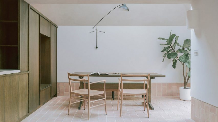
Umber-coloured oak joinery divides the interior of this end-of-terrace home in London's Willesden Green, which has been extended and refurbished by local architecture firm Studio McW.
The two-storey Aperture House now features an additional pitched-roofed volume at its rear, that can be accessed via the main home or a second, less formal entrance set at the side of the property alongside a small planted courtyard.
The residence's owners, a journalist and a psychiatrist, worked from home throughout the coronavirus lockdowns of 2020 and grew to dislike using their kitchen, which was visually cut off from the rest of the house and the outdoors.
They tasked Clerkenwell-based Studio McW with establishing a more versatile "post-lockdown" extension that can be used for cooking, dining, working and entertaining.
Studio McW's approach sought to find a middle ground between a more sequestered layout and a vast, open-plan space, which can often feel impersonal according to the firm's director Greg Walton.
"I think lockdown has certainly compounded the failures of modern open-plan living," he told Dezeen.
"Open-plan layouts offer little privacy and occupants can feel a bit lost in the room. Residential architecture needs to work harder to meet new demands."
In the case of Aperture House, this is achieved using blocks of dark-stained oak joinery. The largest is a cabinet, which is nestled beneath the eaves of the roof and acts as a divider between the external entryway and a small dining room.
At its centre is a rectangular opening that offers a place to perch and remove shoes on one side, while in the dining area it acts as a reading nook and an additional seat when hosting larger gatherings.
"By using joinery to break up the spatial layout you have the opportunity to create, in the same room, separate spaces to eat, cook, welcome visitors and relax whilst still maintaining a form of connection," Walton said.
The cabinet transitions into a low-lying oak cupboard in the kitchen, which allows residents to rustle up meals while keeping the garden, guests and each other in sight.
To the side of the kitchen is a series of taller oak cabinets, interrupted by another nook where small appliances like the kettle and toaster can be tucked away to keep the counters free of clutter.
Just in front of the kitchen, Studio McW made space for a lounge area where the owners can retreat to work or relax during the day.
Rather than installing glass doors all the way along the home's rear facade, Studio McW opted to front the extension with a pivoting glazed panel.
"I think the ubiquitous sliding or bifold doors across the rear of a London terrace are becoming an unromantic ideal," Walton explained. "They don't offer places for respite and repose, there is no shadow or play of light."
"In this house, openings in the new extension are set back within deep, angled brick thresholds, which are designed to focus views and draw in light at specific times of the day."
Another example of this is the off-centre skylight that punctuates the extension's roof and casts shafts of light into the plaster-washed interior.
"Just like in photography, the apertures in a property affect focus and exposure," Walton said.
"Often, the act of bringing light into a home is interpreted as putting in as many windows as possible. But in doing so you create all the characteristics of an overexposed photograph."
A growing number of homes are starting to reflect the effects that the coronavirus pandemic has had on people's lifestyles.
Earlier this year, the co-founders of Studiotwentysix added a plywood-lined loft extension to their own family home in Brighton to make room for more work and rest areas. With a similar aim, Best Practice Architecture recently converted the shed of a Seattle property into a home office and fitness room.
The photography is by Lorenzo Zandri.

