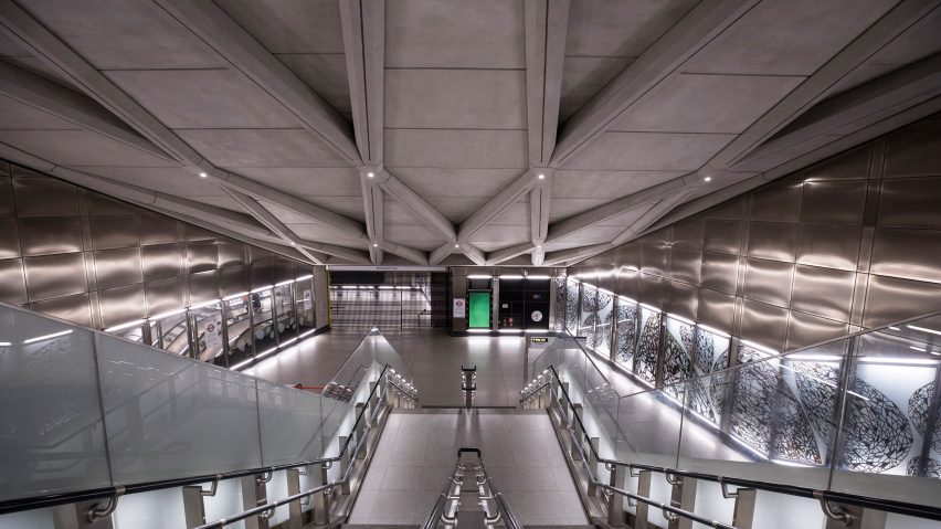
Elizabeth Line "more mannered" than Jubilee predecessor says head of architecture
Ahead of Crossrail's long-awaited opening this month, Dezeen was given an exclusive tour of one of its stations by Julian Robinson, head of architecture for the mammoth subterranean railway in London.
"It wasn't a desire to depart from the Jubilee Line," said Julian Robinson, referring to the 1999 extension of the Jubilee line – the last major addition to the London Underground network known for the ambitious architecture of some of its stations. "This is more of an evolution of the Jubilee Line."
"It's probably more mannered, a more rationalised approach," he told Dezeen, standing in front of a serenely curving concrete wall on the pristine Elizabeth Line platform underneath Farringdon station in central London.
Crossrail biggest upgrade of network for more than a century
On 24 May, three-and-a-half years later than planned and £4 billion over budget, Crossrail will finally open in London. It will be known in operation as the Elizabeth Line.
The trains, which will eventually run 118 kilometres across the south of England from Reading to Shenfield, will carry up to 1,500 passengers each and run every few minutes.
The line will slash journey times and expand London's 160-year-old underground railway network by 10 per cent in the biggest single upgrade for more than a century.
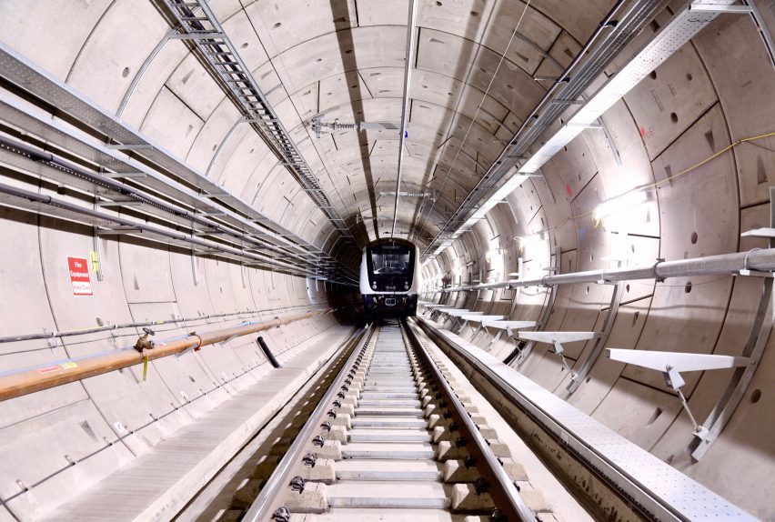
Overall, it is a vast, £18.8 billion feat of engineering that has been decades in the making. Seven million tonnes of earth was excavated to dig 42 kilometres of deep tunnels.
According to Robinson the stations, which were designed by architecture studios including Aedas, Hawkins\Brown, WilkinsonEyre and Allies and Morrison, are both a response to, and a celebration, of the engineering achievement.
"It's not an architecturally designed space, it's not that we decided that yes, we're going to have here a 12-metre diameter tunnel," he said.
"That's not how it works. Everything is sized for the size that it needs to be to cope with the people that need to move through the system."
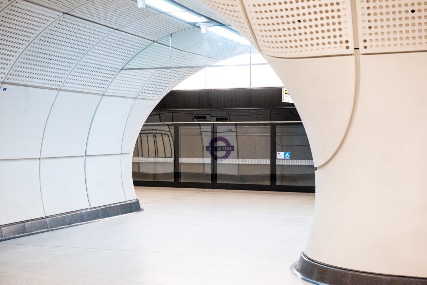
Sometimes the engineering has been used as a design advantage. For example, corners are curved rather than right-angled, eliminating blind turns and reducing the risk of collisions between hurrying commuters.
That was achieved by fixing cladding straight onto the sprayed-concrete tunnels, rather than adding a second layer of sharper-edged concrete as is conventional.
The engineering-first approach is also evident in the aesthetic finish of the stations.
"The choice of materiality really was one of key things the team came up with," said Robinson. "We wanted everything to be self-finished, so it's not lots of painted surfaces, it's raw materials, concrete, reflecting the concrete structure behind not only in its form, but also in its materiality, but in a much more expressive manner."
Robinson is keen to frame the Elizabeth Line as the latest chapter in London's rich transport design story, exemplified by the famous Underground map and roundel logo.
"A lot of the inspiration really is looking back towards the heritage of design with regards to London transport," he explained. "But because of the scale of what this is, it's relatively new in its approach, certainly for the UK. This is new generation, really."
Like many others involved in Crossrail, Robinson worked with British-Italian architect Roland Paoletti on the extension of the Jubilee Line, completed in 1999.
Crossrail designed to have line-wide identity
"[Paoletti] had a vision of having different design teams in each station, but he wanted that common thread, that identity," said managing director of Maynard Design Consultancy Julian Maynard, who was part of the C100 team led by Grimshaw Architects that was tasked with ensuring a consistent, line-wide identity.
"He had left the UK back in the '50s, when there was a very, very strong heritage and identity for transport, and when he came back he thought that had been eroded," Maynard told Dezeen.
The same principle was applied to Crossrail, where again individual architecture studios were commissioned to design each station but using common elements throughout, known more technically as "line-wide components".
"What we're trying to get strategically is that the train is the strongest element of the line identity, so the further you move towards the train the more common the environment becomes," explained Robinson.
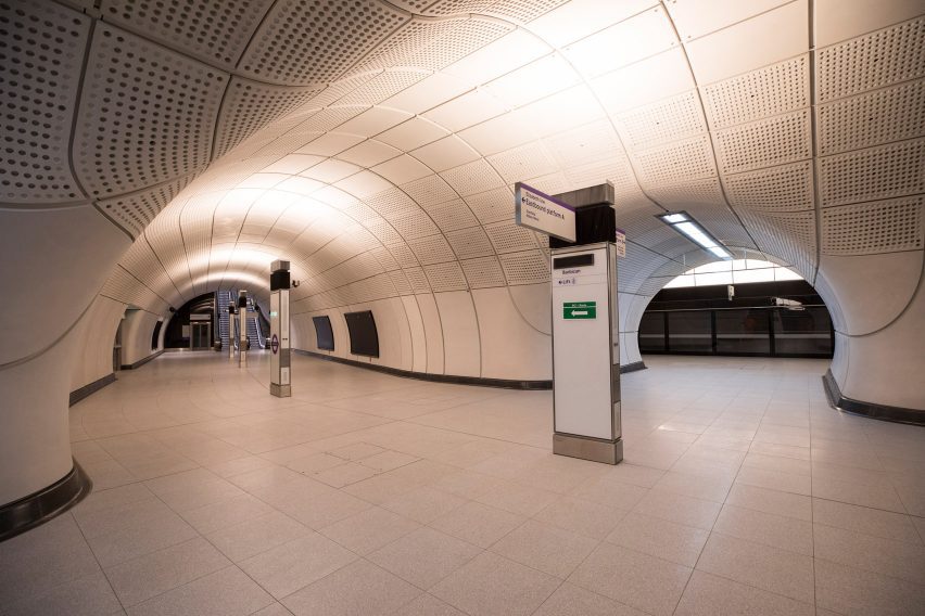
This common environment is defined by features such as the free-standing "totems" tidily housing speakers, lighting and power sockets as well as signage.
Meanwhile, floor-to-ceiling platform barriers bearing high-tech live information screens nod towards the blacks and stainless steel of the Elizabeth Line trains.
The Jubilee Line extension was characterised by the ambitious architecture of its stations – from the cathedral-like Canary Wharf, designed by Foster + Partners, to the Hopkins Architects-designed Westminster, which resembles a subterranean secret base.
However, while some Elizabeth Line stations are impressively vast, they are more understated and strictly functional in their design by comparison, as demonstrated by details like the totems.
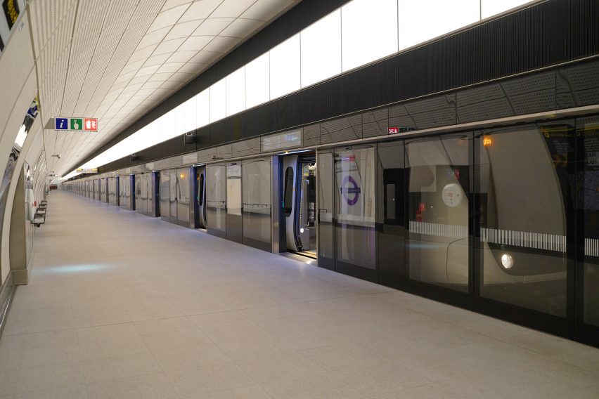
There are also the concrete cladded panels, acoustic to deaden sound. They have a design life of 120 years – the same as the tunnels themselves – in part enabled by being perforated with small holes that allow borescope cameras to inspect behind them without requiring removal.
"A lot of it is about housekeeping and a sense of order," explained Maynard. "And that just gives you a feel of calmness. Once you've controlled all this kit and stuff's not scattered everywhere, that just gives this air of simplicity, I suppose."
Farringdon's Elizabeth Line station, which will see around 10,000 people an hour pass through during peak times, was designed by international architecture firm Aedas.
"It's a space really crafted for movement, reflecting the desire lines of people," Aedas' lead on the project, Soji Abass, told Dezeen at an area just below the ticket hall.
He pointed to an artwork on the see-through walls depicting tumbling diamonds in a nod to the nearby Hatton Garden diamond quarter, with lighting highlighting the incessant trundle of the escalators while other functional elements like cameras and speakers have been suppressed.
This concept feeds into a key, newly developed part of the Elizabeth Line's design: the idea of fast spaces and slow spaces.
Warm lighting encourages slower movement
Here and on the escalators, the intention is to move people through at pace.
But in the ticket halls and at platform level, where passengers must make decisions about where to go, additional signage is combined with environmental cues like indirect, warm lighting to encourage gentler and more considered movement.
That is important because the trains are a huge 205-metres long, meaning that if you exit the platform in the wrong direction, you could be several minutes' walk from your desired destination at street level.
Abass explained that the second ticket hall at this station, near the Barbican, is "designed to be an extension of the urban realm" with large corner entrances and flooring made from distinctive City of London paving stones.
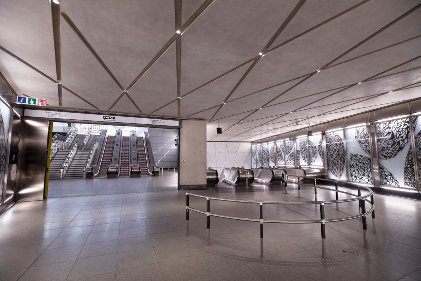
Now all it needs is the passengers. After the delays and budget-busting, Transport for London (TfL) and Crossrail want the Elizabeth Line to be perfect.
While walking along the platform, Robinson spotted a new wheelchair access sticker on the floor.
"I don't know why they couldn't put it wholly in one tile," he muttered, stopping to take a photo of the offending item.
As a full-sized railway carved deep underneath the British capital Crossrail is a first of its kind, but some have suggested it may also be the last.
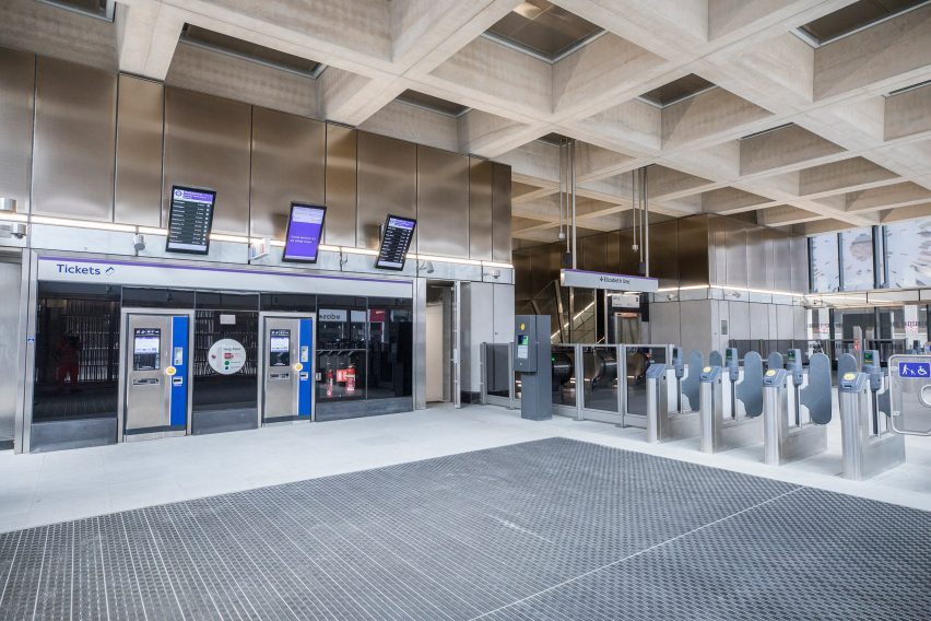
Concerns about the environmental impact of construction in the form of embodied carbon are reaching a clamour, and for a project like the Elizabeth Line the cost is enormous.
TfL has not revealed Crossrail's exact embodied-carbon impact, though it told Dezeen that by replacing older diesel services with modern, energy-efficient trains it anticipates carbon payback will take eight to 13 years.
"You've got to think of the nature of what it is we're doing," said Robinson. "Generally you're only ever going to be doing deep-level tube tunnelling systems in concrete, so you can drive down [the embodied carbon], but you can't necessarily eliminate it."
"But you have to then think that this is all built for a design life of 120 years, it's built with expansion capability so you can put longer trains through without having to extend it," he continued. "So the life of this is not really comparable in the way you often look at embodied carbon within buildings."
He believes we will see another project like Crossrail in London, despite Crossrail 2 being put on hold and the advent of self-driving electric car transit systems like Elon Musk's Tesla tunnels.
"I think we have to because we can't all keep driving around in cars," he said. "I don't see a move away from mass transit systems. If you look across the rest of the world they're getting very busy building more and more of them."
In that case, should the Elizabeth Line be regarded as more of a blueprint for future projects, rather than a standalone achievement?
"I think in many ways, yes," answered Robinson. "I sometimes say that this in itself is one big prototype. The next one will be different, because the technology will have changed, it will have different requirements, but they'll take things from it. It will be the next, next generation."
The photography is courtesy of TfL.