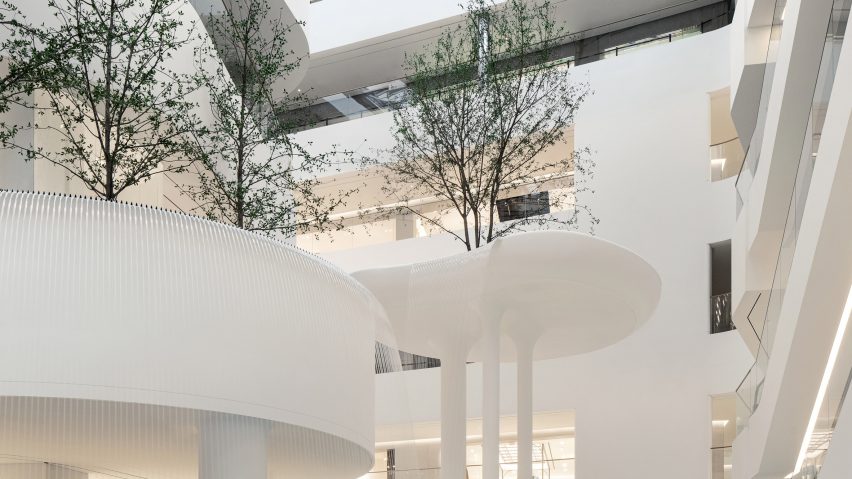
Indoor trees, natural light and a sculptural 12-metre-high waterfall help to create a calming shopping experience inside the Hyundai Seoul department store in Seoul, with interiors designed by Canadian studio Burdifilek.
Hyundai Seoul, which opened last year, is the largest shopping centre in the South Korean capital and spans 89,100 square metres – the equivalent of around 13 football fields.
Toronto-based Burdifilek was responsible for designing three of the 12 floors including a central atrium topped with a lightwell. This extends through the core of the building to funnel sun into the expansive floorplan.
All of the retail spaces are organised around the atrium, which doubles up as a green belt to provide tranquil views of greenery and water from every vantage point.
Burdifilek achieved its "zen-like ambience" through the addition of stilted platforms housing trees and waterfalls that cascade into shallow pools from a height of up to 12 metres.
"Hyundai's vision was to allocate 50 per cent of this floor plate to create public spaces where people can socialise in a much more experiential environment than the typical mall experience has to offer," said Diego Burdi, co-founder and creative director of Burdifilek.
"In the end, our solution was inspired by Seoul's surrounding nature. We chose to bring the outside in and create something unexpected that plays with scale."
The studio designed each floor to have a distinct visual language.
The second floor, housing high-end womenswear, is a neutral gallery-like space with a subdued tonal palette.
Instead of flashy colours, Burdifilek created interest through the use of flowing forms, contrasting textures and layers of reflective and translucent materials.
Mirrored panels installed along the inner edges of the ceiling are rippled like water and create the effect of glancing up at a reflecting pond.
Custom hanging fixtures were installed to create a feeling of lightness while indirect lighting emphasises the sinuous lines of the building.
The third floor features similar sculptural elements to those used on the second floor. But here, forms are bolder, colours are darker and natural materials are juxtaposed with more industrial ones.
Cobalt-blue ribbons are used to suspend clothing racks from an unfinished ceiling, while custom-built mirrored display cases allow the featured brands to take centre stage.
"Our philosophy was to create environments on each floor that would speak to a specific demographic, with a different design language while evoking nature in the spaces in various ways," Burdi said.
"We also strived to create some commonality through sculptural elements that will resonate with the guests and give a physical experience of wandering and exploring."
Burdifilek was co-founded by Burdi and Paul Filek in 1993.
Previous projects by the Toronto-based firm include the flagship for Canadian jacket brand Moose Knuckles, where dimly lit interiors evoke winter's frigid darkness.
The photography is by Yongjoon Choi.

