"I didn't feel the burden of ambitious architecture" says Serpentine Pavilion designer Theaster Gates
Not being an architect allowed Theaster Gates to create a simple structure for this year's Serpentine Pavilion, says the artist in this exclusive interview.
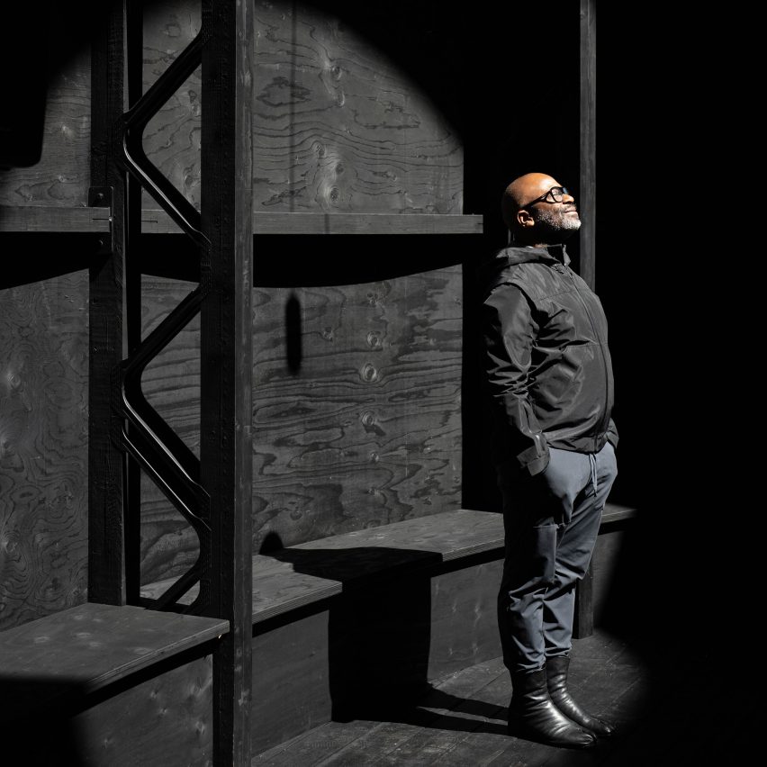
Gates, who was the first solo artist to be given the prestigious commission in its 22-year history, believes that being an artist meant there was no pressure on him to create an elaborate structure.
"This is a moment where an architect can be ambitious with their architecture," he told Dezeen. "But in a way, I didn't feel the burden of ambitious architecture."
"I felt the burden of celebrating faith practices," he continued. "I needed a resonator. I needed a simple structure that would allow sound to amplify."

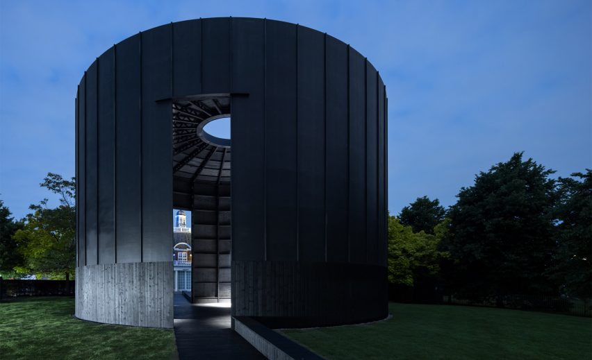
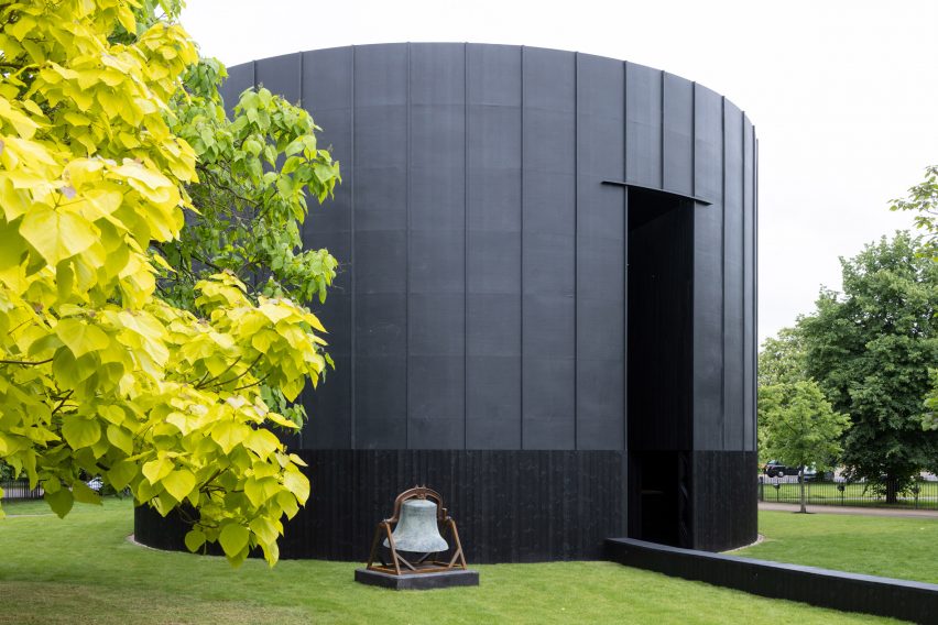
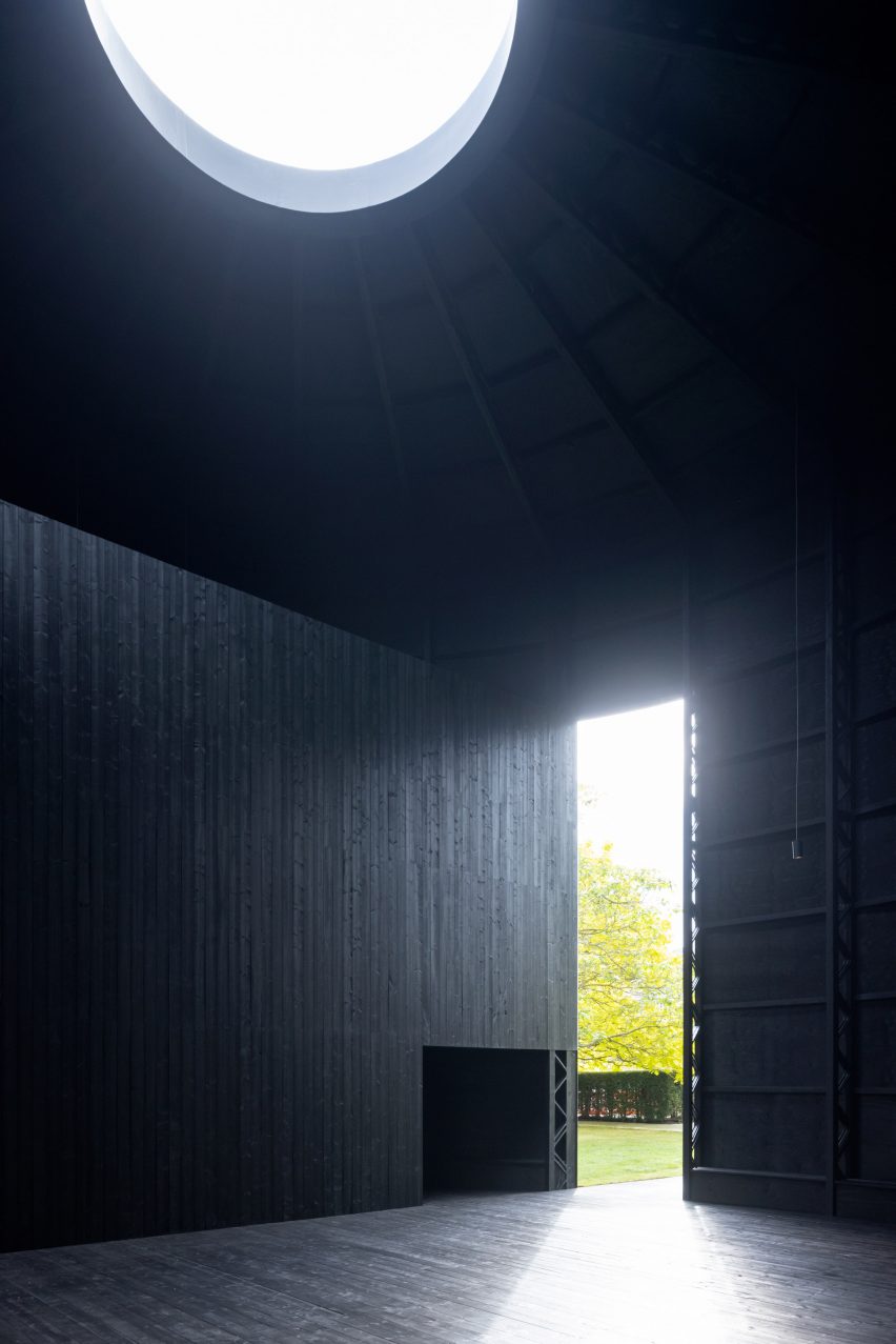
The Chicago-based artist created a simple structure for this year's Serpentine Pavilion, which was designed to be a place of contemplation. The cylindrical form, which was topped with an oculus, was constructed almost entirely of black-stained timber and wrapped in black rubber.
"It feels like we got it as simple as we could," said Gates. "All the bones are apparent. I love showing the skeleton. I wanted the structure to reflect a kind of simple builder's touch."
Gates believes that the pavilions have got more complex since the first one was created in 2000 and that he had an opportunity to take a different approach.

"It seems when an architect is given the pavilion, it's a great win for the firm," he said. "And it's a chance to show off the firm's prowess, its architectural prowess."
"You can see that the projects were getting more and more sophisticated with technologies that can help create pavilions in new and interesting ways," he continued.
Named Black Chapel, the pavilion is entirely black. Gates explained that he wanted the structure to be viewed as one large roof and being a single colour would draw attention to the form. This technique was informed by the work of American sculptor Louise Nevelson.
"I knew I wanted the entire exterior to be a roof as a kind of nod to my dad and a nod to my painting practice – and we got pretty close," said Gates.
"We took cues from Louise Nevelson, she had this idea that if you limit the palette to one colour, people can then pay attention to the form."

The initial design for the pavilion included a dome, but this was lost from the final building during the value engineering process. However, Gates insists he doesn't "miss it at all".
"After the drawings are done, it goes away from you," explained Gates. "Then it goes to council and it has to get approvals, then it's engineering… You don't know if the thing is going to be what you imagined – if it'll remain, but I feel like we kept all the good parts."
Gates worked closely with RIBA Royal Gold Medal-winner David Adjaye, who he describes as his "translator-lawyer-architect", to realise the project.
"David became my artist's advocate," said Gates. "He would have to translate engineering anxieties in the fight. He would have to say: 'Hey Theaster, we have to change this. What are you thinking some options could be? Get back to me today'."
"It was less like an architect and more like a translator-lawyer-architect."
Overall he believes that the process of value engineering undertaken by Aecom engineers with the assistance of Adjaye's architecture studio Adjaye Associates has created a better building than he designed.
"What remains is actually an even more pure building than the thing that I imagined," he said.
Read on for an edited transcript of the interview with Gates:
Tom Ravenscroft: You're the first solo artist to be given the commission. What impact has that had on the project?
Theaster Gates: Well, it seems when an architect is given the pavilion, it's a great win for the firm. And it's a chance to show off the firm's prowess, its architectural prowess.
You can see that the projects were getting more and more sophisticated with technologies that can help create pavilions in new and interesting ways. When I was asked, I thought I'm not an architect, I'm a builder.
But I do know a lot about buildings. And so I wanted the structure to reflect a kind of simple builder's touch And ask what it means if you lead with philosophical intent. I really want the space to disappear. I want it to be a plinth for others. And that structure, it feels like, I got it as simple as we could. All the bones are apparent. I love showing the skeleton. I feel like I could bring humility to the architecture.
Tom Ravenscroft: So over time the pavilions have got more complex and you've returned it to a simple form?
Theaster Gates: This is a moment where an architect can be ambitious with their architecture. But in a way, I didn't feel the burden of ambitious architecture.
I felt the burden of celebrating faith practices and sacred arts' sound. I needed a resonator. I needed a simple structure that would allow sound to amplify.
As I looked at the past 20 years of projects, I thought, where could I insert a finger? And it seemed like, go simple. And enclose it. Make it a chapel, make it round. I always refer to Zumther's pavilion reminds me a lot of conceptualism.
His was the black rectangle, mine is the black circle. Zumthur I think is so advanced in his architectural location that he also doesn't have the burden of proof here. But maybe it's both because we both have this interest in Japan, we both have a sense of minimal strategies that I wanted, I wanted to kind of simplicity,
Tom Ravenscroft: Zumthor's was also black. Was this an important decision?
Theaster Gates: I knew I wanted the entire exterior to be a roof as a kind of nod to my dad and a nod to my painting practice. And we got pretty close.
We took cues from Louise Nevelson. She had this idea that if you limit the palette to one colour, people can then pay attention to the form.
Tom Ravenscroft: This building is clearly a sacred space, why is that?
Theaster Gates: I want to talk about the role that verticality plays in helping a space feel sacred. When I was spending time in Rome, you could go into a room, and the room could be three metres by three metres. But if it was seven metres high, there was something about that chamber, and its verticality. And if it was the more enclosed it was, like wow.
I don't know if it's because it makes you want to look up. Or that in a way we imagine sacred architecture to be more height than width. Often, our psyches are trained to think, wow, if it's tall, it's God.
But I definitely had both the circumference and the verticality as the measures of kind of the beginning. And then I thought, austerity and stripping back. We thought about putting chairs in, pews in. And it was like, no, let's just make it a simple structure. And, let the spiritualness be seen.
Tom Ravenscroft: I heard the design went through some major changes. Are you happy with the outcome?
Theaster Gates: Yeah. After the drawings are done, it goes away from you. Then it goes to council and it has to get approvals, then it's engineering… You don't know if the thing is going to be what you imagined – if it'll remain, but I feel like we kept all the good parts.
Tom Ravenscroft: What did you lose?
Theaster Gates: Initially, I wanted a dome.
Tom Ravenscroft: But that would have been less simple?
Theaster Gates: Yeah, I don't miss it at all. In a way, architects deal with this so much. The rigour is when the ambition meets value engineering – it's how do you maintain a great building when it's 30 per cent over budget?
And you have to make changes. We got to remove the walnut. What are we going to replace that with? Okay, we got to remove the marble, etc. I think what remains is actually an even more pure building than the thing that I imagined.
Tom Ravenscroft: So the building is better than what you designed?
Theaster Gates: Yes it is! So thanks to Julie and the council for making my object better. But I also feel like I would be remiss without thanking David Adjaye and Duncan Wilson and Adjaye Associates because this project needed intelligent quick translation.
David became my artist's advocate. He would have to translate engineering anxieties in the fight. He would have to say: "Hey Theaster, we have to change this. What are you thinking some options could be? Get back to me today." So it was really like he was a lawyer. It was less like an architect and more like a translator-lawyer-architect.
The photography is by Iwan Baan, unless stated.
Dezeen is on WeChat!
Click here to read the Chinese version of this article on Dezeen's official WeChat account, where we publish daily architecture and design news and projects in Simplified Chinese.