Jennifer Morden creates "aspirational" mid-century house with sinister dungeon for Fresh
Production designer Jennifer Morden created a mid-century house to reflect the personality of the flamboyant and misogynistic antagonist in comedy-thriller film Fresh.
Morden and her team built two individual sets in a studio to represent the house for the film, which was directed by Mimi Cave and shot in Canada's British Columbia.
The sets were designed to portray the main floor and basement of a lavish mid-century house that forms a secluded lair for Steve – a seemingly-charming man who seduces women into dating him, after which he traps them in his basement and reveals that he is actually a psychopathic butcher of human meat.
"We wanted to make as much as we could so we could customise it," Morden told Dezeen in a video call from Canada, explaining the decision not to use a real house for the project.
Fresh tells the story of Steve's relationship with Noa, who he briefly dates and subsequently lures to his house. The characters are played by actors Sebastian Stan and Daisy Edgar-Jones respectively.
"The choice to go with a mid-century style house was partly because right now it's really popular," said Morden.
"People love mid-century houses and they've had a big resurgence in modern design. It was also about Steve looking aspirational."
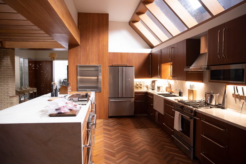
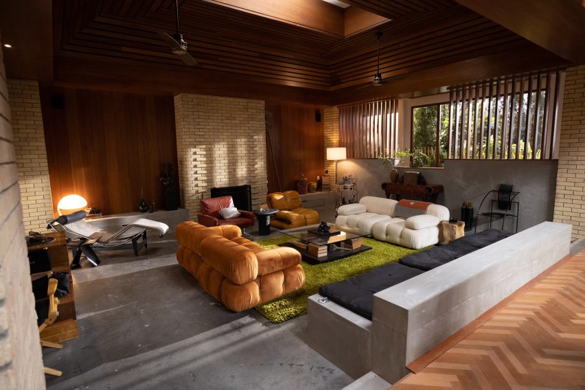
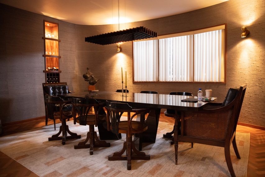
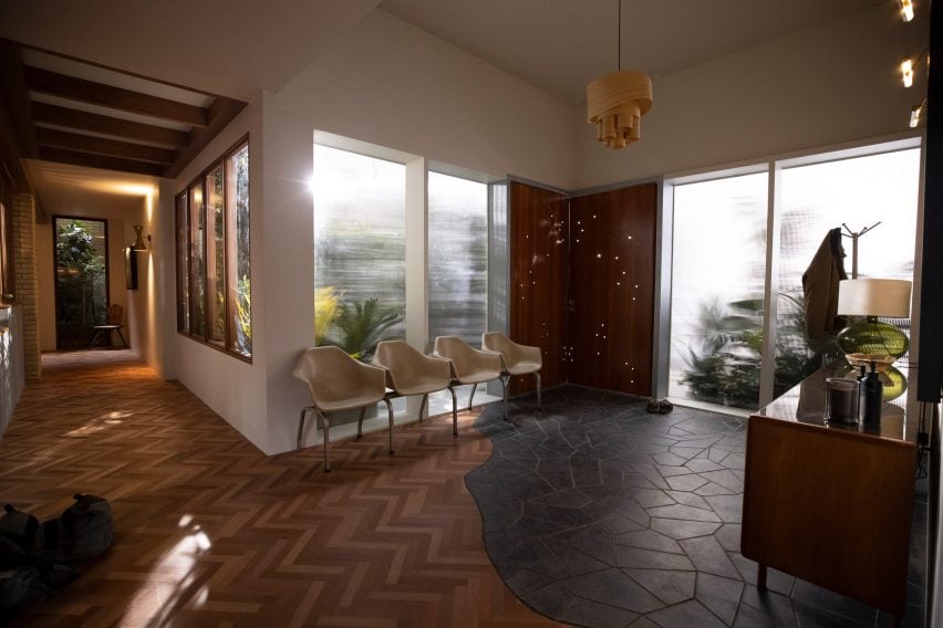
On-screen, the rooms on the house's main floor are presented at subtly different levels from each other in what Morden called a "hierarchy of spaces".
A dining room is seen on the highest level, a kitchen slightly lower down, and then a living room and finally Steve's bedroom.
Plush furniture such as 1970s Camaleonda sofas by Mario Bellini and Eames-like armchairs decorated these spaces and were set against harsher accents including dark wooden cabinetry and built-in concrete seating.
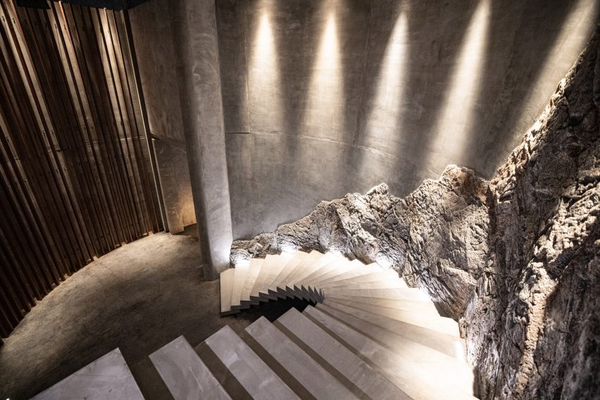
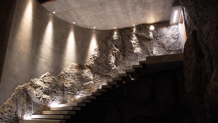
The other set representing the basement featured a concrete floating staircase dug out of rock, which leads to dungeon-like, teak-lined hallways that descend to cells with sunken beds where women are held captive.
Steve's operating room forms the basement's lowest level, where he harvests the imprisoned women's meat and body parts.
"Wherever we see Steve in relation to his victims, he's always at a higher level to them," explained the production designer.
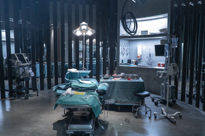
Steve's house intends to reflect his complex and powerful persona, which quickly transforms from outwardly normal to sinister as the drama unfolds, according to Morden.
"I was like, okay, everything we do needs to involve body parts, in some capacity. Every piece of artwork, every piece of furniture and the way the hallways are designed."
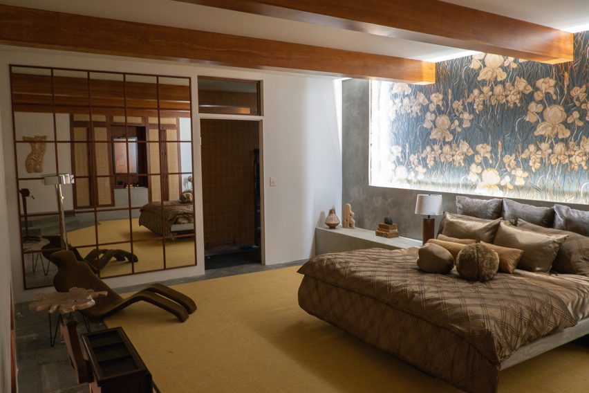
To illustrate this idea, the production designer and her team placed a Michel Ducaroy "body chair" in Steve's bedroom and created faux herringbone flooring from pieces of painted, hand-laid plywood, which Morden said she "really wanted to feel like ribs".
The curved, cave-like basement was informed by fallopian tubes and designed to be a grand auditorium for Steve – a "crazy" idea that Morden pitched in her interview for the project.
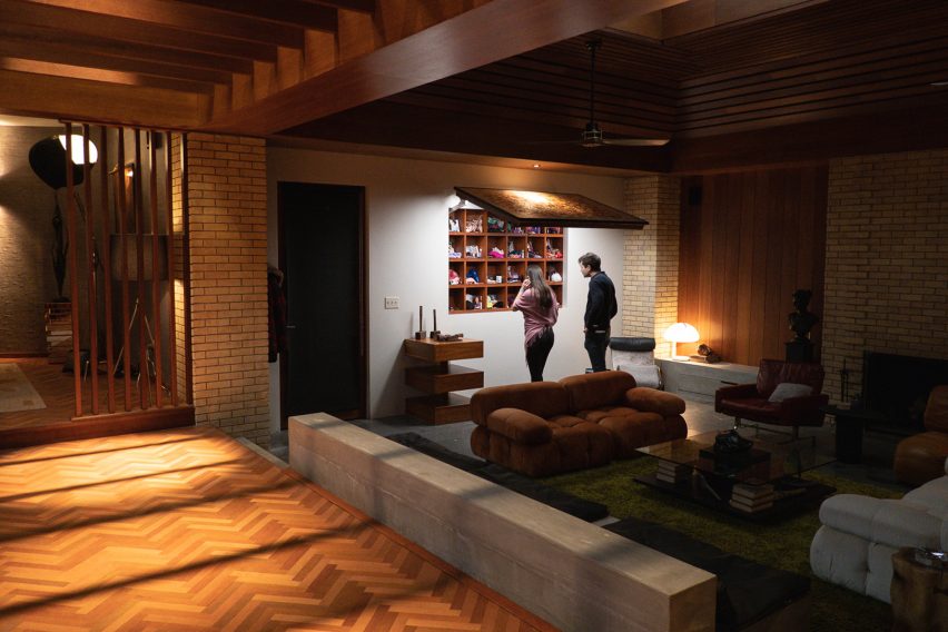
An abstract painting was placed on the living room wall, which actually included hair, teeth and nails on closer inspection. In an early scene, upon arriving at the house before she is drugged and trapped, Noa studies the artwork.
It is later revealed that Steve hides personal items belonging to the captured women behind this painting in boxy cubby holes that mirror the basement cells below.
"Mimi wanted to use the piece of artwork as a little Easter egg [a term for hidden messages in a film] for later because it's the first thing Noa sees and she's drawn towards it," reflected Morden.
"The idea was that if we can draw everything back to body parts then we can start to create the story's subliminal messaging and foreshadow what's to come as much as we can."
The production designer said that it was important to visually connect the main floor to the basement, which was partly achieved by adding wooden elements to the mainly concrete basement and concrete elements to the largely wooden main floor.
Eventually, Cave and cinematographer Pawel Pogorzelski had the idea to add vivid and humorous sunset murals to the walls of the women's cells.
The decision to incorporate colourful carpets became natural after this, linking the basement to Steve's opulent quarters above, according to Morden.
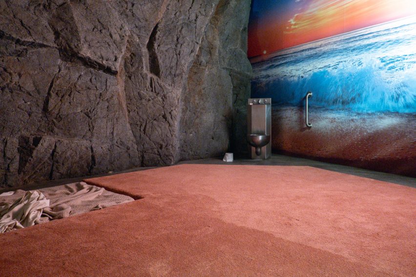
"The idea was, what if we made the basement this space that Steve thought he was gifting to these people?" she explained, referencing Steve's obnoxious and flamboyant character.
"What if we use the idea that this misogynistic and unaware male was like, 'I'm going to create a room that's going to feel so nice for my victims?' What would he put in there?"
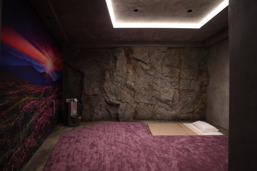
Cinematographically, Fresh also has a warm and fleshy colour palette of reds and oranges throughout, which nods to its graphic storyline.
"I think for me, the biggest thing is just telling people to find all the Easter eggs in the film. There's so much repeated imagery, especially around body parts," concluded Morden.
Other recent film and TV productions that feature architecturally-centred set design include Oscar-winning The Power of the Dog and BBC drama The Girl Before.
The images are courtesy of Jennifer Morden.
Project credits:
Director: Mimi Cave
Writer: Lauryn Kahn
Production designer: Jennifer Morden
Set decorator: Stephanie Ajmeria
Set designers: Peter Stratford and Amanda De Castro
Cinematographer: Pawel Pogorzelski