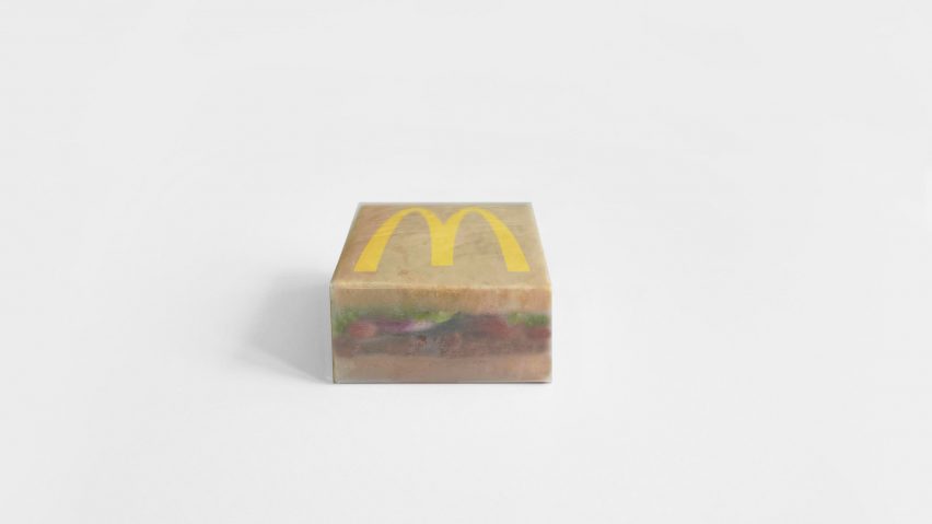
American musician Kanye West, now officially called Ye, has collaborated with Muji industrial designer Naoto Fukasawa to reimagine the packaging at fast-food chain McDonald's.
The rapper's simplified packaging was printed onto a brown, translucent-looking sheet, giving it a muted look that starkly contrasts the fast-food chain's brightly coloured packaging.
It features two bun halves sandwiching a McDonald's burger filled with lettuce, tomatoes, onions and a slice of meat. The iconic golden arches M logo is on the top of the box.
Design part of official McDonald's collaboration
Ye took to Instagram to announce the collaboration by posting a picture of the new McDonald's packaging above the caption "next week it's the fries" – a lyric from his hit song Gold Digger. He has since deleted the post, as he does with all Instagram posts.
Although information about if and when the packing will be rolled out has so far been kept under wraps, the fast-food chain confirmed with Dezeen that the partnership is official.
Fukasawa said that the design process for the packaging redesign with Ye was relatively "simple". The industrial designer sketched out Ye's visions and then sent him the drafts.
"There was only a few simple exchanges of presentations," Fukasawa explained. "When Ye talked about his thoughts, I immediately translated them into ideas and visualise them."
"He saw my simple sketches immediately after Ye expressed ideas to me. He looked at it and replied with a short message saying something like 'awesome' or 'excellent'," he continued.
"A simple, high-quality, short dialogue was exchanged through the design process."
"Ye wanted to explore the food and kitchen field"
According to Fukasawa, Ye, who recently launched his first music-playing device, had been keen to tap into the food industry for a while.
"Ye started asking me in the summer of 2020 to design food and juices and their packaging," Fukasawa told Dezeen.
"He also asked me to design cafes and bars where people could eat and drink," he said. "It was easy to sense that Ye wanted to explore the food and kitchen field."
The rapper already has a successful clothing and footwear line called Yeezy as well as a 10-year partnership with fashion brand Gap.
McDonald's has been simplifying its packaging
Over the past couple of years, McDonald's has launched a series of simplified restaurant and packaging re-designs.
Last year, branding agency Pearlfisher redesigned the chain's packaging to incorporate illustrations of the restaurant's classic menu items.
Pearlfisher's branding replaced the "striking and in-your-face" packaging designed by branding agency Boxer which had appeared on the brand's food packaging since 2016.
Several McDonald's restaurants including "the ultimate McDonald's" on Times Square have also been revamped in recent years, in an attempt to update the brand's image.
The image is courtesy of Naoto Fukasawa.
Dezeen is on WeChat!
Click here to read the Chinese version of this article on Dezeen's official WeChat account, where we publish daily architecture and design news and projects in Simplified Chinese.

