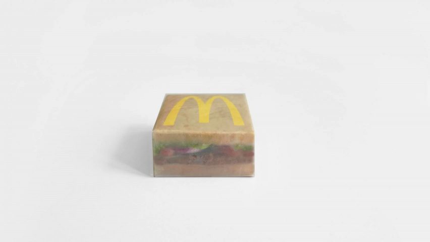
In this week's comments update, readers are discussing Kanye West's redesign of fast-food chain McDonald's packaging and other top stories.
The packaging that West designed in collaboration with industrial designer Naoto Fukasawa, was printed onto a brown, translucent-looking sheet, giving it a muted look that starkly contrasts the fast-food chain's normally bright colours.
"Lots of ridicule coming from people who don't even eat McDonald's anyway"
Some readers are not impressed by the new packaging, which features two bun halves sandwiching a McDonald's burger filled with lettuce, tomatoes, onions and a slice of meat.
"It looks like they just wrapped a burger in thin butcher paper, which, come to think of, is an infinitely better design," said James.
RVA_101 disagreed: "Lots of ridicule coming from people who don't even eat McDonald's anyway," the reader said. "I don't think the packaging is offensive, and it's in line with most of the rebranding efforts other fast food chains have been taking on recently."
"Burger King must be talking to Brad Pitt as we speak," added Milton Welch.
What do you think about the packaging? Join the discussion ›
"How many birds can you count?"
BIG's Biosphere treehouse at the Treehotel in Swedish Lapland was also one of the main discussion points for readers last week.
Pa Varreon was intrigued: "Are the birds fed by the hotel or on their own? Must be a lot of noise and poop. Interesting experiment anyway."
"There is nothing appealing or pleasant-looking about a structure that does not fit into nature and destroys the natural environment," said Ken Steffes.
"Let's measure the success of this project by the level of occupancy," said Arhmatic. "How many birds can you count?"
Would you stay in this hotel? Join the discussion ›
"As a step in the right direction... maybe?"
SOM's and Burckhardt+Partner's design for a hybrid mass-timber and concrete office block on the United Nations campus in Geneva got the conversation going among readers.
"Beautiful work," said Z-Dog. "The integration of services into the ceiling is perfect as so many exposed timber structure projects don't get it right," he continued. "The application of the facade system is really as good as it gets."
"Let's hope the facade lasts longer than their building for JTI just a stone's throw away," added JayCee.
J.C. White Cloud is unsure: "As a step in the right direction... maybe? Still way too much use of concrete and steel that is simply not necessary for mass timber architecture at all, which in turn, downgrades the carbon footprint of the architecture's sustainability greatly."
What are your thoughts on this office block? Join the discussion ›
"World's biggest IHOP"
BIG's proposed design for the National Juneteenth Museum in Fort Worth has sparked debate among readers, who don't seem to be convinced.
Simply Indulgence wasn't a fan of the design: "Looks like 12 1960s style churches all glued together in a circular formation."
"Not seeing much sectional dynamism that can frame and orient visitors' exhibition experience," said JZ. "The renderings really do convey a "tent"-like space (Google HQ?) where all subdivisions of space float tenuously within."
"World's biggest IHOP," agreed Jim Angrabright.
Do you like the proposal? Join the discussion ›
Comments update
Dezeen is the world's most commented architecture and design magazine, receiving thousands of comments each month from readers. Keep up to date on the latest discussions on our comments page.

