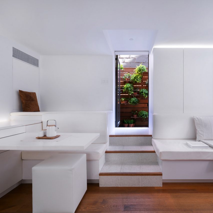
New York architect Martin Hopp aimed to make the most of his dark, irregularly shaped apartment by using lots of white and creating clever "micro elements" like a retractable dining table.
Encompassing 700 square feet (65 square metres), the Hopp Apartment is located on the garden level of a 1930s, multi-storey building in the city's Chelsea neighbourhood.
The unit has various limitations and idiosyncrasies due to renovations that were made to the building's foundation.
"Its odd layout and challenging features of exposed foundation walls and large structural columns were further complicated by being partially submerged below grade and hemmed in by foundations," Martin Hopp, who runs the eponymous local studio.
"This gave the apartment a subterranean feel that only allowed for brief moments of natural daylight."
Hopp set out to introduce a feeling of lightness and brightness, along with maximising space by using built-in millwork and flexible "micro-elements" that enable openness, privacy and multi-functionality.
In the L-shaped social area – which accommodates cooking, dining and lounging – he and his team lined the walls with all-white cabinetry.
Built into one spot is a "rotating table" that can be easily tucked away when not in use. The team also added a folding door that forms a separation between the kitchen and the rest of the room.
Across from the dining nook is a living room with a built-in, white sofa. Between the dining and lounge space are steps to the unit's front door, and beyond it, a wooden deck.
The bedroom is located just off the kitchen and is fitted with simple furnishings and ample storage space. To the other side of the kitchen is a corridor that leads to a bathroom and an office space.
The bathroom features shelving and backlit glass panels that were made possible by the discovery of a two-foot-deep cavity during demolition. The discovery "gave us the opportunity to think creatively about how to use the space", the design studio said.
Similarly, the team got creative when designing the office, which was formerly a large closet. In addition to serving as a work area, the space now doubles as guest quarters, owing to the insertion of a Murphy bed designed by Hopp.
Privacy is provided by sliding wooden doors, along with a pivoting door that extends across the hallway.
"A slightly oversized closet was an opportunity to create a multi-functional space that could be guest room, home office and storage area all at the same time," the studio said.
"Conceived of pre-Covid, the value of the multi-functional spaces have proven invaluable."
In terms of materials, Hopp and his team used an abundance of white oak, which is found on the floors and walls. Only oil was used to protect the wood and enhance its grain.
Additional finishes in the apartment include lacquer, fabric, terrazzo, stone and metal.
"Creative lighting strategies work as additional micro-gestures to make the space feel more functional and pleasurable," the team added.
Other small apartments with space-saving strategies include a micro apartment in Ecuador that features a central organizing element with hidden furniture, and a tiny London residence that has an elevated sleeping area wrapped in translucent panels that reference Japanese shoji screens.
The photography is by Fei Liu.

