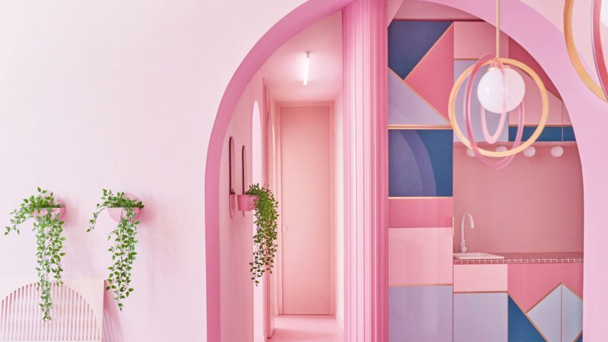
Ten playful pink kitchens that use colour in unexpected ways
From the bubble-gum-coloured cabinets of a Tokyo apartment to the rosy mosaics found in a modernist Grecian villa, our latest lookbook rounds up 10 pink kitchens from the Dezeen archives.
Architects and designers often reach for different shades of pink when they want to add interest and personality to a functional space, such as a kitchen.
Sometimes this takes the form of isolated pops of colour, as seen below in the kitchen islands in a Minsk design office and a creekside home in Lithuania.
Elsewhere, all of the surfaces from the walls and floors down to the kitchen sink are finished tonally in different shades of pink, as evidenced here by two different Spanish apartments.
This is the latest in our lookbooks series, which provides visual inspiration from Dezeen's archive. For more inspiration see previous lookbooks showcasing home interiors that make use of statement windows, board-formed concrete and textured cork-covered walls.
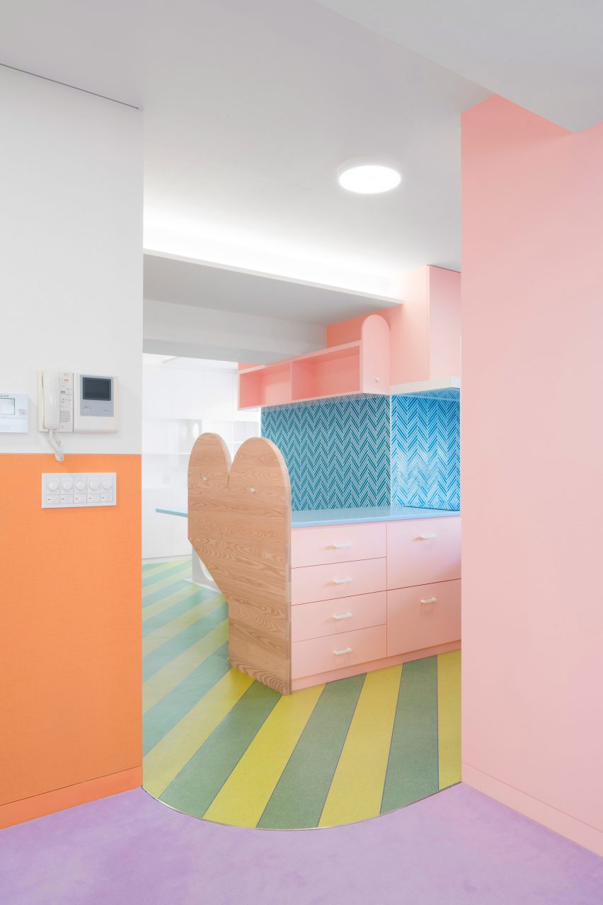
Nagatachō Apartment, Japan, by Adam Nathaniel Furman
A saccharine, bubblegum-pink kitchen suite sits at the heart of this apartment in Tokyo by British designer Adam Nathaniel Furman, clashed playfully with stripes of "watermelon-green" vinyl flooring.
"A lot of the way I described the project as I was developing it was through taste and references to cooking and food, so that the colour scheme became a matter of choosing ingredients for a beautifully calibrated visual feast," Furman told Dezeen.
Find out more about Nagatachō Apartment ›
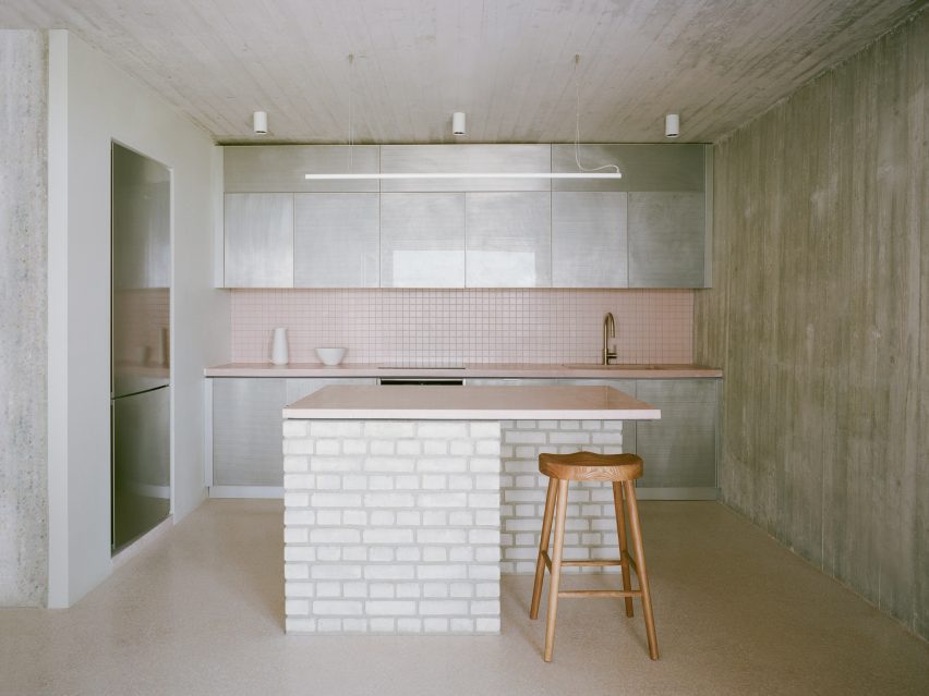
St Minas House, Greece, by Neiheiser Argyros
Neiheiser Argyros used playful colours and materials to complement the existing modernist details of a 1970s villa near Athens, which the architecture practice overhauled last year.
The kitchen's limited material palette of exposed brick and board-formed concrete was rounded off with unexpected touches, such as perforated aluminium cabinets and a dusty-pink mosaic backsplash with matching counters.
Find out more about St Minas House ›
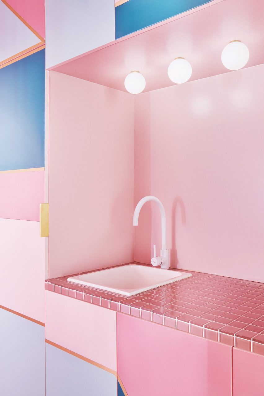
Minimal Fantasy apartment, Spain, by Patricia Bustos Studio
All of the rooms and most of the surfaces in this holiday apartment in Madrid are finished in some shade of pink – all the way down to the kitchen sink.
Local practice Patricia Bustos Studio only broke from the colour scheme when it came to the cupboard fronts, which are interrupted by brass detailing and geometric shapes in denim and baby blue.
Find out more about Minimal Fantasy apartment ›
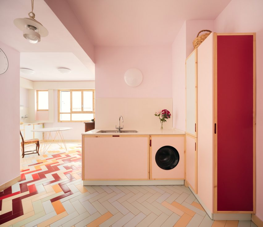
Mixtape Apartment, Spain, by Azab
Pale pink walls and cupboard doors help to jazz up this kitchen in a 1960s apartment, which Spanish architecture studio Azab has overhauled for a retiree in Bilbao.
Mismatched herringbone floor tiles tie the colour scheme together, bringing in little flavours of mint green and cherry red alongside a muted beige to match the timber trim on the kitchen frons.
Find out more about Mixtape Apartment ›
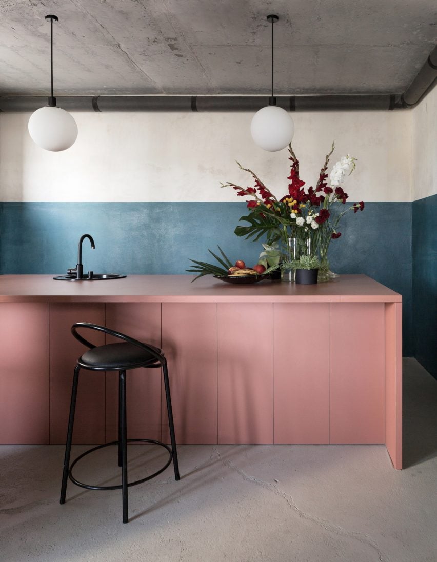
Studio11 office, Belarus, by Studio11
When designing its own workplace in Minsk, interiors practice Studio11 aimed to steer clear of the simple industrial aesthetic favoured by many design and architecture offices.
That meant juxtaposing the interior's raw concrete and plaster surfaces with vibrant accents, such as an abstract portrait by Belarusian painter Zakhar Kudin or a blush-coloured counter, which is set in front of the half-painted blue walls in the shared kitchen.
Find out more about the Studio11 office ›
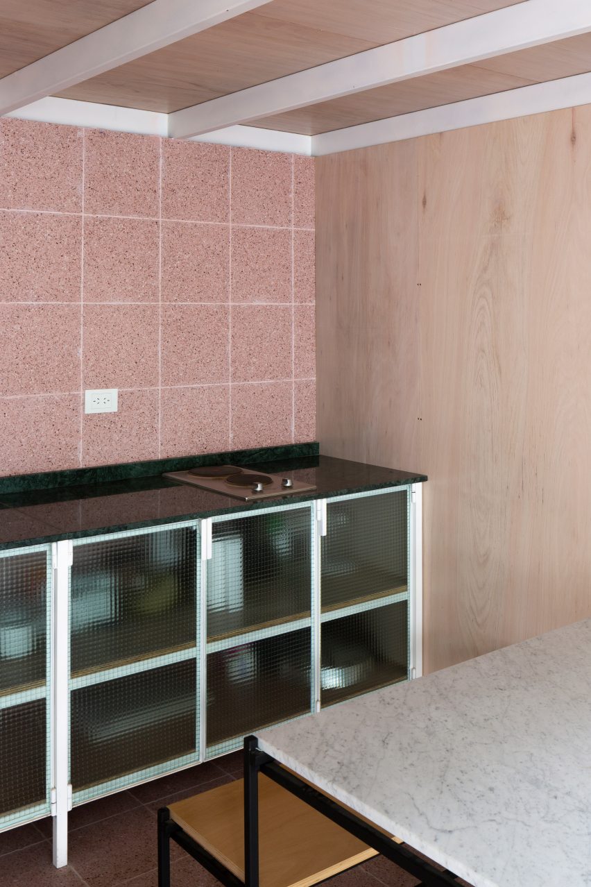
Lerma workshop, Argentinia, by Estudio Nu
Argentinian practice Estudio Nu created this communal kitchen when dividing up its own design studio, set in a former dental mechanics workshop in Buenos Aires, in order to create accessible office spaces for other local creatives.
Here, speckled pink tiles were chosen to match the interior's muted material palette, which combines rippled glass doors with pale timber walls and concrete floors.
Find out more about Lerma workshop ›
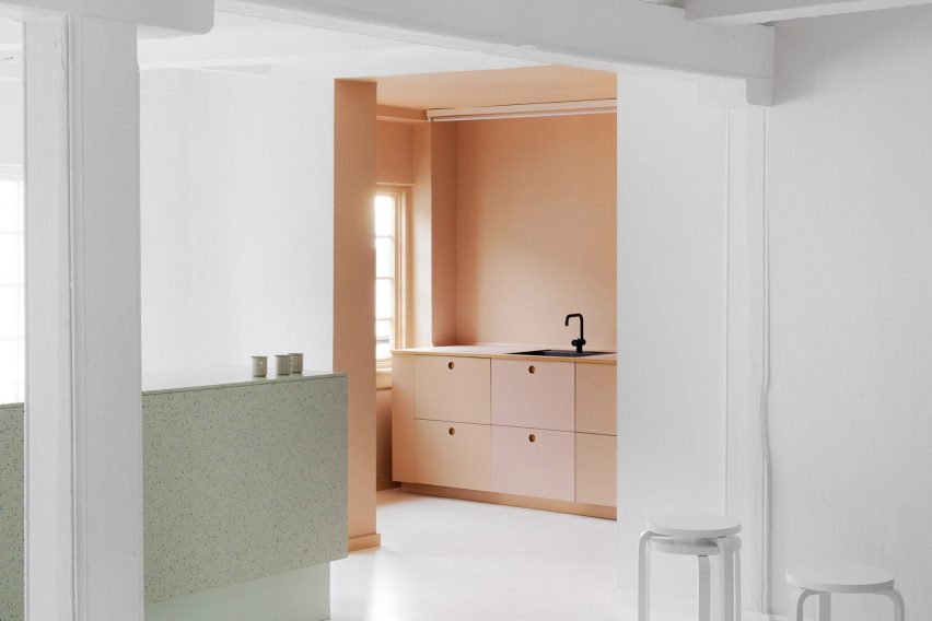
Designers Remix showroom, Denmark, by Reform
Danish brand Reform, which specialises in customising IKEA kitchen suites, took inspiration from the colour schemes and gradients of makeup palettes when designing the break-out area of this fashion showroom in Copenhagen.
Here, kitchen fronts from Reform's Basis collection are finished in progressively deeper pastel shades ranging from peach to blush and dark rose, contrasted against a jet-black sink and tap.
Find out more about Designers Remix showroom ›
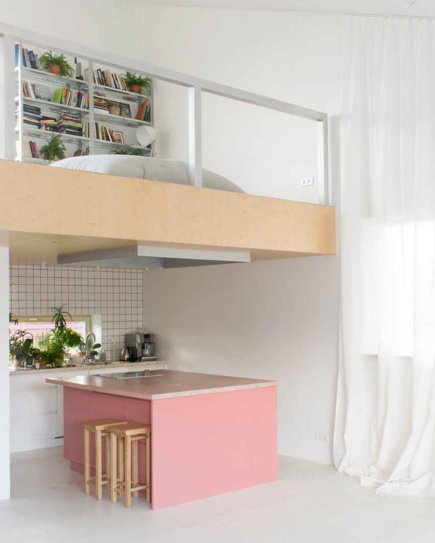
House and the River, Lithuania, by After Party
White walls, floors and ceilings create a bright, modern backdrop inside this creek-side house in northern Lithuania, with character added in the form of antique Soviet-era furnishings and splashes of unexpected colour.
Its monochrome kitchen is tucked under a mezzanine and punctuated by a salmon-coloured island with a terrazzo countertop in ballet-slipper pink.
Find out more about House and the River ›
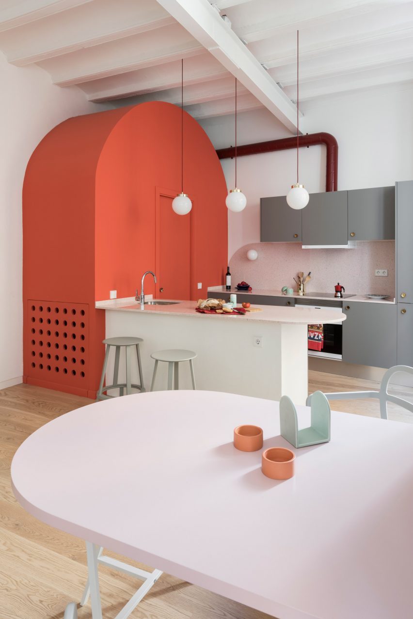
Apartment in Born, Spain, by Colombo and Serboli Architecture
An arched, coral-pink volume squeezes in a second bathroom next to the kitchen of this compact apartment, which is set in a 13th-century residential building in Barcelona's historic El Born neighbourhood.
This same motif is repeated in the breakfast island with its curved worktop made of pink quartz and the matching rose-tinted dining table.
Find out more about Apartment in Born ›
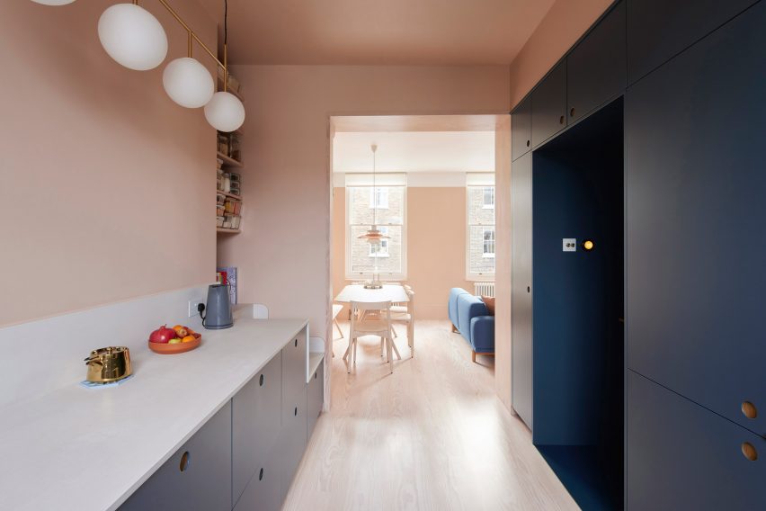
Maison Pour Dodo, UK, by Studio Merlin
Pale, plaster-coloured walls and Douglas fir floorboards are contrasted against smokey blue cabinets inside this flat in London's Stoke Newington, which local practice Studio Merlin overhauled for founder Josh Piddock and his girlfriend.
The interior combines what Piddock describes as a "spectrum of storage", ranging from a hacked IKEA kitchen suite topped with a concrete Caesarstone counter to open, pantry-style shelves squeezed in above a small seating nook.
Find out more about Maison Pour Dodo ›
This is the latest in our series of lookbooks providing curated visual inspiration from Dezeen's image archive. For more inspiration see previous lookbooks showcasing statement windows, board-formed concrete and textured cork-covered walls.