Architensions places sculptural addition on top of a suburban New York home
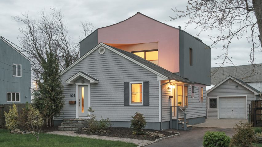
US studio Architensions has designed an asymmetrical addition with pink tile and grey stucco called House on House for a home in Long Island that is meant to "subvert the typology" of the suburban dwelling.
The project entailed the renovation and expansion of a compact, 1960s home in the suburban town of Babylon, New York.
The name stems from the addition of an upper-level volume that "looks as if another house has been placed on top of the house", said Brooklyn-based Architensions, which was founded by Alessandro Orsini and Nick Roseboro.
The project started in 2018, when the owner commissioned Architensions to update his 850-square-foot (79-square-metre) residence in a way that "reflected his adventurous design ambitions".
The client desired a larger, less introverted home that offered a feeling of porosity between the interior, the backyard and the neighbourhood.
"Rather uniquely, the client was not interested in approaching the project from the perspective of resale value," the studio said.
"The idea of the commodification of architecture as a real estate asset did not emerge throughout the development of the design."
After deeply researching the local area, the designers put forward a design that represents a juxtaposition of past and present and "challenges the cookie-cutter, single-family suburban typology typical of the surrounding area".
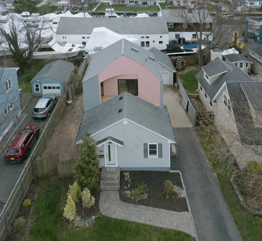
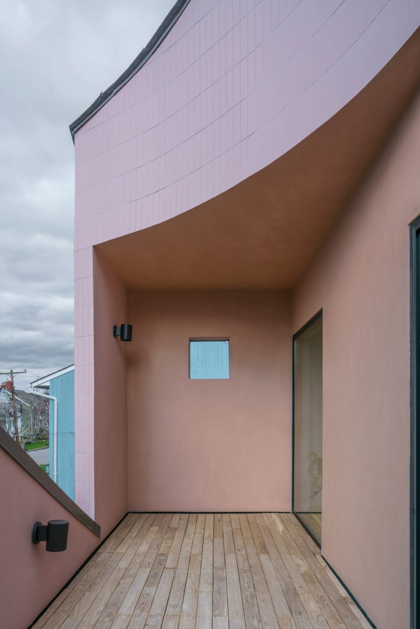
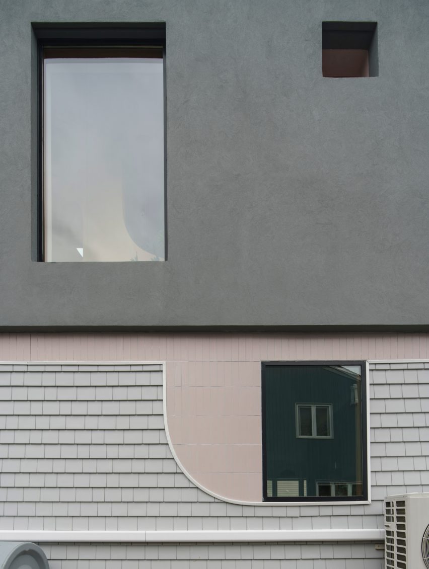
On the ground level, the home's original shape and grey vinyl siding were retained. Up above, however, the team added a sculptural, gabled mass clad in thick grey stucco and smooth ceramic tiles coloured pastel pink.
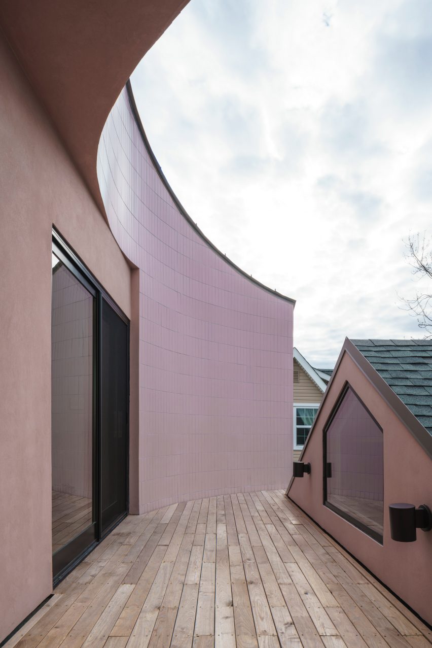
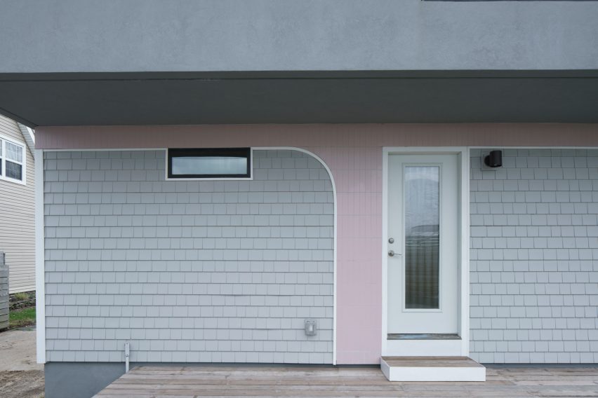
"In several places, the tile descends onto exterior walls of the original home in inverted arcs, arches and swoops, as if the new is slowly overtaking the old," the team said.
The street-facing side of the addition is carved away to form a semi-circular terrace – a subversion of patios found in the area, which are typically oriented toward the backyard.
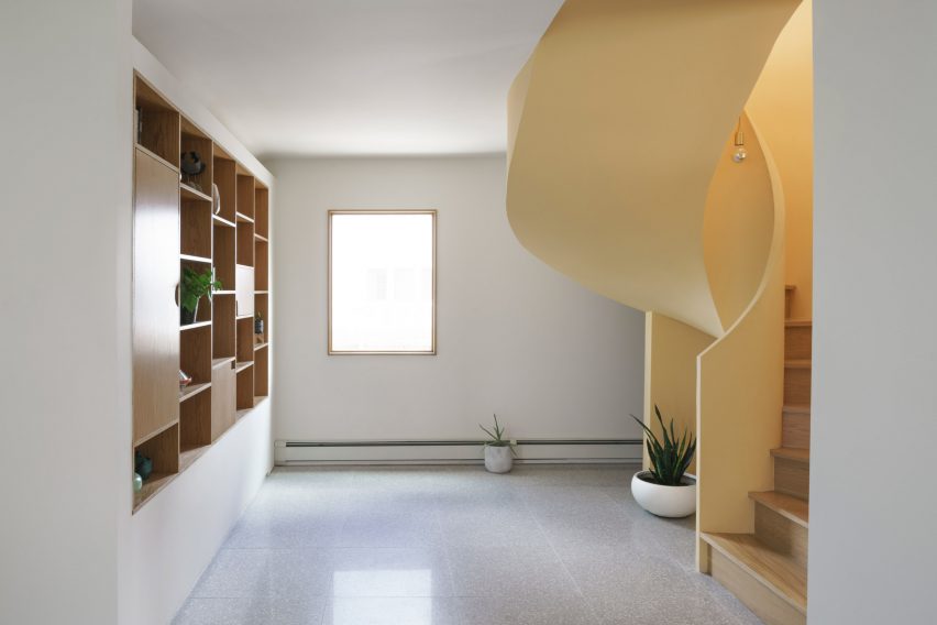
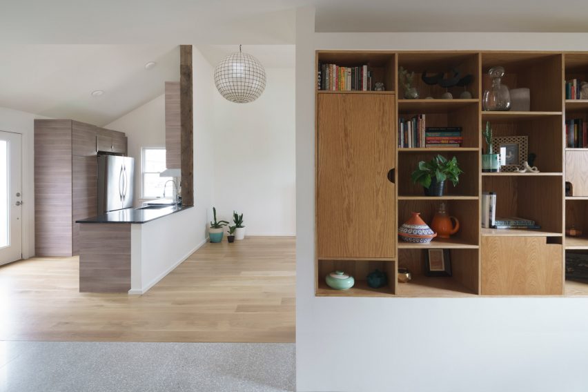
The existing structure was also revamped inside; the kitchen and living room were opened up, and a study area and guest room were added.
A service core houses a bathroom, laundry equipment and a closet.
Windows and doors were repositioned in order to strengthen the relationship between inside and out.
These changes are hinted at on the exterior – as the windows were moved on the existing structure, the tiles from the addition were extended down.
"We introduced the ceramic tiles to establish the duality between new versus existing," said the studio.
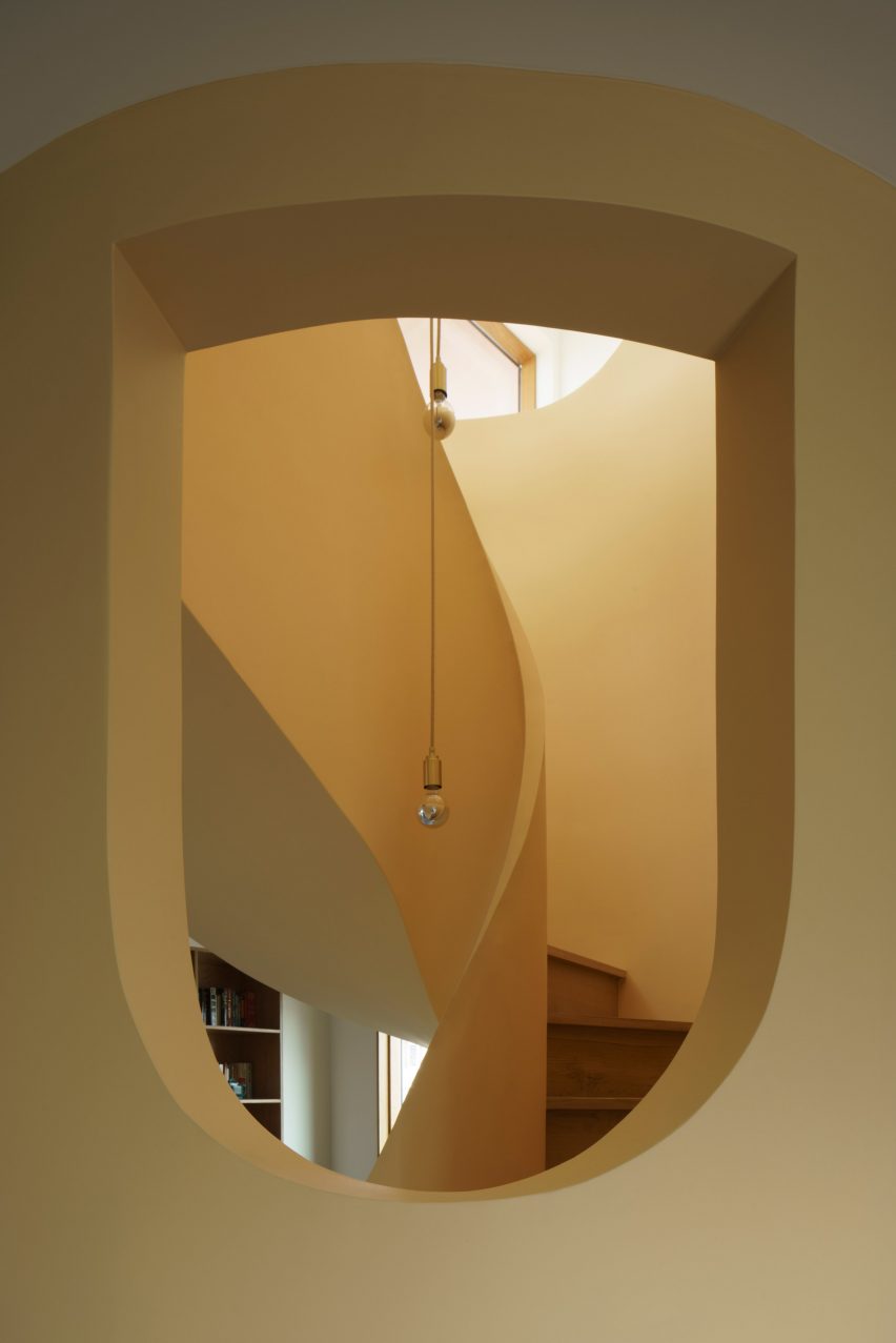
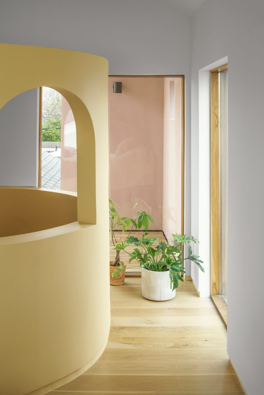
A new, cylindrical staircase – its shape informed by space constraints – connects the ground level to the extension above.
"The stair needed to be compacted to save on space, but it also needed to be part of the layout as an element of separation, without being a wall," Architensions said.
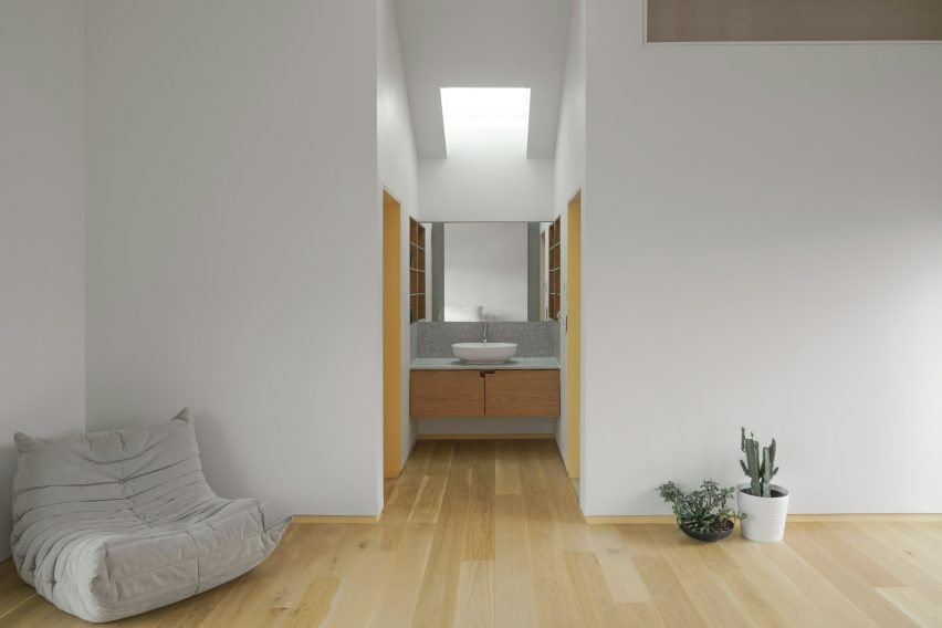
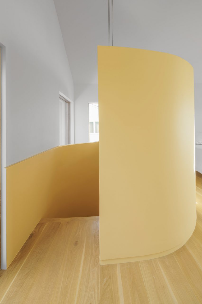
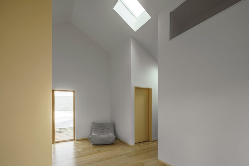
Upstairs, one finds a primary bedroom held within a large, open space. The staircase serves as a partition between the sleeping area and the front patio.
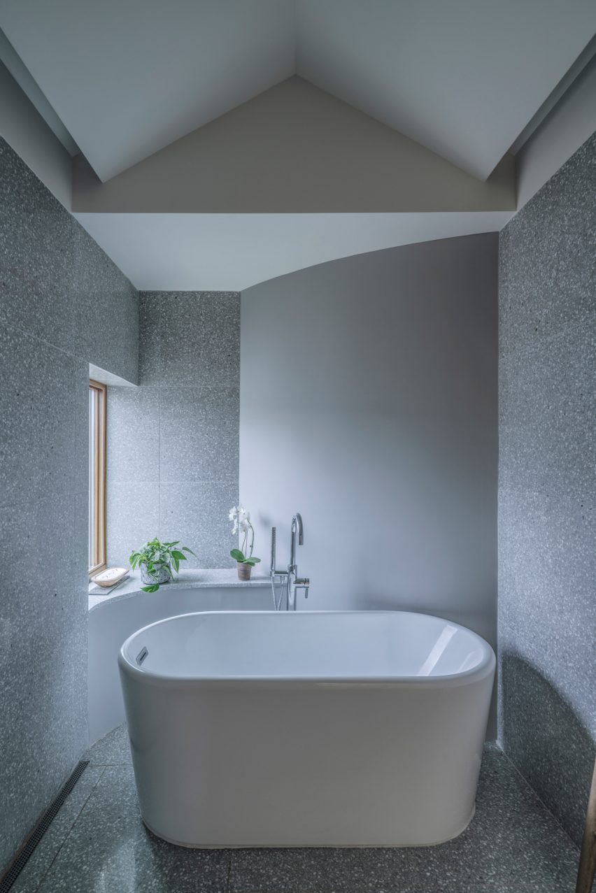
The bathroom features a window bench and grey-and-white terrazzo. A "communal sink" – located in a niche between the bathroom and a walk-in closet – is meant to question "traditional concepts of modesty and privacy", the studio said.
The team used yellow throughout the interior to define spaces, emphasize transitions and brighten up the atmosphere.
"The interior was originally painted white, which conveyed a numbness, or fear of colour," the studio said.
As noted, the project was informed by extensive research, specifically in regard to the "cultural history and architectural taxonomy" of the surrounding area.
The home is near Levittown, a planned community of standardized, affordable homes that were built by Levitt & Sons, Inc between 1947 and 1951 – just after World War II – and served as a catalyst for suburban developments throughout America.
While these communities made home ownership possible for many Americans, they often were not accessible to Black or Indigenous families, said Architension.
Moreover, they tended to have "architectural features and layouts that fostered the isolation and introversion of the nuclear family, rather than community".
The designers noted that the wood-framed homes were made with industrial techniques that did not permit much customization. Generally, variation was found only on the facade via decorative elements influenced by neo-classical and Victorian styles.
While conceiving House on House, Orsini and Roseboro produced a taxonomy of architectural elements – such as windows, porches and roofs – typically found on suburban homes, which they would then hack and remix.
"In order to subvert the typology, we needed to become intimately familiar with it – then remix and subvert it," said Roseboro.
"We explored design solutions that addressed the existing home's relationship with the history, context and vernacular," added Orsini.
"We wanted to discover a new spatial paradigm that would link the architecture of the house to its social narrative."
Architensions has created a variety of projects in New York and beyond, including a tiny writer's studio in a Brooklyn garden and an installation at the 2022 Coachella music festival that looks like a giant, surreal playground.
The photography is by Michael Vahrenwald at ESTO.
Project credits:
Architecture: Architensions
Design team: Alessandro Orsini, Nick Roseboro, Anna Laura Pinto, Gerald Rubia, Giorgia Gerardi
Architect of record: Hany Rizkalla
Structural engineer: Seborga Engineering
General contractor: Thomas James Construction