Peter Saville unveils "subtle but necessary" update to Aston Martin logo
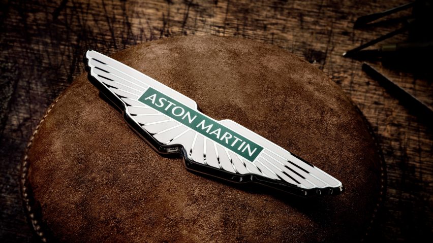
British luxury carmaker Aston Martin has revealed an update to its winged logo created by legendary designer Peter Saville.
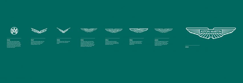
The redesigned logo remains very similar to the previous one, with the most noticeable change the removal of a semi-circular line running through the wings.
"The Aston Martin wings update is a classic example of the necessary evolution of logotypes of provenance," said Saville.
"Subtle but necessary enhancements not only keep forms fresh, but allow for new technologies, situations and applications to be accommodated in the future. The process was one of clarifying and emphasising the key feature of the Aston Martin marque."


Part of an attempt to boost its appeal among younger people, it is the first update to the Warwickshire-based company's marque since 2003.
It will be used on the next generation of sports cars released by Aston Martin, while the brand's Formula One team will bear it on their livery at the French Grand Prix this weekend.
"We are designing to make people fall in love"
Along with the curved line being removed, the outlines of the wing have been made slightly thicker and the green behind the brand's name made a solid colour.
"Because we are designing to make people fall in love, to connect with the hearts and minds of our customers, every object we design at Aston Martin has deep meaning and intention and is created with honesty and emotion," said Aston Martin's executive vice president Marek Reichman.
"As we approach an exciting moment of product evolution, the design of the new wings was no different. Every millimetre of each line – of each shape within the new wings, are drawn forward from the depths of our 109-year Aston Martin creative wellspring."

Aston Martin said the rebrand forms part of a new identity concept it calls "Intensity. Driven" which seeks to highlight its vehicles' reputation for combining speed and power with a sophisticated aesthetic and commitment to craftsmanship.
It has made a short film to demonstrate the idea, showing visualisations of a driver's pupil dilation and heart rate while doing high-speed laps in an Aston Martin Valkyrie hypercar.
The badge itself to be affixed to Aston Martin cars will be handcrafted at Vaughtons, a silversmith studio in Birmingham's jewellery quarter that also produced the Football Association Cup trophy.
Saville took "the wings to another level"
British graphic designer Saville is best known for his work for former Manchester music label Factory Records, which saw him create some of the most famous record sleeves of all time including Joy Division's Unknown Pleasures and New Order's Blue Monday.
"Adding Peter Saville, an icon in British graphic design and an inspirational creative figure to me personally, took our exploration and evolution of the wings to another level," Reichman added.
Saville revealed that he was working on a new identity for Aston Martin in an interview with Dezeen published last October.
"I was a little bit critical of the wings," Saville said at the time. "I thought, the cars are getting more and more modern but the wings still look a little bit mid-century."
Aston Martin was founded in 1913 and has updated its logo eight times. It made a foray into architecture in 2020, working with US studio S3 Architecture to build an angular house in Hudson Valley and later partnering with David Adjaye to design five apartments in the British-Ghanaian architect's first New York skyscraper.
Other recent car manufacturer rebrands featured on Dezeen include efforts by Rolls-Royce, Volvo, Toyota and Nissan, all of which moved to flatter emblems.