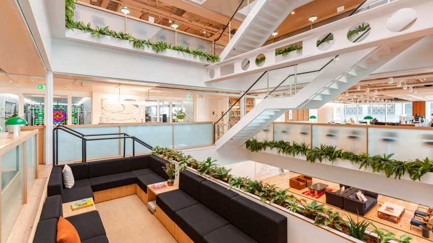
"No one wants a sea of desks anymore" says WeWork's global head of design
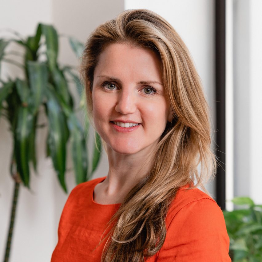
WeWork is designing a more grown-up form of co-working, says global head of design Ebbie Wisecarver, as the brand reacts to the pandemic and puts greater focus on large enterprise clients.
Wisecarver told Dezeen that the workspace provider, which has 756 locations in 38 countries, is moving away from the traditional co-working model in response to the changing demands of its clients.
"A lot of our older spaces had a sea of desks and no one wants that anymore," she said.
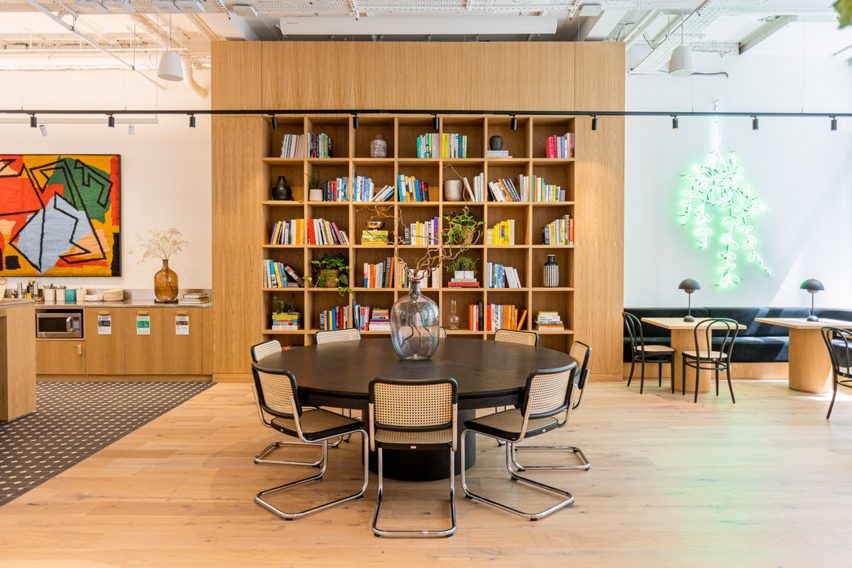
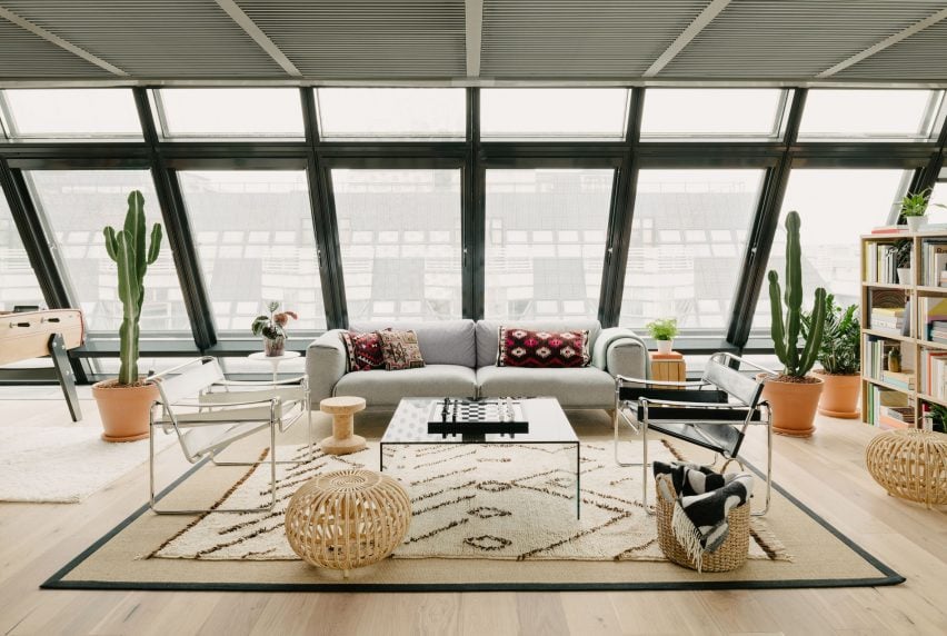
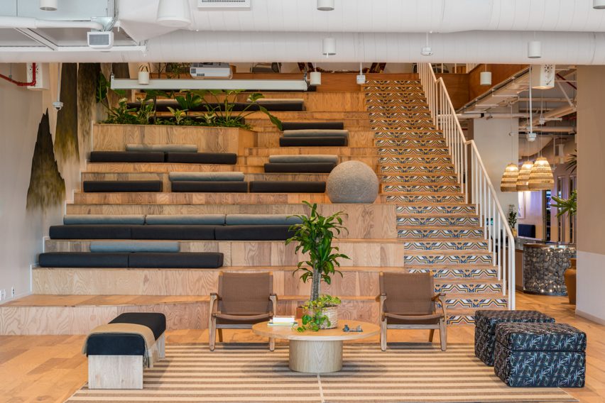
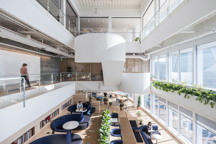
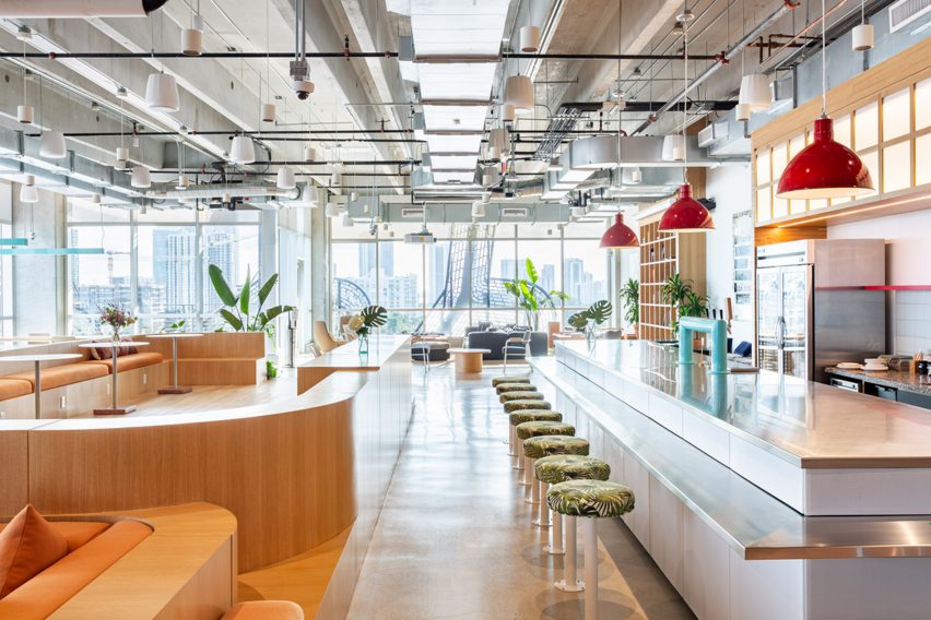
WeWork's current workplace model is more centred around flexibility and collaboration, with a wide variety of meeting spaces, more lounge-style seating and different types of lighting.
"In some of our larger offices we might have had 10 per cent soft seating or collaboration-type furniture, and now it's moving upward of 50 per cent," Wisecarver explained.
"The reality is, as we're moving forward, everyone's grabbing at the solution for the post-pandemic workstyle. What we're trying to do is offer space that can transform based on different needs."
An alternative to corporate headquarters
This change of approach has been partly fuelled by Covid-19, which has ushered in a new working culture that involves more remote working and virtual meetings.
However it also reflects the changing business model of WeWork, which launched as a start-up in 2010 and enjoyed a decade of major investment and rapid expansion before suffering near-collapse after a failed IPO bid in 2019.
In the early years, WeWork's primary focus was on providing desk space for small-scale entrepreneurs. More recently, it has shifted towards serving larger businesses and organisations.
In 2019, large enterprises (LEs) represented approximately 40 per cent of WeWork's clients, but today it's closer to 50 per cent and likely to continue growing.
WeWork offers these companies an attractive package; instead of having to maintain a corporate headquarters, they can rent a state-of-the-art space in a prime location, then equip their staff with All Access membership passes that give them access to any other WeWork around the world.
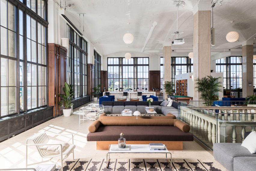
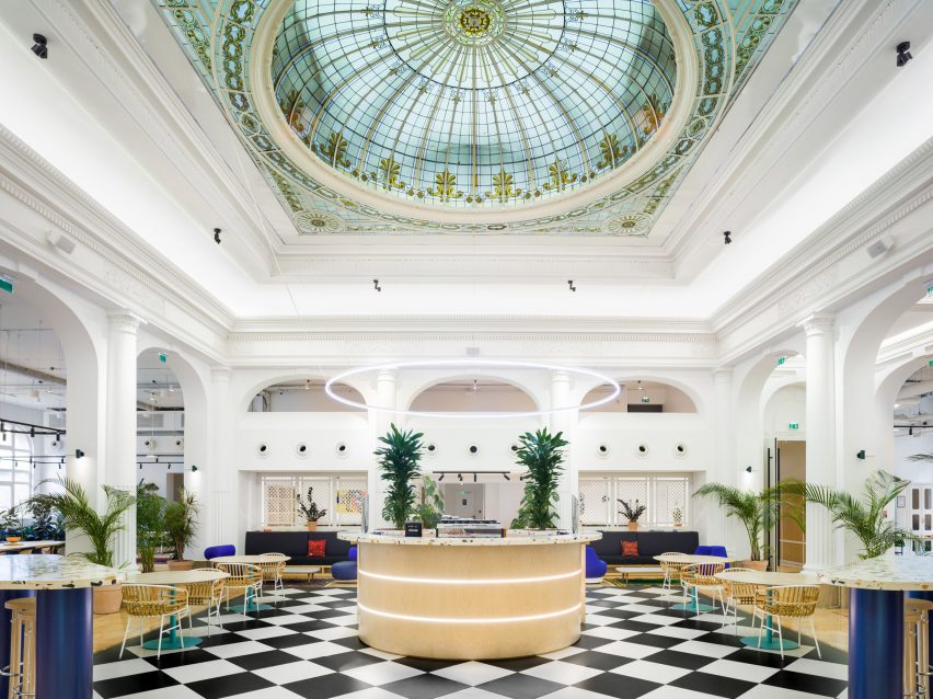
Wisecarver names British electronics retailer Currys – which recently moved its headquarters to the WeWork at 10 York Road, next to London Waterloo station – as an example.
"They have a central hub where everyone can get together and collaborate, but they can also go and meet up in different satellite offices," she said.
"I think that's definitely what companies are gravitating towards."
A new design approach
In designs terms, this has led WeWork to adopt a more neutral and grown-up aesthetic, departing from the playful and youthful style that defined its workspaces in the past.
"While a co-working member might like the liveliness, enterprise members often want a different feel. They might something more formal, or spaces that can be more easily branded," said Wisecarver.
A trained architect, Wisecarver previously worked at Steven Holl Architects and Diller Scofidio + Renfro before joining WeWork in 2015. She was appointed global head of design in 2019.
Under her steer, WeWork has developed a catalogue of design palettes that it can offer to LE clients – with names like New York Loft and By The Sea – to help them create spaces that feel appropriate for their brand.
It has also created a template called Collaboration Hub, which is geared towards companies whose staff primarily work from home and only need to come into the office for teamwork activities.
"As we go through the pandemic, it has been a question of how our spaces can continue to be a destination," she said. "How can our members feel like they're coming in with purpose, and that they have a level of flexibility?"
Read on for the full interview:
Amy Frearson: What is WeWork's design strategy?
Ebbie Wisecarver: WeWork has always been about creating a homey, comfortable environment. That can mean many things, but what we want to create is a high performance space. We want good acoustics and quality space, we want the materials to be soft and inviting, with plants and art, and we want to create a wow factor.
Amy Frearson: How to you achieve that?
Ebbie Wisecarver: You don't only create comfort through the materials, but also through different types of space. We try to capitalise on flexibility. We know that some people want to be able to work in one space but be able to hop into a phone booth to have a private conversation. And they might not want to be there all the time. People need to know that there are various space types for them to work in and that the choice is on them. It's a new way of working for a lot of people and I have certainly seen that in China and Japan, where the work culture is quite different.
Amy Frearson: Do you have a formula that you apply to every location or do you create bespoke designs for every space?
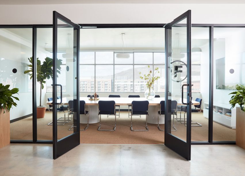
Ebbie Wisecarver: We have a very clear set of standards for our office spaces, meeting rooms and even phone rooms. A lot of it is around lighting, power, data; we need to make sure the spaces function. We're able to be more bespoke in our common areas, and draw from the building and neighbourhood. We want a member to walk into a space and understand it's a WeWork, but not feel that it's a replica of another WeWork.
Amy Frearson: What is your process for ensuring you don't simply replicate what you've done elsewhere?
Ebbie Wisecarver: We make sure we do our due diligence when we walk into new buildings. If it's an older building that has character, we make sure we draw from that. It's also about adding in unique spaces that we don't have anywhere else. And while our meeting rooms are very much the same, they might have a different look and feel.
Amy Frearson: Do you apply the same approach to the furniture you select?
Ebbie Wisecarver: We have standardised sizes with furniture, to make sure they function well. So we do repeat a lot of our meeting room tables, desks and chairs. We want to make sure the tables have integrated power and that we have certain types of chairs and sofas. Where we try to have more fun is with the accessories, the textiles and the feature elements. Like in Japan we designed a kotatsu that is very unique to that country and it's fun, but I don't think it would fit anywhere else. It's about letting that local flavour come through special elements.
Amy Frearson: How does this design approach compare with the early days of WeWork, before the pandemic and before the failed IPO in 2019?
Ebbie Wisecarver Early on, WeWork was very much focused on small-scale entrepreneurs wanting desks and the spaces were really designed around that. The early concepts from Miguel and Adam were using a lot of glass, having transparency so that you would run into people and be able to spark up conversations. But the original WeWorks didn't have the amenities, so from a design perspective some of the older spaces were a bit moody. We also tried some things that didn't necessarily work out; there was a phase when there was a lot of layering and materials, and some of that stuff hasn't really held up.
In and around the IPO, we started thinking more about how our design decisions can be driven by data. We wanted to ensure that spaces were sufficient, and that the new spaces we were designing and building were actually what members needed. Being able to pull data from a specific neighbourhood or market meant we could build the right product instead of just guessing.
From an aesthetic standpoint, this led to our spaces becoming much lighter and brighter. Our original locations probably didn't have the appropriate lighting for an office. Now we have an in-house lighting team who really focus on elevating and layering the light, which wasn't a big part of our design in the beginning. We make sure spaces feel light and fresh, with that more Scandinavian feel.
Now we've moved on from the IPO, our growth has become less focused on co-working and more about serving large enterprise clients, who want something very different. While a co-working member might like the liveliness, enterprise members often want a different feel. They might something more formal, or spaces that can be more easily branded. We've done a lot of these single-member full floors.
Amy Frearson: So a lot of the design shifts have been fuelled by this shift towards more larger enterprise clients?
Ebbie Wisecarver Yes, it was almost like we were having to meet the needs of a new member type, which became an interesting challenge. They wanted to design spaces in their own way but they needed some guidance and strategy. We actually developed a series of palettes – we have By The Sea, Modern Executive, New York Loft, and so on – so that when they came to us, we actually could give them options to design their space in a way that made them feel like it was theirs.
Amy Frearson: How has the pandemic influenced this approach?
Ebbie Wisecarver As we go through the pandemic, it has been a question of how our spaces can continue to be a destination. How can our members feel like they're coming in with purpose, and that they have a level of flexibility?
A lot of our older spaces had a sea of desks and no one wants that anymore. No one is coming back to sit in a giant room with a bunch of desks. That has been one of the biggest shifts. In some of our larger offices we might have had 10 per cent soft seating or collaboration-type furniture, and now it's moving upward of 50 per cent. We have some great examples of members that have taken regular office space and we have transformed it into this thing that we're calling the collaboration hub. The reality is, as we're moving forward, everyone's grabbing at the solution for the post-pandemic workstyle. What we're trying to do is offer space that can transform based on different needs.
We've also introduced All Access membership, which means we're bringing members into other locations. They might be only coming in for two hours, so we have to think about that from a design perspective. How are we improving our wayfinding? Are we providing them appropriate areas with power and comfortable seating?
Amy Frearson: What other design shifts have you made since the pandemic?
Ebbie Wisecarver: There was a period of time where everyone was saying, 'no one's going back to the office'. So our first priority was really making our spaces safe. That didn't just mean sanitiser and fresh air, but also looking at our HR systems and ensuring that we had protocols and rules.
What we also started to see, when our sales team would go out and meet clients, was that it would no longer just be their head of real estate or their CFO. All of a sudden their head of HR or head of talent was joining them. It became less about efficiency and packing people in, and more about providing space, amenities and strategy. That's where we started to see our advantage. We have such a big footprint but also the flexibility at a portfolio level. We're able to look at commute time and potentially set up offices in a way that that is more convenient for their people.
We started strategising with a lot of different companies about why people come in to the office. It didn't have to be about head-down work – that could be done at home, or at a local WeWork. But you do need to come in for training and mentoring, and for team events. A lot of ideas came out of that, in terms of flexible space. Could prefab rooms become an option? Can we leverage different furniture types? That helped us think about how we could repurpose some of our offices to be these kind of touchdowns for companies, then pair them with All Access or On Demand memberships to give staff the flexibility they need. We want people to come in with purpose and meaning, and to feel energised.
Amy Frearson: Since the pandemic, it seems that more co-working spaces are being created in residential areas than before. Has your strategy for choosing locations shifted at all?
Ebbie Wisecarver: It hasn't really changed. We have thought about the suburban market as a possibility but we still see our strength as being in core cities, in busy locations that are accessible by train.
What's interesting about having large global enterprise clients is that they often help us make these decisions. We had an enterprise client get in touch to ask if we had a space in Lisbon, which we didn't, so we're now working with them to open a space there. In the past we were growing at such an aggressive pace that, in a lot of ways, it was just numbers. Now, as we get back into growth, we're being a little bit more organic and allowing our members to drive that.
Amy Frearson: Can you give any other examples of enterprise clients that have informed your strategy?
Ebbie Wisecarver: A great example is Currys. They left their headquarters in Acton and took a whole floor in 10 York Road, then equipped their whole corporate workforce with All Access passes, which give them access to any WeWork in the world. They have a central hub where everyone can get together and collaborate, but they can also go and meet up in different satellite offices. I think that's definitely what companies are gravitating towards.
Amy Frearson: What's next for WeWork? What are you ambitions for the future?
Ebbie Wisecarver: Growth is in our future and part of our strategy for growth is through acquisition. We recently acquired Common Desk, which is a small co-working company that originated in Texas. Common Desk is an amazing company that has beautiful spaces and has built a following that is uniquely theirs. We're not trying to take over, we want them to still be Common Desk. Our objective is simply to be as in as many places and as convenient to our members as possible.
The photography is courtesy of WeWork.
Dezeen is on WeChat!
Click here to read the Chinese version of this article on Dezeen's official WeChat account, where we publish daily architecture and design news and projects in Simplified Chinese.