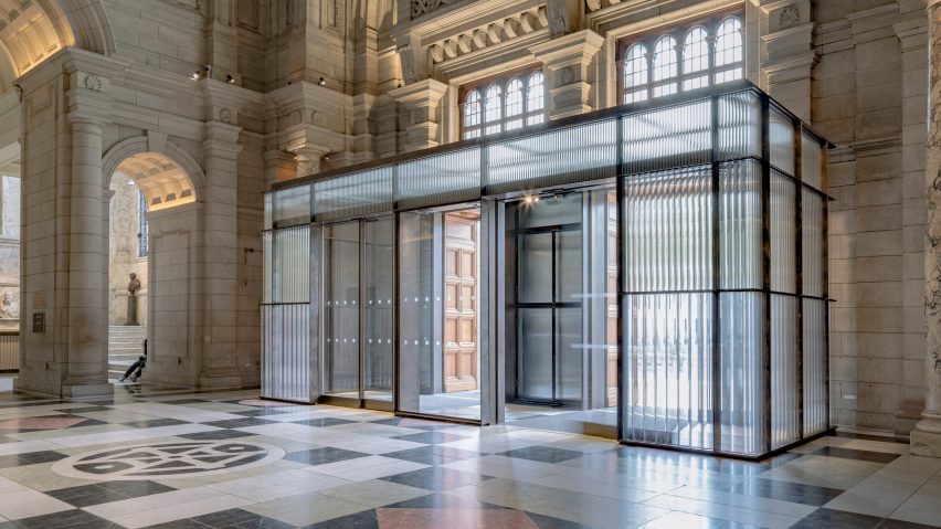
Sam Jacob Studio adds glass-tube entrance to London's V&A museum
British architect Sam Jacob has used ribbed glass to create a contemporary entrance for London's historic V&A museum and updated its bathrooms with a broken-ceramic cladding that feels "a little perverse".
The studio drew on the Victoria & Albert museum (V&A's) collection for its designs, choosing glass for the lobby in a nod to the museum's glass collection and crushed jasperware for the bathrooms.
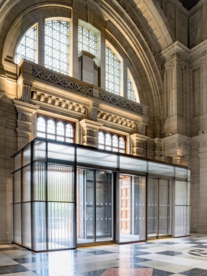
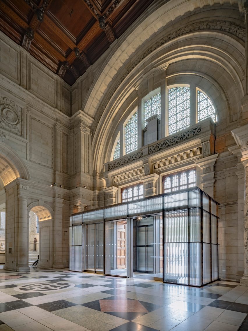
The entrance structure was designed in response to the existing proportions of the building and is formed of three bands of glass tubes, starting with 120-millimetre diameter tubes on the lower level that become thinner on the upper levels.
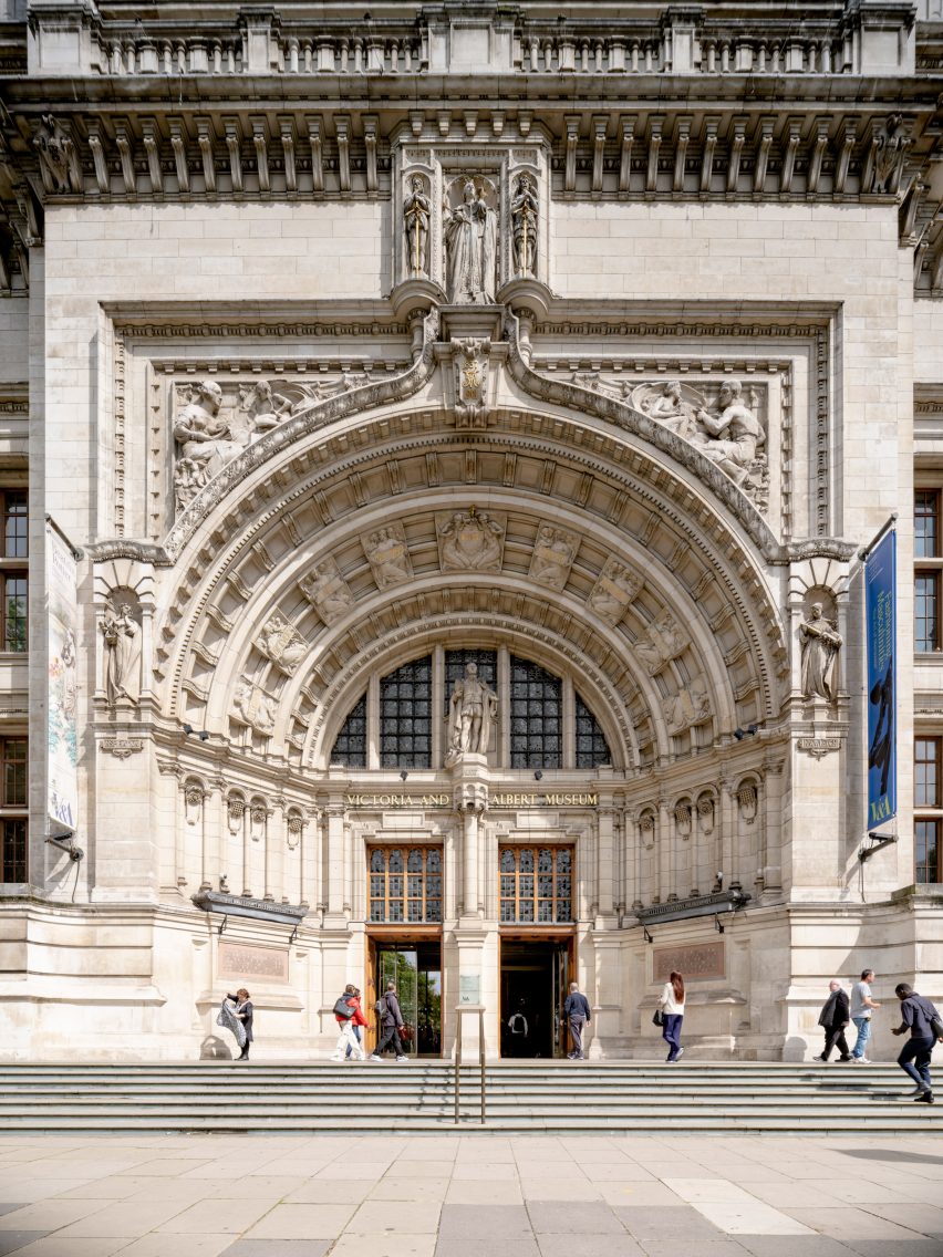
Sam Jacob Studio wanted the design, which marks the entrance from Cromwell Road, to function as a modern response to the surrounding Grade I-listed museum building.
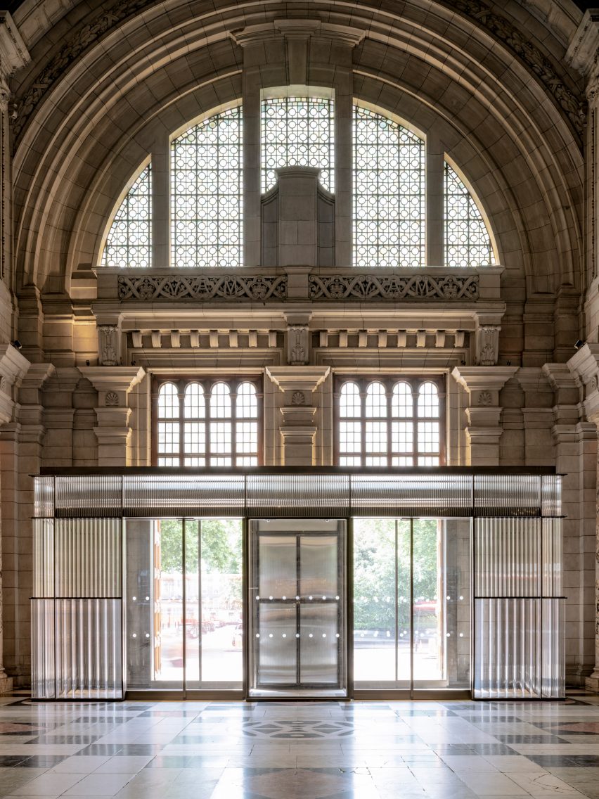
"The heights of the whole structure and the way it is split into three levels is a contemporary response to the historic fabric," Jacob told Dezeen.
"This helps the new elements resonate in a harmonious way even with a very different design sensibility," he added.
"Working with historic buildings is a great challenge and one that means it's important to understand what is really there, and why it might be like that."
Using glass for the lobby also helped create a more dramatic and dynamic effect at the entrance, while nodding to the large arched window that dominates the space.
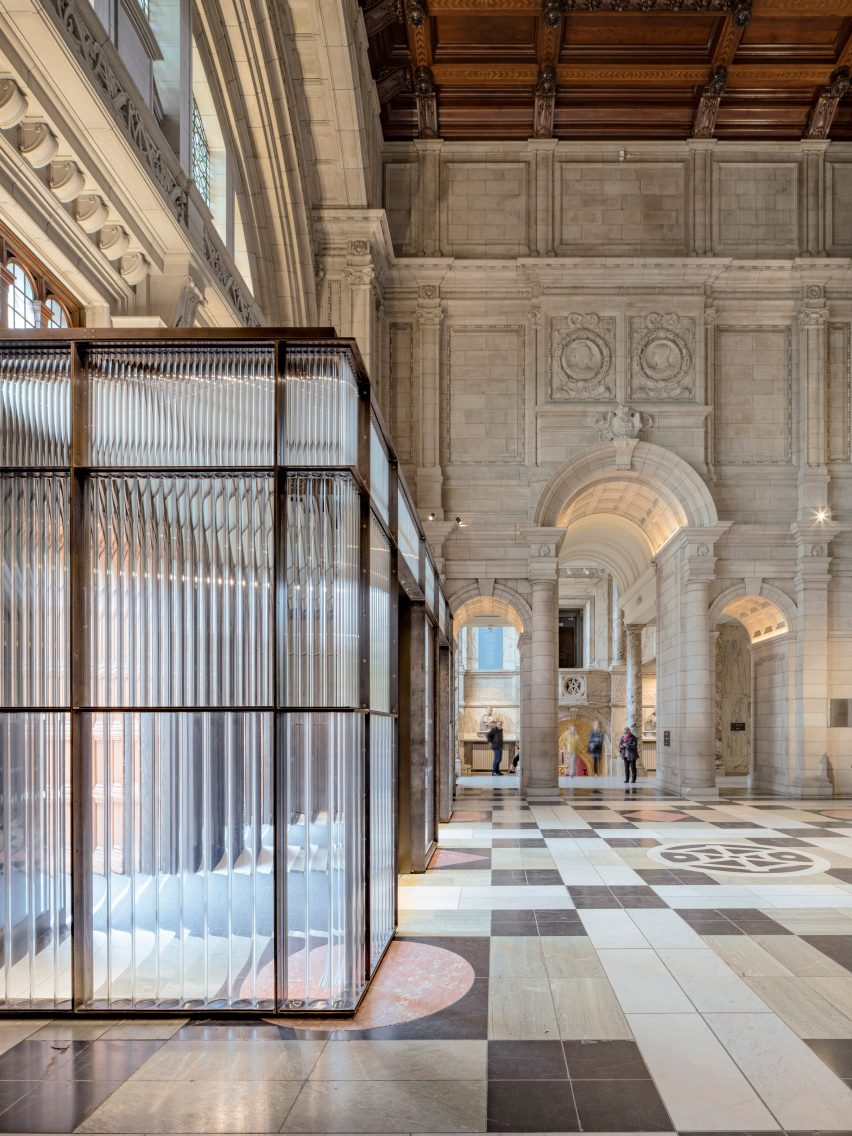
"The glazing for the entrance – especially the glass tubes – were a way to retain a sense of transparency at the entrance, but also to dramatise the way light is transmitted into the space," Jacob said.
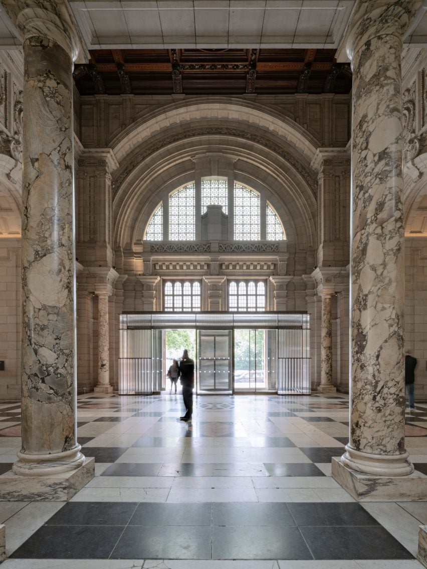
"The effect of the tubes is to act like lenses, and the movement of people through the entrance becomes visually more animated, producing different effects as the daylight changes over time," he added.
"It's also a response to the large arched window above, that has texture and colour to the glass, so that the whole interior elevation now acts in a similar way."
"It's glass used not so much for quality of transparency but for the dynamic effects of light passing through that it creates," he added.
Jacob also added sliding doors to the lobby and designed a collection of moveable stations that will be used for bag checks on entry.
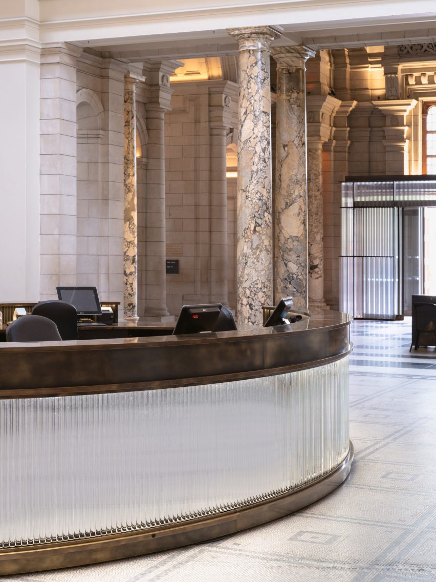
At the museum entrance, the studio added a welcome desk made from glass tubes with a mirrored backing that reflects the surroundings.
As well as the lobby, the architect also updated the bathrooms. Here, Jacob used crushed jasperware waste material from the Stoke-on-Trent factory that makes the V&A's Wedgwood porcelain collection.
This was used to create colourful wall panels constructed by crushing 700 kilograms of blue, grey, pink and black ceramic waste.
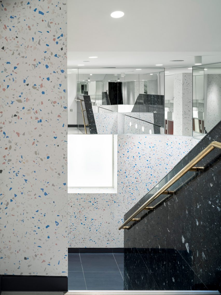
"Terrazzo is a material you often find in these kinds of spaces, so our intention was to introduce a really unusual material element by using the waste jasperware," Jacob said.
"It is a material that resonates with the history of the V&A, and with the history of British applied design and with a certain luxury," he added.
"Even in a fragmented state, jasperware colours are instantly recognisable. Using it in this smashed-up state, and making a feature of its brokenness, felt like a very modern take on those traditions."
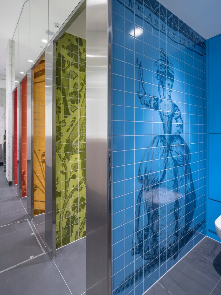
The design was also intended to make the museum's visitors think about reuse and how we care for objects.
"It also feels a little perverse – using broken ceramics in a museum where objects are usually incredibly carefully looked after," Jacob said. "But a beautiful kind of perversion – all the coloured fragments make a speckled colour field to the walls that surround you."
"It's an interesting experiment in the high concept reuse of waste material, about how we care for objects and the impact that the production of designed objects has on the world."
The bathroom walls have been decorated with life-sized digital prints showcasing figures from V&A's collection, as well as landscape scenery.
For Jacob, designing for the V&A meant "working in the shadow of people" such as British designer William Morris, a history that made him think about what a similar design response might look like today.
"We tried to channel a contemporary version of that same spirit of applied arts to help transform some of the most functional spaces of the museum into places of delight, places to interact with the collection in different ways, and make it a more accessible and engaging experience," he said.
Other recent projects by Sam Jacob Studio include an office, bar and events space for the ArtReview magazine in London and a neolithic shelter in Shenzhen port.
The photography is by Timothy Soar.
Project team:
Architecture: Sam Jacob Studio
Lighting: Studio ZNA
Structure: Price and Myers
Main contractor: Alcema
Specialist fabricator: Millimeter
Terrazzo: Diespecker
Quantity surveyor: Currie Brown
Mechanical and electrical services (M&E): Harley Haddow / JRG Electrical