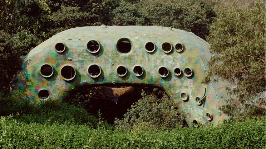
Latvian photographer Anna Dave has released photographs of Javier Senosiain Aguilar's El Nido de Quetzalcóatl in Mexico, a work of organic architecture shaped like a snake.
Named El Nido de Quetzalcóatl – or the Nest of Quetzalcóatl – in reference to a god with a serpent form in Aztec religion, the structure was completed in 2007 by Senosiain who describes the project as a work of organic architecture.
Following design principles that take into account place and tradition laid down by architect Juan O'Gorman, Senosiain said that organic architecture is "the philosophy of architecture that searches for harmony between men's habitats and the natural surroundings".
Construction on the project began in 2001 on a plot of land in Naucalpan, a municipality outside of Mexico City.
Officially finished in 2007, the project has continued to grow and now has 10 apartments in the main body as well as sculptures and detailed landscaping that all contribute to the overall design in the form of an iridescent snake.
The whole complex unfolds over a 5,000-square-metre plot of land that has expanded to include Parque Quetzalcóatl, a sculpture garden and reserve to maintain local plant life.
The park includes a greenhouse embedded into the landscape that has a tile-lined passageway that leads to a massive atrium with a water feature and a stained-glass atrium.
"We had to analyse deeply the topography of the site since it had caves, very pronounced level curves, a glen that crossed the whole site through the middle, et cetera," Senosiain told Dezeen.
The apartments fill the parabolic body of the primary structure, the exterior of which is made of ferrocement and the facade is covered in portals that serve as windows for the dwellings but also add a scaley texture.
"The interior spaces were built according to the necessities of human beings, the snake shape was given after because of the organic shapes but it wasn't taken into account as a design principle, it's more of an accident, however, it is fun for the designers and for the inhabitants," said the Mexican architect.
From the parking area, inhabitants enter the body of the snake. From here, one moves along a corridor that accesses the first of the apartments.
Then, as the snake curves down back towards the ground, a staircase leads down to another set of apartments.
From this landing, an outdoor bridge embedded in the back of the snake leads to the final three homes.
The interiors of the 200-square-metre apartments are minimal compared to the exterior. White plaster covers the walls and shelving on the wall slopes to match the curvature of the envelope.
Tile flooring in regular and irregular patterns is mixed with carpeted areas.
Outside the main structure, a series of sculptures trail off into a garden with terraced lawns and ponds.
The architecture team said that ponds were designed to both cool the site and maintain the humidity for the flora.
The complex has its own treatment plant that recycles the water for use in irrigation.
"With time the vegetation has been reinforced and the building seems more integrated to the natural surroundings, it's as if they created a connection of nature with the building," said Senosiain on the perceived changes of the site since its completion.
The gardens and complex are private, but many of the apartments are available as Airbnbs.
Dave said the project attracted her because she tends to avoid the "conventional HDR-esque style of architecture photography, whether in my choice of gear, light or angles."
"It seemed to encourage the visitor to crawl into nooks and crannies, rather than seeing it from a bird's-eye view," she continued.
"It's a project that is overwhelming to photograph because of how unique it is. Each view and corner of it seems eccentric, stimulating, never-before-seen."
Organic architecture as an explicit design term can be traced back at least to Frank Lloyd Wright, whose projects emphasized designs that integrated the structure and nature – though the practices are certainly much older.
Organic principles have been prevalent in moves toward more sustainable design. Under the name biomicry, designers have moved beyond replicating natural forms and have begun using organic materials in the shaping of structures.
In 2021, American-Israeli architect Neri Oxman released a manifesto called NATURE X HUMANITY that called for reintegration of human building practice with organic forms.
The photography is by Anna Dave

