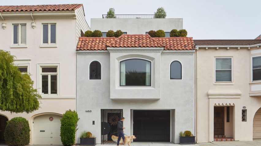
Architecture studio SAW incorporated curved elements and multiple staircases in its renovation of a 1930s dwelling that is meant to reconsider the "notion of groundedness".
The Wraparound House is located in the Marina District, which stretches along the San Francisco Bay.
Designed by local firm SAW, or Spiegel Aihara Workshop, the project entailed the overhaul and expansion of a 1930s, Spanish Revival-style dwelling that sits on a long, rectangular property. The building originally had three bedrooms and totalled 2,921 square feet (271 square metres).
The clients – a couple with three school-age children – desired a home with more space for indoor and outdoor activities, places for working, and views of the water.
The project came with an extra challenge – the need to remediate the soil under the house, which was contaminated and unstable.
The contamination was likely caused by residue from a former gas plant that operated in the area from 1891 to 1906, when a major earthquake struck the city.
In addition, most of the Marina neighbourhood was once a landfill, resulting in instability in the soil – a major issue given that San Francisco is prone to earthquakes.
"The site, in particular, is in a liquefaction zone, in which sand and silt would take on the characteristics of a liquid during an earthquake," the team said.
The team ended up excavating four to six feet of soil and replacing it with new soil.
They lifted up the entire house and modernised the foundation using a thick mat slab. Load-bearing and shear walls were redistributed, "opening up possibilities for unusual spatial configurations".
"The project was an opportunity to remediate and stabilize the land beneath the home – and for the architects, a conceptual reconsideration of the notion of groundedness through re-distributing the excavated ground vertically," the team said.
To enlarge the house, the team added an upper-level volume that is set back from the street. It also added space horizontally by expanding the ground level in the rear. The home now totals 4,738 square feet (440 square metres).
The front facade was left largely untouched, but the rear elevation was transformed to include stepped terraces connected by a black spiral staircase.
"On most days, one is just as likely to take the exterior stairs as the interior stairs to move between rooms," said architect Dan Spiegel, a founding partner at SAW.
"It doesn't quite look like it, but it works a bit like a mobius strip in that way."
Inside, the ground level holds the foyer, a two-car garage, a den and interlocking bedrooms for the kids. The middle level contains a formal living room, a dining area, a kitchen and a family room.
On the top level, one finds the main bedroom suite and two additional bedrooms. A roof deck offers a sweeping view of the city and the bay.
Rooms are filled with an eclectic mix of decor, and finishes include stone, wood and metal. Heidi Kim of local studio White Space Design oversaw the interior design.
Within the dwelling, levels are connected by a staircase with sculptural, white walls. Near the garage, a secondary interior stair connects the ground and first floors.
The team wanted all levels to feel connected to the remediated earth.
"We set out to maintain a complete continuity of a new ground across the entire house, ensuring that every roof was not so much the top of something, but the bottom of something — a new ground," the team said.
The team also wanted to honour the building's architectural heritage.
In turn, the studio incorporated curved elements – such as rounded corners and the sculptural staircase – which draw upon the arched thresholds found in Spanish Revival homes.
"The project's name, Wraparound, comes from the impact of subtle variation in corner geometry on directional movement, in the same way a rounded corner on a hockey rink serves to help wrap around the back of the goal and control a puck to the other side," the team said.
SAW also oversaw the home's landscape design, which had to be fully rethought due to the soil remediation.
The team created an hourglass-shaped lawn that is ringed by a scooter/bike track. Artificial turf was used to help cut down on water use.
Atop the house, a portion of the roof is a planted surface with a mix of sedums, succulents and shrubs.
Other projects by SAW include the vertical expansion of a hillside residence in San Francisco, allowing for better views, and the creation of a "nomadic fitting room" for a online lingerie retailer, which the firm designed in collaboration with US studio MOA.
The photography is by Paul Dyer. The top photo is by Mikiko Kikuyama
Project credits:
Architecture and landscape architecture: Spiegel Aihara Workshop (SAW)
Project team: Kenneth Hu, Max Obata, Sharon Ling, Darcy Spence, Max Kronauer, Dan Spiegel, Megumi Aihara
General contractor: Forma
Interior design: White Space Design (Heidi Kim)
Structural engineer: Element Structural Engineers
Geotechnical engineer: Murray Engineering

