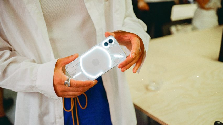
With its transparent light-up back, the Nothing Phone (1) hopes to recall the way that early smartphones "blew your mind", according to the London-based tech company's design director Adam Bates.
Designed with input from Swedish engineering and design studio Teenage Engineering, Nothing's Phone (1) was recently released with the aim of disrupting the smartphone market.
"There's this desire to create something iconic that can be built upon – something memorable which connects with people," said Bates, who was formerly head of design at Dyson.
"It's something that lots of companies do quite successfully, but maybe less and less in my experience of tech."
The Phone (1) smartphone features a light-up "glyph interface" on its transparent back intended to help cut screen time.
"I was very excited in the 2000s and the start of the 2010s," Bates told Dezeen. "As a designer, that was an incredible period. So many fantastic launches of new products that kind of blew your mind at the time, they really exceeded expectations."
"And I suppose this is one of the reasons I'm here really; that feeling is an amazing feeling that we want to feel again, and we want other people to feel if we can," he continued.
Nine-hundred LEDs in the glyph illuminate to create light patterns that can indicate things like who is calling, notifications from certain apps and charging status.
When the phone is placed screen-down, the Glyph will light up to provide silent notifications, or it can be used to gently illuminate photo subjects in dark conditions. Its design was informed by filament lightbulbs and Massimo Vignelli's New York City subway map.
The Phone (1)'s 4oo-plus inner components are visible through its transparent body, with black and white colour options.
"These products that we all use all the time are these slabs which don't really tell you anything about what they do, and they're also very similar," Bates said.
"You've got two surfaces on the phone, one of them is not really used for much, and the other side is the screen, and so there are lots of opportunities there to tell a story to help connect people with the product."
"One of the things with the back of the Phone (1) is that as soon as you go transparent you can start to tell a story about the components within the phone," he added. "There's all this lovely tech which happening and is always just covered."
In a move away from the trend towards ever-more cameras in recent smartphone releases, Phone (1) sticks with a dual camera.
Nothing claims its product is also more sustainable than rival smartphones, with the frame made from 100 per cent recycled aluminium and more than 50 per cent of its plastic components made from bio-based or post-consumer recycled materials.
The company designed its Android-supported operating system (OS) in-house, with bespoke fonts, widgets, wallpapers and sounds on the 6.55-inch display.
On the home screen, there is a non-fungible token (NFT) gallery that allows users to display their collection and track prices.
To conserve battery, the software loads most-used apps faster while the rest are frozen. A custom-made chipset has been created in an attempt to maximise speed.
Other features include wireless reverse charging of the Nothing Ear (1), a wireless earphone set that was the company's first product release and, like the phone, has transparent casing.
The OS also allows Phone (1) to unlock the doors or turn on the air conditioning in a Tesla, with Nothing promising more third-party integrations in future.
Its overall specifications are around the mid-range of the smartphone market, though its retail price is lower than comparable models. It has not yet launched in the US.
The company has backing from Alphabet's GV (formerly Google Ventures), as well as a number of other venture capital firms and private investors including Tony Fadell, an engineer who created the initial concept and design for the iPod.

