"Unsettling yet splendid" says commenter
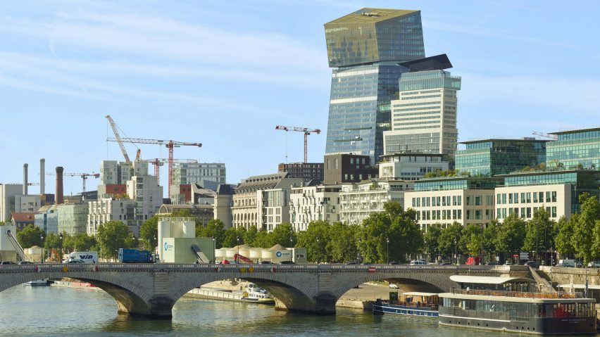
In this week's comments update, readers are dissecting a pair of inclined skyscrapers in Paris, designed by Ateliers Jean Nouvel.
French studio Ateliers Jean Nouvel unveiled a pair of angled skyscrapers in the French capital that lean away from a central plaza, which is making readers feel "at best, uneasy".
The landmark towers were designed to be visible from the River Seine and several of the city's landmarks. Studio founder Jean Nouvel said the inclined design "enables us to play a game with the reflections".
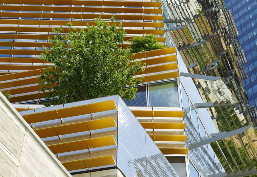
Sorperdida found the towers "unsettling yet splendid, as it usurps a totally bland suburban horizon". Joaquin, having researched the site on Google Earth, thinks "the building looks very specific – or in context – to that particular location. I think it works".
Chris Rogers thought Nouvel's project was "light and attractive, even if the plane of the podium is a bit much". Kabi Lawal concludes, "if the goal was to be different, it's a success".
Do you think Ateliers Jean Nouvel's skyscrapers are a success? Join the discussion ›
"We don't strive to experiment any more"
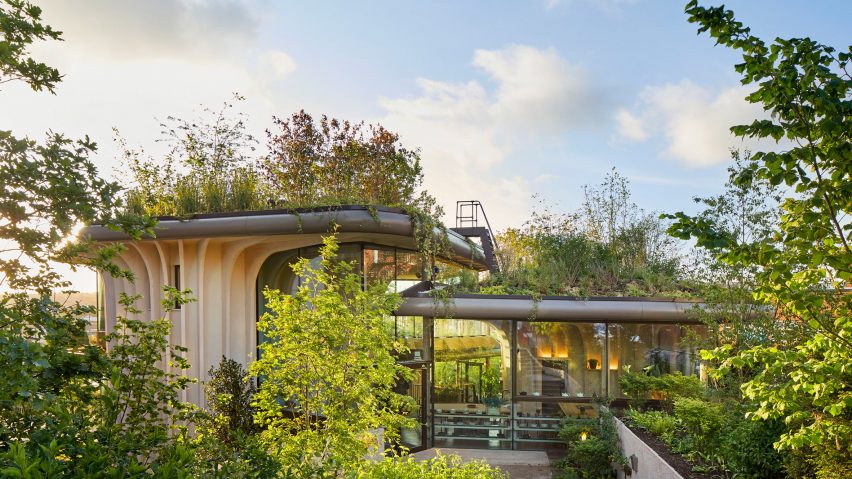
British designer Thomas Heatherwick claimed that "we're living through an epidemic of boringness" and that it's time for us to move on from "dull, flat, shiny, straight, inhuman" buildings, in a talk at Singapore Design Week.
Commenter Wake up thought "he's completely right".
"We don't strive to experiment anymore," he said. "As long as we push forward with mediocrity, our cities are going to be soulless – but the developer doesn't care, nor our profession."
However, Rashkolnikov79 believed that "uniqueness" is less important and that we need "buildings to synergise with their context". Chuck Anziulewicz agreed and would "prefer a cityscape to have a certain degree of cohesiveness, rather than looking like a jumbled pile of toys".
Shane Keena added that, naturally, "all architects want to leave their mark, to make their impression on the field", but the question to ask is; "what architecture fits your individual, local, national and global identity?"
Do you think we're increasingly surrounded by characterless buildings? Join the discussion ›
"One good wave and she's gone"
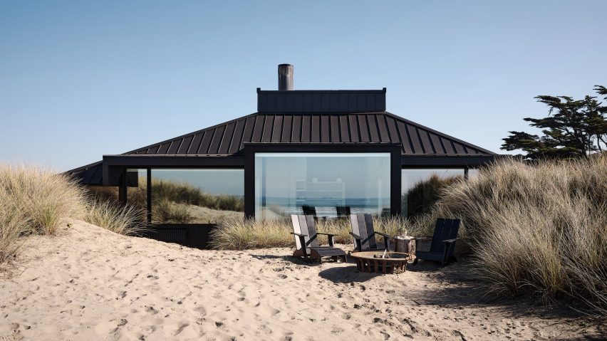
Fuse Architects completed the renovation of a 1968 beach house on the shoreline of Monterey Bay in California. The practice added cedar cladding, expanded the windows and skylights and brightened the interiors.
Apsco radiales was curious "why the house wasn't originally raised on columns, being so close to the ocean. One good wave and she's gone". Le Corbet thought the blinds "completely interfere with the openings and look like cheap bolt-ons".
Most commenters are enjoying the likeable simplicity of the design. Sim finds the project to be "very nice and nothing over the top" and JZ applauded "the targeted interventions that seem to minimise change and maximise impact."
What do you think of this renovation project? Join the discussion ›
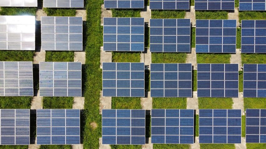
"What's your alternative?"
This week Dezeen launched its solar power guide as part of our Solar Revolution series. Solar is expected to become more widely adopted in the coming years as the world weans itself off fossil fuels.
Jack Woodburn was worried "about the mining and rare-earth mineral-processing by fossil-fuelled equipment, with very significant water usage", that manufacturing solar panels requires. He also wonders "how much food-producing farmland needs to be sacrificed to plant solar arrays?"
But Jonny Panic counters that "solar farms are typically in places where you aren't growing crops – like the desert". In addition, they offer the consideration that "energy consumption requires mining, whether it's coal, natural gas or lithium. What's your alternative?"
Is solar energy the future? Join the discussion ›
Comments update
Dezeen is the world's most commented architecture and design magazine, receiving thousands of comments each month from readers. Keep up to date on the latest discussions on our comments page.