The London Fire Brigade has unveiled its updated typeface designed by Studio Sutherl& and The Foundry Types at the Running Towards exhibition of graphic artworks informed by the organisation's design heritage.
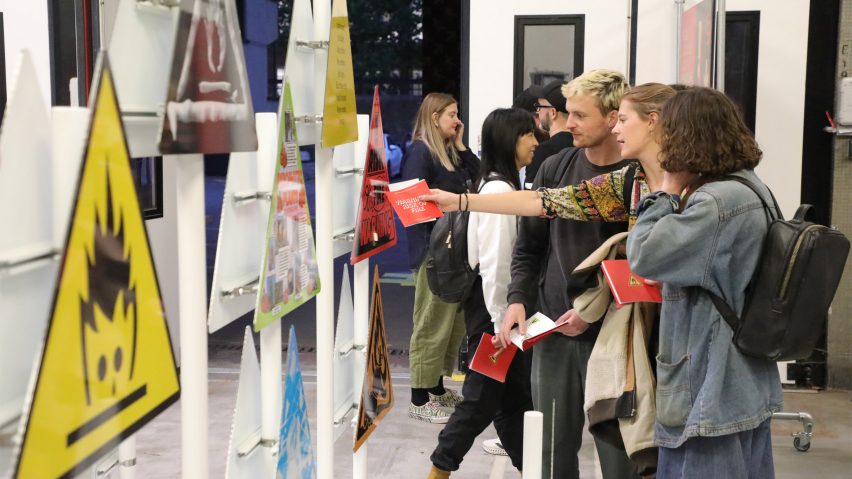
The Running Towards exhibition took place at the Shoreditch Fire Station during the London Design Festival, with visitors entering through the building's big red shutters into a display of artworks created by UK designers.
The new Fire Brigade Sans typeface, created by Studio Sutherl& and The Foundry Types, was displayed on the exterior of Shoreditch Fire Station.
Its design was informed by the lettering of old fire engines and on the facade, the typeface was printed in the red, yellow and gold colours synonymous with fire engines.
To celebrate the typeface, London Fire Brigade collaborated with communications agency KesselsKramer, writer Thomas Sharp, Studio Sutherl& and carpet manufacturer Brintons on the exhibition, which saw designers create their own interpretations of the organisation's design heritage.
Among the pieces on show were graphic interpretations of the Danger Risk of Fire safety sign, a bespoke carpet with a pattern informed by the universal fire exit sign and firefighting objects and items from Shoreditch Fire Station's own collection.
KesselsKramer described the showcase as "a celebration of London Fire Brigade's bravery, aiming to inspire that very same spirit within ourselves."
The studio invited 25 London-based designers to recreate the fire safety symbol for their display, titled Warning: Risk of Fire.
"It felt appropriate that for London Fire Brigade’s inaugural Design Festival exhibition, a piece of graphic design synonymous with the fire service became the focus," said KesselsKramer.
Presented on triangular signs, each artwork was designed to tell a story of firefighting bravery. Graphic artist Jimmy Turrell's interpretation was dedicated to his father who was a firefighter.
Illustrator Franz Lang's entry represented the story of her grandma's cat, who was rescued from a tree by the fire brigade.
"This is such an iconic location for an art show," said Lauren Coutts, art director at KesselsKramer. "To get a rare glimpse into a fire station is very exciting in itself so to then be able to celebrate bravery here, in so many forms, feels very special."
Brintons created a bespoke wool carpet for The Running Towards exhibition, which features a pattern informed by the universal fire exit symbol.
Burgundy and navy chevrons repeat along the length of the carpet with arrows and stick figures that reference the fire exit sign. According to Brintons, the carpet is made from wool to exemplify the material's naturally fire-retardant properties.
"As a material, wool contains a higher water and nitrogen content than other man-made fibres making it a naturally fire-retardant material," said Brintons.
"Another benefit is that it does not emit smoke or fumes, often one of the main causes of serious health issues following a fire."
Other exhibitions that took place during London Design Festival include a collection of wooden objects made from a dying ash tree and a sculptural stone installation that references Stonehenge.
The photography is courtesy of the London Fire Brigade.
The Running Towards took place between 20 and 24 September as part of London Design Festival. See Dezeen Events Guide for an up-to-date list of architecture and design events taking place around the world.

