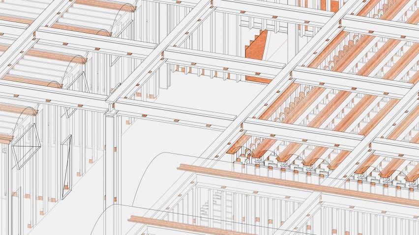
Washington University in St Louis presents 10 architecture, landscape and urban design projects
Dezeen School Shows: a greenhouse that utilises passive heating strategies and a cluster of buildings on a farm that aim to integrate natural environments with human-inhabited space are included in Dezeen's latest school show by students at Washington University in St Louis.
Also included is a riverside multi-family housing complex that encourages social interaction and an apartment building with adjustable windows that allow occupants to control light, ventilation and privacy.
Washington University in St Louis
Institution: Washington University in St Louis
School: Sam Fox School of Design and Visual Arts
Course: Master of Architecture, Master of Landscape Architecture and Master of Urban Design
Tutors: Chairs Monica Rivera and Derek Hoeferlin
School statement:
"Together, we have a unique opportunity to do more than create beauty. Through critical thinking, research, and cutting-edge interdisciplinary programmes, the Graduate School of Architecture and Urban Design at Washington University in St Louis gives students the means and the motivation to improve our world.
"Our degree programmes in architecture, landscape architecture and urban design, combined with dual and joint degree options, immerse our students in experiences that propel them to leadership in their fields.
"Students in the Graduate School of Architecture and Urban Design leave with more than just a degree – they leave with an expanded view of the world, a passion to facilitate change, and the skills to make a lasting impact
"Our studios are organised around cumulative, collective experiences. As part of a Tier I research institution, we provide a rigorous academic environment where students develop a love of craft and the ability to move fluidly between digital and analogue platforms.
"Students learn to work independently in a culture that supports curiosity and collaboration across disciplines with people whose ideas and expertise are as provocative and enlightening.
"Sometimes, the most radical approach is straightforward. We teach our students the grounding principles that will empower them to take their ideas wherever they want to go."
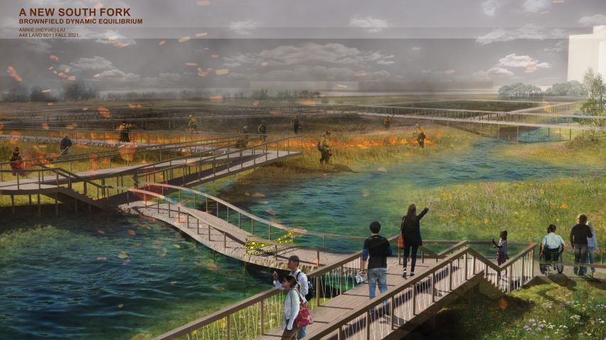
New South Fork by Heyue Liu
"The headwaters of Bubbly Creek, the South Fork of the South Branch of the Chicago River, has been plagued by floods and pollution problems for a long time.
"In recent years, the Chicago authorities have worked hard to clean up deteriorating sediments and improve the water quality, trying to restore the vitality of Bubbly Creek.
"The project uses the rainy season floods to imitate the reverse of upstreaming the Chicago River, as the government used to reverse the Chicago River to ensure the purity of their drinking water in Lake Michigan.
"The imitated mechanism turns the water on the two parts of the site into a microcosm of history, echoing the river history museum transformed from an old factory on site.
"The project is also ambitiously committed to improving flood controls by adding a retention pond on the brownfield at the source. The renovated site connects the residential area to the new South Fork and Bubbly Creek, encouraging public engagement."
Student: Heyue Liu
Course: Landscape Architecture Design V, Master of Landscape Architecture
Tutor: Micah Stanek
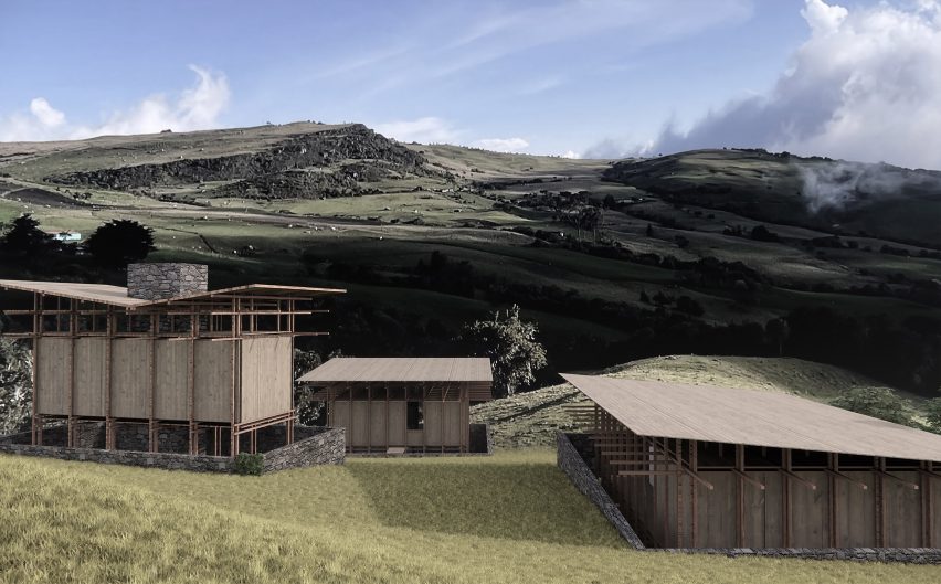
Wandering Farm by Alex Lyu
"The project is designed to be individual nodes of architecture on the landscape that accommodate different functions and activities for a biodiversity farm in Colombia.
"Each piece is constructed with a heavy and durable stone base against the damp earth and water of the high-altitude Colombian tropical Paramo.
"The base elaborates a strong mark on the natural topography itself but leaves the rest of the ground free for the farm, allowing animals to wander around the land. A delicate and lighter timber structure situates on the top of the base, forming spaces for human habitation.
"Ultimately, the combination of the bases and upper structures provides different conditions for utilising and engaging space for various activities and creates the in-between spaces that blur the boundary between the natural environment and human-inhabited space."
Student: Alex Lyu
Course: Architectural Design V, Master of Architecture
Tutor: Derek Hoeferlin
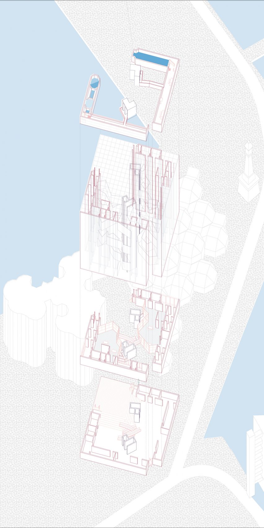
A Flexible Matrix by Xiaofan Hu
"The story begins with two solid pink walls and the people behind them. The walls aim to protect the occupants from the touristy and dark alley where the apartment building is located.
"From the outside, no signs of domestic life are suggested or revealed. As you enter through the slip between the two solid walls, a more dynamic and lively space opens up with an abundance of green space, a paved playground, and windows that are adjusted to the tenants' needs.
"In contrast to the stark and massive exterior walls, the interior facade appears to be light and full of liveliness. The flexibility of filters allows occupants to control light, ventilation and privacy during different times of the day or year."
Student: Xiaofan Hu
Course: 419 International Housing Studio, Master of Architecture
Tutor: Emiliano Lopez
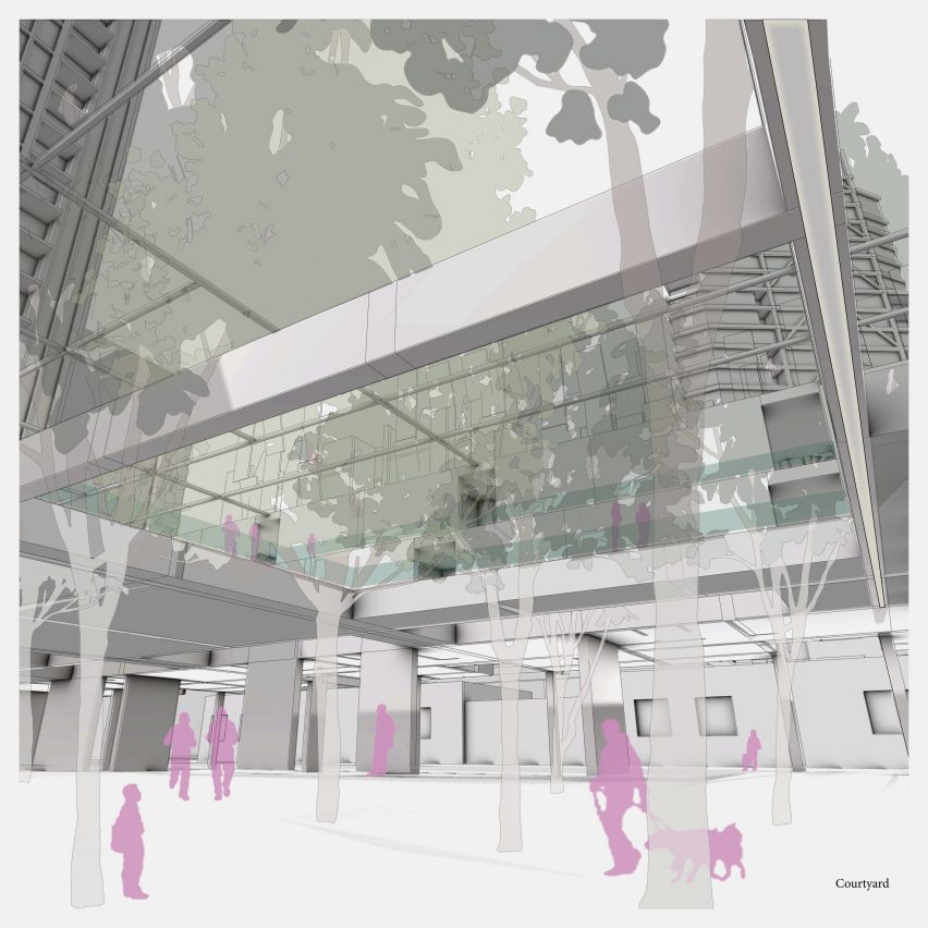
Chicago Grove (Of Trees) by Jaegwan Lee
"The site is located at Chicago's Montgomery Park alongside the North Branch of the Chicago River. Most riverside properties in this area are occupied by large industrial factories that separate the urban fabric from the river or are privatised by residential buildings that fully fence the river edge from the public.
"This project occupies the plot in a permeable way to create a rare public space along the river. Thus, the housing units are lifted to maintain the public space underneath. The structures supporting the housing blend with trees in the park on the ground floor to create a horizontally permeable space that flows from public to semi-public and back to public.
"The courtyard space capitalises on vertical permeability with platforms for the residents to use as catwalk corridors and general outdoor space to enjoy sunlight, much like the public space that surrounds them.
"Conceptually, the structures holding up the housing are like trunks of trees. The interior walls in the units slide in and out to bounce light into the spaces like branches that extend from the trunks, and the whole project is like a canopy that conditions the space beneath."
Student: Jaegwan Lee
Course: 419 International Housing Studio, Master of Architecture
Tutor: Phillip Holden
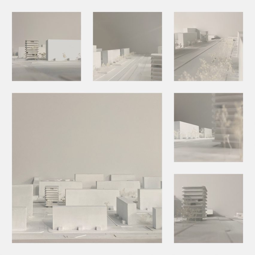
Exposure by Baili Null
"The courtyard typology of a typical Berlin block creates tension between neighbours in close proximity and public spaces open to the city.
"This project confronts the issue of privacy and the delicate balance between coverage and openness by placing privacy devices within an occupant's control.
"The threshold between domestic space and the city was thickened by offsetting the building's footprint, creating a balcony that envelopes the inner glazed facade layer. This transitional space acts as a barrier to the interior, where occupants can introduce additional privacy devices, or choose to be exposed.
"The facade layer can then be unfolded and extend the interior space to the edge of the balcony, to thick columns that invoke a feeling of comfort and protection despite an entirely open facade."
Student: Baili Null
Course: 419 International Housing Studio, Master of Architecture
Tutor: Julie Bauer
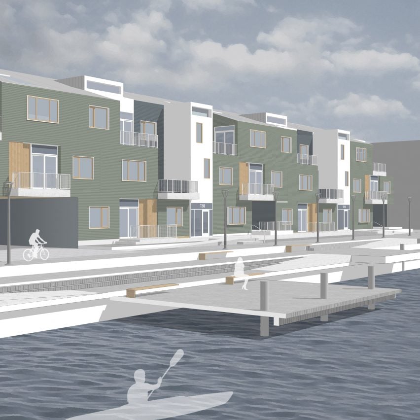
Adjacencies by Shannon O'Donnell
"Working with the maritime context of Halifax, Nova Scotia, the driving force behind this project is a strong connection to both the sea and the social aspects of multi-family housing.
"These connections are evident in the circulation of the site, as well as interior connections within dwelling units that allow for views of Halifax Harbor on one side and a communal park on the other.
"Social interactions are encouraged through semi-private spaces such as patios and balconies, which are arranged to optimise daylight within the units.
"The project considers the unique qualities of the city, such as references to the Halifax Porch, local usage of colour, and vernacular building design which takes into account climatic conditions."
Student: Shannon O'Donnell
Course: 419 International Housing Studio, Master of Architecture
Tutor: Don Koster
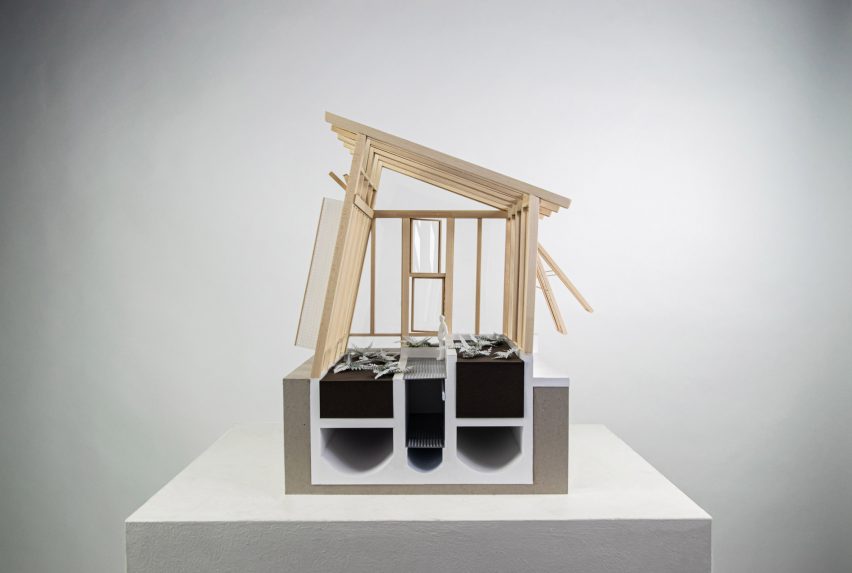
Flora Conservancy Community Centre by Cody Heller
"The proposed community centre is an extension of the Flora Conservancy's greenhouse and gardens facilities within Forest Park in St Louis.
"Inspired by the Walapini – a south American greenhouse typology that places it below grade for thermal regulation – the design exaggerates the traditional passive and form strategies to best respond to the St Louis climate, ultimately achieving a variety of spaces for community engagement and philanthropic activities.
"Centralised by the surrounding garden beds with a lantern-like object embedded within the earth, the greenhouse presents itself as a hub for the Flora Conversancy's social and economic ambitions.
"The project aims to curate public experiences across the site through moments of view-making, attempting to isolate the visitor in a green that verges on utopian paradise."
Student: Cody Heller
Course: 317 Core Studio, Master of Architecture
Tutors: Bruce Lindsey and Jonathan Stitelman
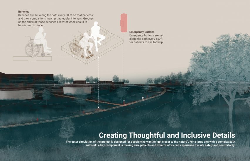
Chrysalis to Everlastingness by Wei Hui
"Death is the ultimate proposition. Today, given an increasingly ageing population, high rates of cancer, and a global pandemic, we are being forced as a society to face mortality more directly than in previous decades.
"Taking that challenge head-on, The Chrysalis to Everlastingness is an exploration of the landscape architecture's power to humanise end-of-life care and transform the burial process into an ecologically regenerative practice.
"Located in rural central Missouri at the site of a highly-disturbed 120-acre former surface coal strip mine site, Chrysalis engages the full site through a series of interconnected, closed-loop and environmentally sensitive operations.
"The three main components include a nature-focused end-of-life care facility located within a restored prairie landscape, a small-scale sustainable forestry operation to help manage the emergent forest and produce the woody and plant-based material needed for green burial, and an ecologically regenerative green cemetery that allows the deceased to become part of the regenerative landscape process and the circular natural processes."
Student: Wei Hui
Course: Landscape Architecture Design IV, Master of Landscape Architecture
Tutor: Irene Compadre
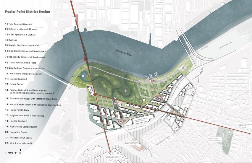
Expanding L'Enfant by Timothy Buescher
"Through equitable, resilient design initiatives that reduce social-environmental vulnerability and restore the site's ecological integrity, this proposal for Poplar Point seeks to establish Anacostia's own axis on the historic Washington DC grid by balancing competing development interests with the existing social needs of a historically neglected community."
Student: Timothy Buescher
Course: Master of Urban Design 713
Tutor: Patty Heyda
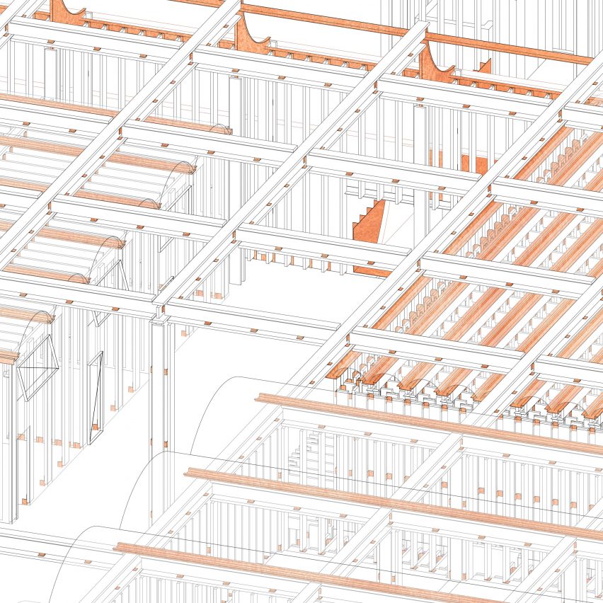
511 Barcelona Studio Abroad by Jacqueline Traudt
"The instinctual approach to this citadel addition starts by defining the isotropic or anisotropic grid of the existing structure.
"Then, grids were used to organise and define the proposed programme of an addition to the rooftop of the historic Pompeu Fabra University library, which was originally designed as a Roman water tower.
"The characteristics of each space are understood through the density or directionality of gridlines. In this way, the project is about weaving together different densities.
"It takes on a language of textile and needlework to provide a variety of enclosures to each programmed space, as well as the opportunity spaces between the newly formed addition."
Student: Jacqueline Traudt
Course: 511 Barcelona Studio Abroad, Master of Architecture
Tutor: Ramon Bosch and Bet Capdeferro
Partnership content
This school show is a partnership between Dezeen and Washington University in St Louis. Find out more about Dezeen partnership content here.