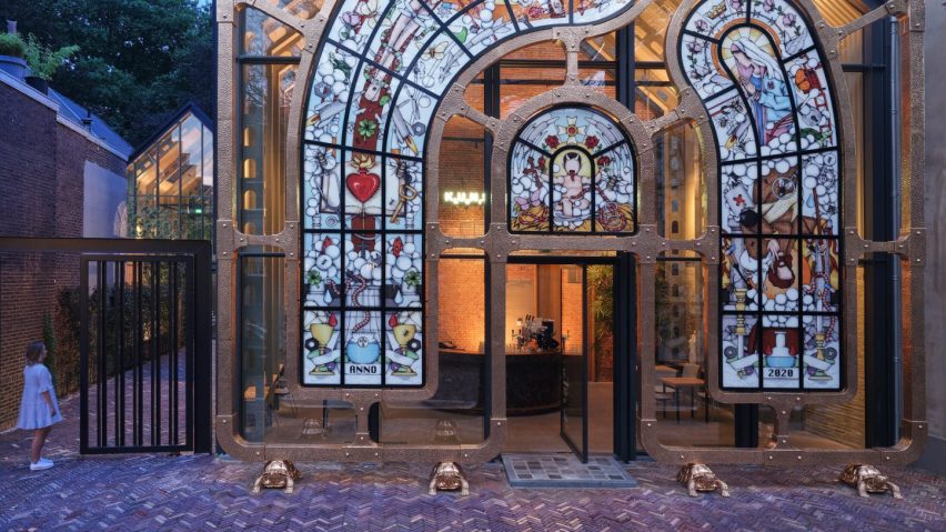
In this week's comments update, readers have had strong reactions to Studio Job's surreal stained glass screen for a Dutch art institute, in the Netherlands.
The local practice has completed a bronze-and-glass sculpture named The Embrace, which stands in front of KunstKerk in Dordrecht.
It was described by the studio as a "surrealist take on classical church windows," featuring a baby with devil's horns based on the designer's son who, he told Dezeen, "has a devilish nature". Commenters reacted.
Simply_Indulgence was skeptical: "You don't like religion? Sure okay. But don't go out of your way to offend others who do. Demonic baby J3sus doesn't work well". Ulisses Papa was upvoted for taking offense, arguing that if similarly "outrageous iconography was made related to other Abrahamic religions, this disfigurement wouldn't last days, or hours".
But Oliver van den Hoven thought the design worked. "It's a daring but appropriate novelty to the lovely, but sleepy town of Dordrecht. Good work on the details of both graphics and frame."
Michael thought "it would look beautiful as an entrance way to an actual church" and Ken Steffes was equally complimentary: "The greatest use of a traditionally old and out-dated material I have seen this decade. Fantastic! And I love the feet."
What do you think of this creative interpretation of stained glass? Join the discussion ›
"I admit to being envious of whoever lands such a lavish client!"
British architecture studio Foster + Partners completed two skyscrapers in China, which are connected by an open-air suspension bridge over 100 meters above the ground. Readers were overwhelmingly impressed.
Rd got upvoted eight times for their thoughtful comment: "They are glass boxes but with so much more character and personality than the glass boxes surrounding them. It seems to me that this is a prime example of Foster's signature style, am I wrong?"
Alfred Hitchcock agreed that they are "good-looking structures, but as others have said, the way they meet the ground and the resultant public realm they provide is appalling".
Design Junkie thought "these buildings look proper futuristic. I really like them. Pretty slick".
While Romeo Reyes was in raptures: "Simply spectacular! It's a well-orchestrated play of masses that are harmoniously blended together forming a perfectly-balanced composition. Truly, a remarkable ensemble originating from the Foster stable".
Are you a fan of Fosters' latest skyscrapers? Join the discussion ›
"Daring and dated at the same time"
Canadian architecture studio Partisans has designed a residential tower in Toronto that takes its shape from both natural clouds and revision clouds – a notation that architects use in technical drawings.
If built, it will be 99 metres tall and contain 32 floors of apartments and amenities spaces.
Heywood Floyd was giddy; "Natural clouds and revision clouds in the same building?! Brilliant!". Devin du Plessis echoed similar sentiments "Cloud, evolved cloud, revision cloud HAHAHA brilliant. It's so whimsical, Charles Moore would love it."
Raffi thought "the design feels daring and kind of dated at the same time. Compared to all glass-and-steel buildings that just look drab with no character, this is a refreshing option."
Luis felt the practice had been "brave in avoiding the strategy of the outdated glass towers of Toronto, but the final design looks like some bold Baroque futuristic visions of the past".
Has this project got you on "cloud nine"? Join the discussion ›
"The spirit of the 60s and 70s"
Architecture studio BIG has completed six curved housing blocks that combine to form a spiral shape at the Sneglehusene development near Aarhus in Denmark.
JZ considered the project carefully, and thought that it had a "strong form with a powerful interior focal point. But the weaving of the parking betwixt the BIG and masonry blocks seems like a cop out. It would have been more meaningful to have the central green space spiral outwards and give each of the ground floor units facing that direction more garden."
Rust Belt Brett concurred that it has an "exciting site plan, very unique". Apsco Radiales considered it is perhaps the "first project from BIG that I think makes some sense".
Pa Verreon concluded "there is a spirit from the 60s and 70s. Sounds like quality social housing, hopefully, that example will be inspiring to other architects".
What do you think? Join the discussion ›
Comments update
Dezeen is the world's most commented architecture and design magazine, receiving thousands of comments each month from readers. Keep up to date on the latest discussions on our comments page.

