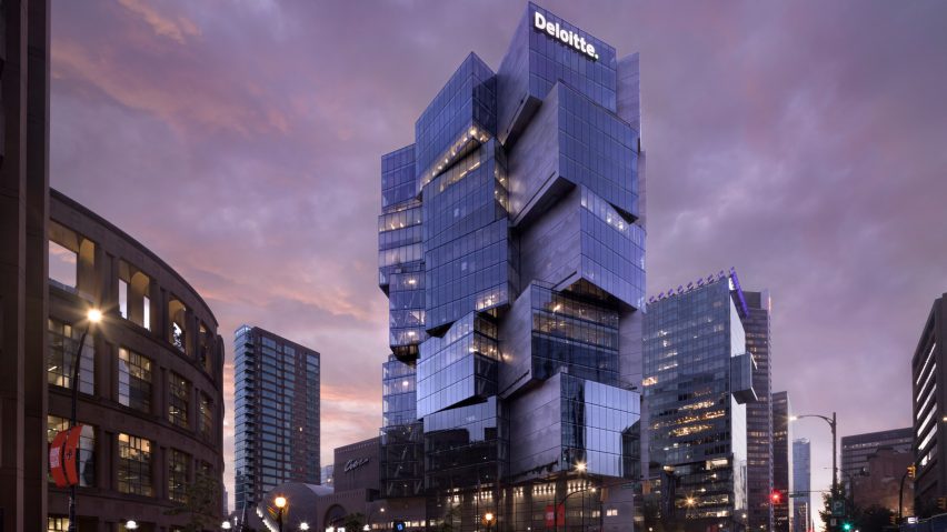
Tokyo-based architecture studio OSO has completed Deloitte Summit, a skyscraper in Vancouver with stacked protruding boxes that resemble a set of lanterns.
The 24-storey tower was constructed using a series of steel-framed cubes stacked on top of each other to create a sculptural effect.
Taking up an initial plan for the site developed by another architect that was "conventional to the core", Japan-based studio OSO decided to keep certain elements of the glass tower modality, while eschewing the typical form.
Each of the boxes is four storeys tall and protrudes asymmetrically from the building's core. A series of cantilevers work with the generous setback and create a jagged profile.
"A brief study led to a completely different approach to the glass box: rather than a single extrusion, we found that multiple, smaller extrusions could achieve the same density," said OSO.
"The smaller extrusions became weightless glass cubes that were haphazardly placed on top of each other."
The stacked cubes were all oriented in different directions, amplifying views from the offices housed inside. It also creates a multi-dimensional effect, where no side can be considered the front of the building, taking advantage of the corner lot and low-lying surrounding buildings.
"The facade's angles and reflections create an ever-changing silhouette that shifts depending on the position from where it is seen," said OSO.
"The tenant does not expect to find glass floors overlooking the city, roof terraces under overhanging volumes, and vertical gardens framing views of the mountains."
"All this is accomplished by rearranging – rather than abandoning – the conventional glass box."
According to OSO, the "sense of randomness" that comes from the stacked forms was mediated by relatively simple floorplans throughout the structure, and the glazed panelling offers a sense of coherence for the design.
Canadian developers Westbank, which has been behind a number of other skyscrapers in the city including BIG's Vancouver House, said that the design was conceived as a performance, taking cues from the sculptural functionality of Japanese lanterns.
The floor-to-ceiling glass allows for the whole facade to be illuminated at night if desired, while the large windows and many-sided envelope also help increase the amount of natural light inside the building.
"We asked the architects to come up with an idea where the office building morphs into something else, such as a piece of sculpture," said Westbank.
"The resulting project takes inspiration from a Japanese light sculpture to reimagine the conventional glass box office tower."
Westbank also said that the building will have an explicitly performative aspect.
"Every evening, the building will put on a 'performance'," it said.
"As a prelude to the performance, shortly before 9 pm, the building lights will dim and the blinds lower. At 9 pm, the building will slowly illuminate, taking on a lantern-like effect."
"The bulk of the building is held by a central elevator core and six 'mega-columns' that penetrate through all floors," said OSO.
"There are no other columns in the centre of the floorplate, only trusses along the facade that transfer perimeter loads from one cantilevering volume to another."
Inside, the floorplans were left largely open due to the lack of columns in the floorplates, allowing for flexible working spaces for the occupants. The ground floor lobby holds a wood-and-plant-filled cafe.
OSO was founded by Michael Sypkens and Esteban Ochogavia – two former employees of Japanese architect Kengo Kuma – in 2017.
Also on the West Coast, earlier this year, OSO announced plans to suspend a Boeing 747 between two skyscrapers in Seattle to create an occupiable museum.
The photography is by Ema Peter.
Project credits:
Design architect: OSO
Executive architect: Merrick Architecture
Developers: Westbank and Allied

