Selldorf Architects revises plans for National Gallery's Sainsbury Wing
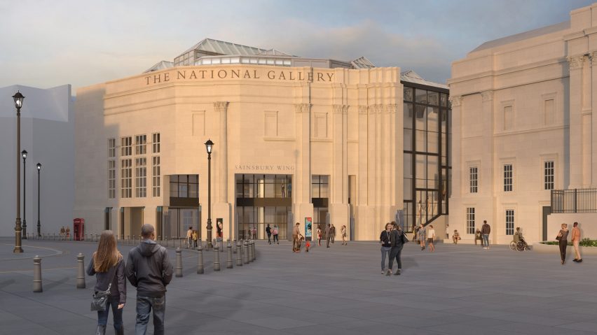
New York studio Selldorf Architects has made changes to its revamp of the postmodern Sainsbury Wing at London's National Gallery, which had been criticised as "damagingly destructive".
The plans to remodel Robert Venturi and Denise Scott Brown's postmodern Sainsbury Wing were first revealed earlier this year and met with heavy criticism from heritage bodies and architects.
The National Gallery submitted revised plans on 17 October, detailing changes to the proposal that it said were done after hearing from heritage bodies and stakeholders.

Feedback received during a public consultation also played into the new design, Selldorf Architects said.
"Since submitting the project in August we have been in a period of public consultation receiving feedback on the design from multiple stakeholders including the public," founder Annabelle Selldorf told Dezeen.
"We have listened to those comments and really took it on if you will."
She added that the new design intends to give the gallery a more inclusive feel.
"The overarching goals remain the same – to create a more inclusive welcome for the now six million visitors a year to the Gallery and the design allows for that right from the outset with the new 'Square within a Square', an enlarged security vestibule, more transparency and openness to the space for people to linger and orientate themselves before moving on to view art," Selldorf said.
Egyptian-style columns to be moved under new plans
The newly submitted plans detail a number of changes that Selldorf Architects has made to its design for the Sainsbury Wing.
The internal screen walls of the rotunda on the main floor, which would have been removed under previous plans, will now be retained.
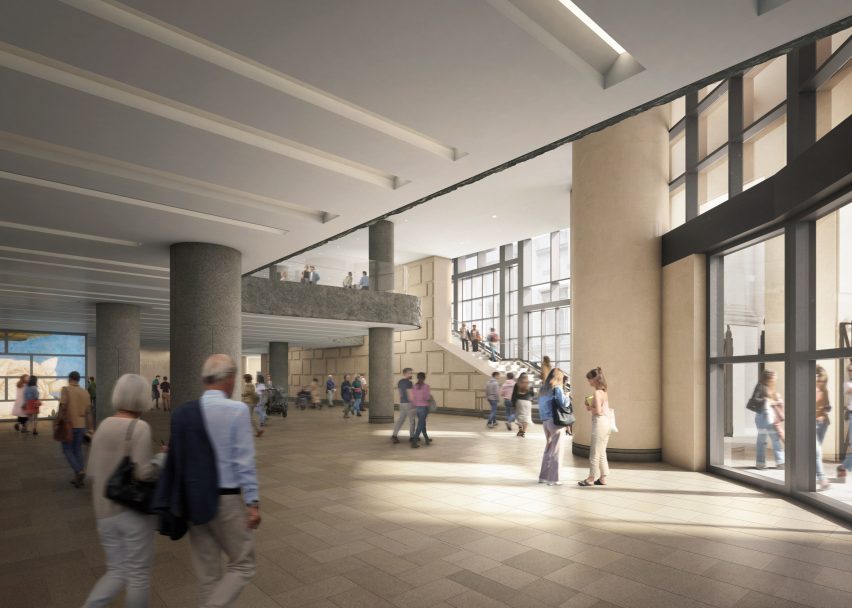
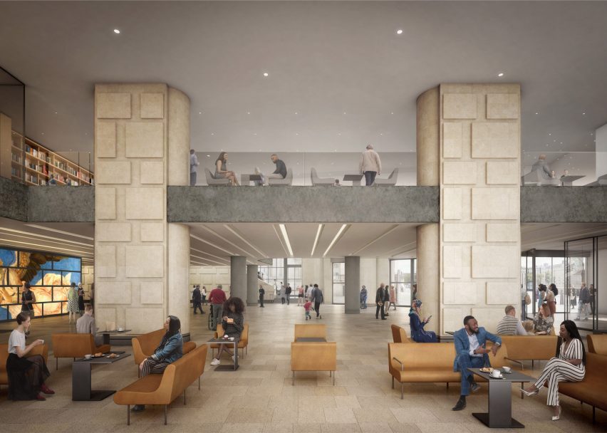
In the entrance lobby, two pill-shaped columns will be moved one structural bay to the west, while its six Egyptian-style columns will be moved to become part of a new bookshop. A curved wall will also be moved.
The remaining structural columns on the ground floor, as well as structural columns on the first floor and the exposed first-floor edge, will be clad in Pietra Serena stone. Previous renderings appeared to show the columns clad in pale wood.

Changes have also been made to the glass balustrade on the first floor, which will now have a misted glass finish and no handrail or metal framing. It will be set back from the slab edge.
Finally, the studio has extended the use of a rusticated limestone finish on part of the stone wall between the lobby and the stair, which will now reach the full two-storey height of the wall.
"In the updated plans more of the existing fabric will remain, creating a clearer dialogue with the original building," Selldorf said.
"In any design process, it is important to listen to input and critiques but particularly for something as public and prominent as the National Gallery. I know that we will not be able to satisfy everyone, but I am very pleased with where we have come out."
National Gallery "needs to do a rethink"
Architecture critic Hugh Pearman, who had deemed the original plans for the remodel "damagingly destructive", wrote on Twitter: "This superficial revision doesn't change my view that the NG is literally starting from the wrong place and needs to do a rethink on where its main entrance should be."
This superficial revision doesn't change my view that the NG is literally starting from the wrong place and needs to do a rethink on where its main entrance should be. As set out here: https://t.co/kJrB1h3yp8
— Hugh Pearman (@hughpearman) October 18, 2022
In an article for The Arts Newspaper, Pearman called on the gallery to reconsider its plans to keep the Sainsbury Wing as its main entrance, which it was not originally designed to be, claiming that it "unbalances the whole composition of the National Gallery".
"But if the gallery continues to insist that its main entrance should be at the far western end of the main complex, then only the most minimal and respectful alterations to Venturi and Scott Brown’s unique building should be allowed," Pearman said.
According to the National Gallery, the latest changes to the design allows it to keep more of the building's existing fabric.
"The changes to the scheme are a natural evolution of the process of listening and consultation," a spokesperson for the National Gallery said.
"We have found ways to retain more of the existing fabric whilst meeting our ultimate ambition of providing a world-class welcome for our millions of visitors," they added.
"People's needs and expectations have changed dramatically over the last 30 years and we need to accommodate these, as well as the 100 per cent increase in visitor numbers."
Previous proposals criticised as "an act of vandalism"
Critics of the original scheme include architect and University of Westminster professor Sean Griffiths, who told Dezeen: "In the context of the unique character of this building, the deployment of ubiquitous corporate, airport concourse aesthetics in the proposed revamp looks a lot like an act of vandalism to me."
In an opinion piece for Dezeen, architecture editor and writer Catherine Slessor said: "History now seems to be repeating itself at the Sainsbury Wing," arguing that the proposed changes to the building are the latest in a long line of controversies surrounding it.
The Sainsbury Wing renovation is part of the National Gallery's NG200 project to mark its bicentenary in 2024. It will see a seminar room, archival store and staff offices added, as well as an espresso bar on the building's ground floor and a cafe on its first floor.
The images are courtesy of the National Gallery.