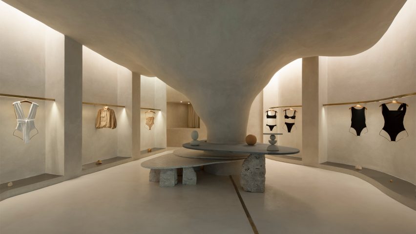
Organic shapes and stone-like surfaces characterise the interior of the Haight clothing store in Rio de Janeiro, which was designed by Brazilian practice AIA Estúdio in collaboration with designer Raphael Tepedino.
A large pillar with a rough, textured surface dominates the 110-square-metre shop interior, expanding as it ascends before merging into the ceiling to create a cave-like space.
"Its height starts small and in the back part it ends higher in a nonlinear form, just like a cave," AIA Estúdio founder Alice Tepedino told Dezeen.
"The infinite and diverse processes of erosion that form cliffs, caves, stalactites, sands, stones and the movements of water with its tracks and shapes led to our creative process being part of the concept developed for the store's spatiality."
Rather than being a cumbersome obstacle, the pillar helps organise the shop's circulation and movement of shoppers, according to the studio.
"It is from the occupation around the pillar that the space fluidity is achieved. This disposition is enhanced by curved lines that define the path inside the store," said Tepedino.
Slabs of soapstone and Bahia beige marble encircle the pillar at different heights and are propped up by Bahia beige marble rocks that create a display surface and a place for shoppers to sit.
On the perimeter walls, niches with stainless steel bases display Haight's clothing on brushed-brass rails.
The metallic surfaces and straight edges of the niches contrast with the organic shapes and materials in the centre of the shop, which is located in the Shopping Leblon retail centre.
Tepedino used indirect lighting in the niches to illuminate the space, mimicking cracks in cave walls where sunlight can seep through.
"The exhibition interspace was thought of as a cut in the walls, an operation emphasised by the transition of materiality," said Tepedino.
"Inside, there are exhibition racks in brushed brass, which, with their more solar aspect, contribute to subtly warming up the store's ambience, together with the soapstone and its greyer tone."
Tepedino's design is the first of Haight's stores to be located inside a shopping centre, which prompted the designer to approach the project in a different way.
The entrance to the shop is a large opening that provides open access from the shopping centre to the nature-inspired shop interior.
"The design adopted a contrasting strategy between the store and mall, which, despite the rigid and controlled environment, offers opportunities such as the possibility of not having a door," said Tepedino.
"The brand's conceptual basis is related to natural landscapes but when you are inside the mall, you find a language that is the opposite of Haight's conceptual basis, with artificial elements and cold materiality."
"Once you're inside the store you get disconnected from the artificial atmosphere of the rest of the building," Tepedino continued.
The project has been shortlisted in the small retail interiors category of Dezeen Awards 2022, alongside a surfaces showroom in Helsinki with colourful terrazzo-like walls and an oxblood red shop interior with walls decorated with Victorian-style balusters.
The photography is by Maira Acayaba.

