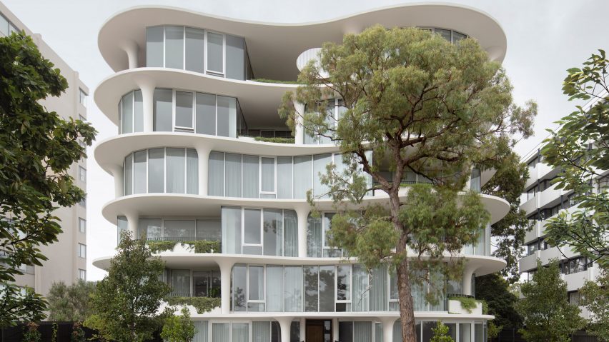
In this week's comments update, readers are discussing Wood Marsh's sinuous, curved Melbourne apartment block.
Commenters were curious about architecture studio Wood Marsh's six-storey apartment block in a Melbourne suburb, which features protruding floorplates and mushroom-like columns.
"There are structural engineers' tears somewhere in this"
"Beautiful building, and nice floor plans", commented Kevin Perera. "If it was twice as tall the proportions would look even better", they added.
"How on earth does this work in section? Where is the insulation depth for the terraces?" asked Chris D.
Colin MacGillivray was in awe of the "extraordinary exterior columns which do not carry through vertically. How do loads get transferred down? A thickened edge floor slab perhaps? Every floor is different – baffling."
Z-dog appreciated the challenges that have been overcome: "I'm sure there are structural engineers' tears somewhere in this project due to the columns not stacking up in the facade! It was totally worth it though and the elevation is truly a beautiful execution of a free-flowing curved slab."
What do you think about this project by Wood Marsh? Join the discussion ›
"Since when is championing diversity and inclusion only for the diverse and excluded?"
The Royal Institute for British Architects announced the appointment of Robbie Turner as its new director of inclusion and diversity, succeeding Marsha Ramroop, who resigned in March of this year.
In the comments, readers debated how best to approach diversity, inclusion and filling positions like this one.
Diplo joked that RIBA's new hire was a "brave and stunning" choice, but J Hooker was left scratching their head at the decision and asked, "why appoint a white guy?"
"Since when is championing diversity and inclusion only for the diverse and excluded? Just because he looks like a CIS male, doesn't mean he might not tick other diversity boxes (neurodivergent, invisible disability, gender diversity etc). And even if it turns out he is a CIS man, we need CIS men to be allies in the quest for diversity and inclusivity. Not exclude them!" commented Franc Lea.
However, they continued: "All that is not to say that more often people from diverse backgrounds better understand the plight of accessing and working in historically, predominantly white workplaces and how best, and most sensitively, to implement change."
Michael added that "anything that helps make the world a better place, not least the work environment, is good news".
Who do you think is the right candidate for a diversity and inclusion director? Join the discussion ›
"Exactly what you shouldn't be doing for impaired vision"
Readers were baffled by some of the decisions made by Odile Decq on her all-glass residential project for a client with vision loss.
The French architect designed the Maison de Verre house in Carantec – a town in Brittany, northern France – for an owner who suffers from an irreversible and progressive condition that means he can only make out vague shapes, so needed his home to offer consistent, diffused lighting.
"I do wonder if the nature of the client's vision impairment means that he won't be affected by the jarring, vertiginous walls the way people with typical vision are", commented Kemarino.
"Aren't inclined walls towards the interior exactly what you shouldn't be doing for impaired vision?" asked HP.
Archi said: "This is an interesting concept on light but if the person can't see enough to need windows then a giant stair in the middle of the space with knife-edge glass guard rails and no handrails seems ridiculous."
JZ agreed that the project was "peculiar. Especially that stair; to be given such a prominent location and then to make it difficult to see with failing eyesight."
What do you make of Maison de Verre? Join the discussion ›
"I'm waiting for my invite"
Norman Foster has created an angular retreat in Martha's Vineyard for "friends of the Foster family", featuring furniture designed by the architect for Karimoku.
Constructed with angled steel beams, the holiday home's shape was informed by North American barn structures with large amounts of timber chosen to reference local traditional wood-boarded structures, according to Foster.
Ken Steffes thought it was "very refreshing to see light and bright interior furnishings and millwork".
However, Walter Astor commented that he "typically likes Foster's interiors but these seem incredibly sterile and joyless".
Jay C White Cloud was more critical: "if you're going to advertise your furniture line then just do so. Don't depreciate another natural setting with more unsustainable modernity using concrete slabs and steel beams. Pointless industrial material selection made to 'look natural' by glueing some wood to it".
But Pa Verreon described it as "a peaceful retreat nested within an elegant and comfortable space", saying that they would "love to be invited there".
"I'm waiting for my invite", echoed Whateverandeveramen.
What do you think of this project from the hand of Pritzker Prize-winning Norman Foster? Join the discussion ›
Comments update
Dezeen is the world's most commented architecture and design magazine, receiving thousands of comments each month from readers. Keep up to date on the latest discussions on our comments page and subscribe to our weekly Debate newsletter, where we feature the best reader comments from stories in the last seven days.

