A hotel that pays tribute to early German modernism and an apartment within a ski resort designed by architect Marcel Breuer are among the projects collected in our latest lookbook, which explores interiors informed by the Bauhaus.
The most influential art and design school in history, the Bauhaus' was established in Germany in 1919 and although it closed just over a decade later continues to influence interior designers today.
Work produced by students and teachers during the school's 14-year history, centred on founder Walter Gropius' ethos that art and craft should marry to create a new architecture.
The below projects feature distinctly Bauhaus elements including chrome tubular chairs, geometric shapes, primary colours and abstract textiles.
This is the latest in our lookbooks series, which provides visual inspiration from Dezeen's archive. For more inspiration see previous lookbooks featuring living rooms that use warm neutrals to create a cosy ambience, bedrooms with wardrobes that are disguised as walls and contemporary living rooms in Georgian and Victorian homes.
Cassiopeia Apartment, France, by Volta
Tasked with reviving the "Bauhaus spirit" of this apartment set within a Breuer-designed ski resort, architecture studio Volta added soft furnishings in mustard yellows and royal blues, referencing the colour palette of movement.
Armchairs with steel frames that resemble Breuer's Wassily Chair have also been used to decorate the living room.
"The Bauhaus movement was predominant in the design of the project," said the studio. "It has influenced its history, its choice of materials and its furniture. The challenge was to revive its influences in a contemporary context."
Find out more about Cassiopeia apartment ›
Design studio The MP Shift wanted De Maria, a contemporary American restaurant in Manhattan's Nolita neighbourhood to look like an artist's studio, complete with white brickwork and pink-tinted plaster.
The studio paid tribute to Bauhaus and 1970s Soho style by adding sofas upholstered in tan-coloured leather, orb-shaped pendant lamps and simple pieces of art with triangular shapes.
Find out more about De Maria ›
Nadzieja, Poland, by Agnieszka Owsiany Studio
Design influences from the Bauhaus collide with Israeli flavours at Nadzieja, a restaurant in Poznań, Poland designed by local studio Agnieszka Owsiany Studio.
Filled with brown-leather chairs with tubular steel frames, high granite ivory counters and spherical pendant lights, the eatery has a bright and warm interior that draws parallels with the large number of Bauhaus buildings found in Tel Aviv.
Find out more about Nadzieja ›
Schwan Locke Hotel, Germany, by Fettle
Influenced by the work of proto-Bauhaus association Deutsche Werkbund, design studio Fettle wanted the interiors of aparthotel Locke to be at once nostalgic and distinctly contemporary.
Its 151 apartment rooms feature a combination of light timber, raw plaster, chrome, steel and mohair materials set against a colourful yet muted pink and green backdrop.
Find out more about Schwan Locke hotel ›
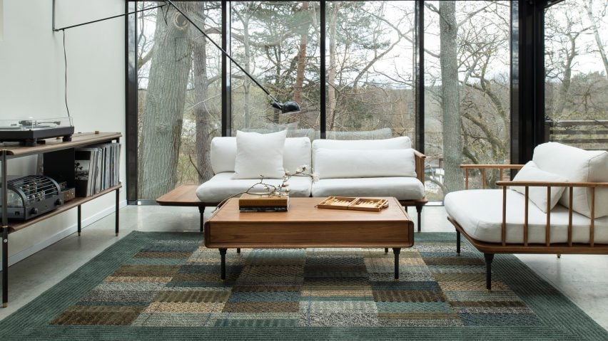
In this living room, Swedish designer Ellinor Eliasson's tufted rug acts as a centrepiece and gives the space a warm and richly textured look.
The graphic, modernist rug recalls the work of renowned Bauhaus weaving workshop teacher Anni Albers, who is best known for her textiles and recognisable lines, colours and forms.
Soho House Nashville, US, by Soho House
At the Soho House in Nashville, guests can enjoy a taste of the city's musical heritage while uncovering the building's industrial past as a knitting mill.
Designed to feel warm and rich, much like the rock and roll, jazz and blues music that Nashville is known for, the accommodation features bespoke lamps, brassy industrial finishes and plenty of tubular decor to create an industrial interior that still feels modern.
Find out more about Soho House Nashville ›
53 West 53, US, by André Fu and AFSO
Architect André Fu and his Hong Kong studio AFSO referenced the geometric designs of the Bauhaus school for 53 West 53, a model unit set within architect Jean Nouvel's New York tower block.
The two-bedroom apartment is peppered with sculptural pieces of furniture such as a room divider comprised of dark wood and rods, which compliments the existing walnut doors and oak floors and cabinets.
Find out more about 53 West 53 ›
RP House, Brazil, by Estúdio BG
Inside this stripped-back two-storey residence called RP House, black steelwork, bare walls and simple white volumes stacked on top of each other come together to create a sparse yet light-filled Brazilian home.
São Paulo studio Estúdio BG said that the design referenced the principles of repeatability and standardisation advocated by designers of the Bauhaus.
"This 1920s movement was characterised by the replication of design in an industrial format," the studio said. "The simple geometric volume, the elimination of decorative elements and the use of the roof as terraces reinforce the principles adopted in the project."
Find out more about RP House ›
Palm Springs Dome House, US, by Pavlina Williams
Los Angeles-based architect Pavlina Williams added multiple windows and knocked down several walls in her renovation of this Californian house, transforming it from a gloomy residence into a desert sun trap.
In the open-plan living area, a caramel leather Wassily Chair by the Hungarian architect and designer Breuer sits alongside a spiral stainless-steel staircase that leads up to a loft.
Find out more about Palm Springs Dome House ›
KaDeWe, Germany, by India Mahdavi
French architect India Mahdavi borrowed from the Bauhaus' preoccupation with strong graphic lines and shapes in her renovation of department store KaDeWe by adding sweeping black, white and grey stripes of Santa Margherita to the floor of the womenswear section.
Elsewhere in the 2,000-square-metre shopping space, pink carpeting is set off against triple-tiered, brass clothes rails and olive green and dusty pink velvet curtains.
This is the latest in our lookbooks series, which provides visual inspiration from Dezeen's archive. For more inspiration see previous lookbooks featuring bathrooms where the sink takes centre stage, homes with arched openings that add architectural interest and bookshops designed to enhance the browsing experience.

