The Broad "doesn't feel like a traditional museum" says Elizabeth Diller
Architect Elizabeth Diller explains how The Broad museum in Los Angeles was designed to feel "extremely welcoming" in the next instalment of Dezeen's Concrete Icons series produced in collaboration with Holcim.
The video features The Broad in Los Angeles designed by Diller's studio Diller Scofidio + Renfro, a three-storey museum that houses an expansive collection of contemporary and post-war artworks.
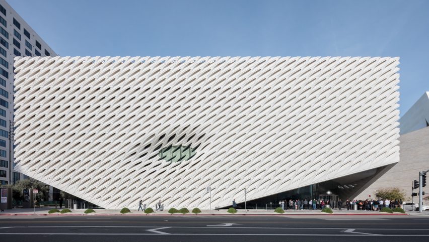
Speaking to Dezeen in an exclusive video interview filmed at the Diller Scofidio + Renfro office in New York City, Diller explained how the building was designed to feel inviting to visitors with a porous facade that allows light to be gently diffused into the gallery.
"It doesn't really feel like a traditional museum," Diller said.
"There's no sense of authority. When you step off the street, no one tells you where to go. There's no information desk, there's no admissions desk. You don't pay, it's free. It feels extremely welcoming."
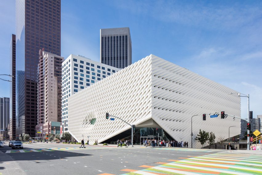
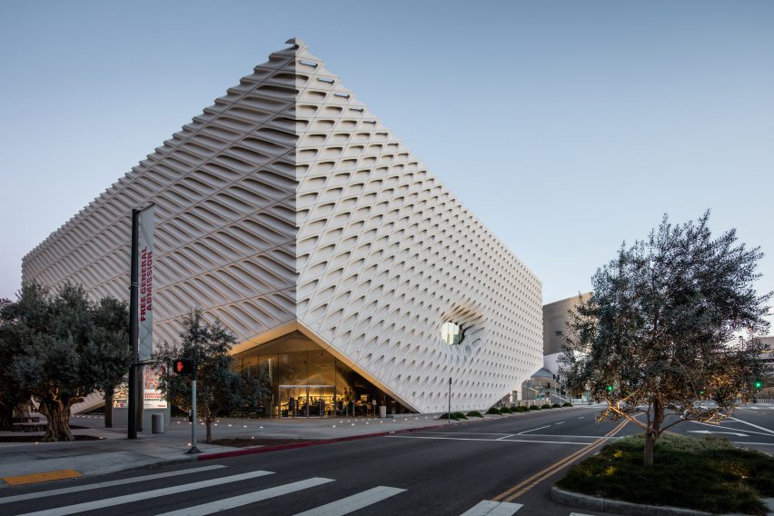
Completed in 2015, the building comprises two main components, which Diller describes as "the veil and the vault".
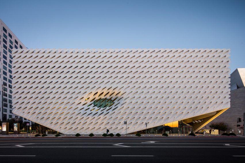
The veil refers to the latticed concrete facade that covers the building on all sides but lifts at the corners to form entrances to the lobby and cafe.
The honeycomb exterior is made from 2,500 fibreglass-reinforced concrete panels made from 380 distinct moulds that were shaped using parametric software.
"I love the brutality of concrete, I love the rawness and the refined aspects," Diller said.
"There's a lot to do with thinking about the carbon footprint of concrete and finding new systems, new products, and aggregates and just allowing concrete to be more sustainable."
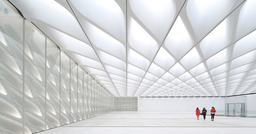
The concrete panels enable light to penetrate the column-free interiors and provide optimum natural light to view the artwork without overexposing the pieces.
"What we wanted to do was make a very porous facade to make a connection between the street and the museum," Diller said. "It's a two-way system where you can see in and museum-goers can see out."
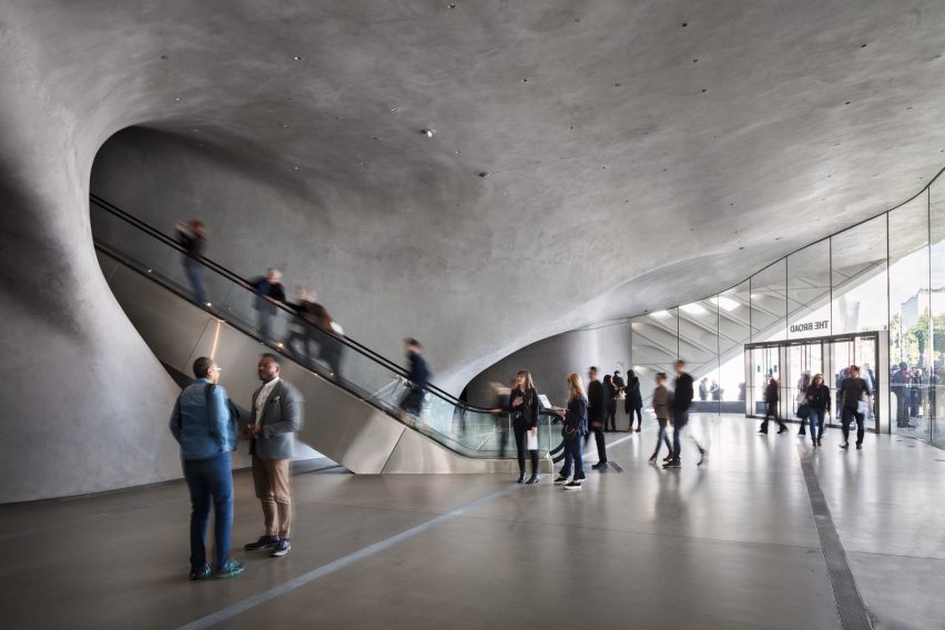
At the centre of the building lies the vault, which stores archive pieces and artworks not on display or on loan. The vault takes the form of a cavernous opaque mass that hovers over the lobby and beneath the gallery spaces.
From the lobby, visitors move through the solid volume via escalators, which lead to the above gallery spaces. The vault is punctuated with openings to enable visitors to peer inside and get a sense of the depth of the vast collection of work.
"Once one enters, you're really underneath the vault and you feel the heaviness of this floor," Diller said. "When you leave, you take the stairs through and you actually see what's in the vault."
Diller Scofidio + Renfro is a multidisciplinary architecture firm founded in 1981 and led by Diller, Ricardo Scofidio, Charles Renfro and Benjamin Gilmartin.
Other projects completed by the studio include the US Olympic and Paralympic Museum in Colorado and the renovation of Museum of Modern Art in New York.
Concrete Icons is a six-part video series, created in partnership with building materials company Holcim, which profiles the most striking contemporary concrete buildings by the world's leading architects.
The previous instalment in the series focuses on MAD's sinuous Cloudscape library in Haikou, China. Future videos will profile projects including Tatiana Bilbao's Casa Ventura in Monterrey, Mexico.
The photography is by Mike Kelley unless stated otherwise.
Partnership content
Concrete Icons is produced by Dezeen for Holcim as part of a partnership. Find out more about Dezeen's partnership content here.
Build the icons of the future with Holcim's low-carbon ECOPact concrete, delivering up to 90 per cent less carbon dioxide emissions compared to standard concrete with no compromise on performance.
Find out more about how Holcim works with architects here.