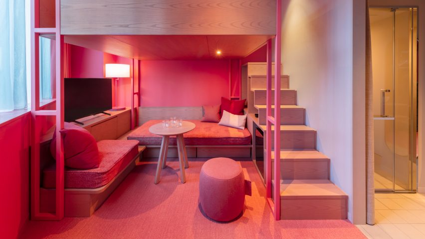
For our latest lookbook, we've cherry-picked 10 interiors clad in shades that recall Viva Magenta after American colour company Pantone named the bright pink hue as its Color of the Year for 2023.
Pantone describes Viva Magenta as "a brave and fearless red shade that vibrates with vim and vigour" and reflects current attitudes towards experimentation and fearlessness.
"It's assertive but it's not aggressive – we refer to it as a fist in a velvet glove," said vice president of the Pantone Institute Laurie Pressman.
Shades of bright pink magenta have been used by interior designers in the projects below to brighten up spaces in locations ranging from Copenhagen to Tokyo.
This is the latest in our lookbooks series, which provides visual inspiration from Dezeen's archive. For more inspiration see previous lookbooks featuring homes with sliding doors, lounges with suspended fireplaces and cottage interiors.
Shoreline Waikiki, Hawaii, by BHDM
The interior of the beachside Shoreline Waikiki hotel in Hawaii has a flamboyant colour scheme, giving it a jubilant feel that matches the island's surrounding tropical flora and fauna.
Redesigned by US studio BHDM for the "millennial-minded traveller", the accommodation has a hot-pink carpet that stretches from the reception to the ground floor lounge and contrasts the brightly coloured yellow, teal, blue and red furniture upholstery.
Find out more about Shoreline Waikiki ›
Atrium, US, by Smith Hanes Studio
Rich tones of green, raspberry and gold collide with smooth terrazzo, shiny tiles and tropical wallpaper in Atlanta bistro and restaurant Atrium.
Local architecture studio Smith Hanes Studio looked to the lines, patterns and shapes found in colourful French cafes and art deco buildings for the space, which is filled with an array of large leafy plants.
Family Kitchen, UK, by Mizzi Studio
British design studio Mizzi Studio renovated this restaurant in London botanical garden Kew Gardens, creating a whimsical eatery that wouldn't look out of place in the Charlie and the Chocolate Factory film.
Designed to introduce young children to new foods, the space features playful decor such as an apple-shaped seat, giant timber-weaved fungi sculptures and a magenta-coloured Ethiopian Enset tree.
Find out more about Family Kitchen ›
Maggie's Centre, UK, by Ab Rogers Design
At this Maggie's Centre cancer treatment site in Sutton, England, patients can rest and convalesce in a pinky-purple-toned living area that studio Ab Rogers Design wanted to feel cheerful, yet sensitive.
"Believing in colour's sensual and psychological power, we coloured the surrounding rooms to suit the functions and activities they host," said Ab Rogers Design founders Ab Rogers and Ernesto Bartolini.
Find out more about Maggie's Centre ›
Rotazioni and Visioni by Patricia Urquiola
The rust, mustard, dusty pink, baby blue, yellow and caramel block colours and black lines in these rugs by Spanish designer Patricia Urquiola contrast the circular openings that punctuate the walls in this pared-back room.
Made from Himalayan wool and silk, the soft rugs have been used to add depth and warmth to the space.
Find out more about Rotazioni and Visioni ›
Scape, UK, by Ab Rogers Design
A ribbon of magenta pink courses through the central areas of Scape, a housing block that Hackney-based studio Ab Rogers Design refurbished for students in London's East End.
Vibrant colour-coding knits the buildings’ internal parts together, while the bedrooms are informed by the sleeping quarters of train carriages, with space-saving furniture such as cupboards that double up as desks and seating nooks nestled in the windows.
Toggle Hotel, Japan, by Klein Dytham Architecture
Sandwiched between a raised expressway, a railway line and Tokyo's Kanda River, Toggle Hotel was designed by Tokyo-based Klein Dytham Architecture to stand out from the neighbouring infrastructure.
Inside each of the rooms, which guests are able to choose based on their colour preferences, the furniture, bedding, carpets and soft furnishings are all coloured in the same shade.
Find out more about Toggle Hotel ›
Casa Lana, Italy, by Triennale di Milano
A plush pinkish-red carpet covers the floor of this model apartment, which was recreated within the Triennale di Milano as part of a permanent new installation.
Originally designed by Memphis Group founder Ettore Sottsass for a friend, Casa Lana is arranged around a wooden enclosure with built-in shelving and sofas.
Find out more about Casa Lana ›
Resa San Mamés , Spain, by Masquespacio
Valencia-based studio Masquespacio injected splashes of its signature colour-blocking style throughout Resa San Mamés, a 1,850 square-metre building that houses 351 students in Bilbao, Spain.
In the main lobby, millennial pink paint clashes with the crimson tiles that line the walls, while soft furnishings and partitions were used to define zones elsewhere on the ground floor.
Find out more about Resa San Mamés ›
Hayarden school, Israel, by Sarit Shani Hay, Chen Steinberg Navon and Ayelet Fisher
A rainbow of colours, including a bright pink that straddles fuschia and magenta, have been used to brighten up this two-storey school in Tel Aviv, which local designer Sarit Shani Hay, architect Chen Steinberg Navon and Ayelet Fisher overhauled in 2019.
Situated in Tel Aviv's Hatikva Quarter – a neighbourhood with a high number of asylum-seekers – the school has a house-shaped reading nook and colourful paintwork, which the team hoped would help to create an inspiring learning area for the children of refugees.
Find out more about Hayarden school ›
This is the latest in our lookbooks series, which provides visual inspiration from Dezeen's archive. For more inspiration see previous lookbooks featuring Bauhaus-informed interiors, homes in converted warehouses and neutral living rooms.

